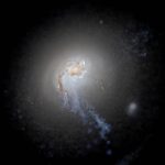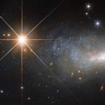
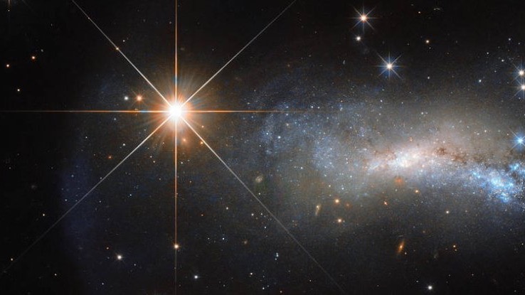
Not the Fast Radio Burst. Radio waves aren’t visible to the eye. This is something else, from the Hubble Space Telescope. See a spectrum of the burst below. Image via NASA/ ESA/ Hubble/ ScienceAlert.
Fast Radio Bursts (FRBs) are short, intense bursts of radio waves lasting perhaps a thousandth of a second, coming from all over the sky and of unknown origin. In a shock discovery that could help to solve one of astronomy’s greatest mysteries – on April 28, 2020 – astronomers used an Astronomer’s Telegram to announce a Fast Radio Burst originating from inside our Milky Way galaxy. That’s a first. All other FRBs have been extragalactic, that is to say outside our galaxy. Even more importantly, the astronomers think they’ve also identified the source of the burst.
Explanations have ranged from neutron stars to supernovae to the inevitable aliens.
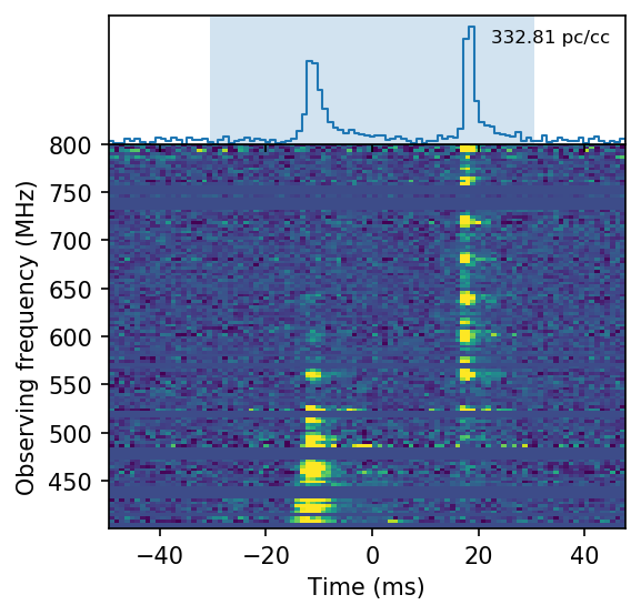
Dynamic spectrum – a range frequencies over time – from the April 28, 2020, Fast Radio Burst, via Astronomer’s Telegram.
FRBs were first detected in 2007. This new detection of an FRB is, in astronomical terms, very close to home. Astronomers found it using the CHIME (Canadian Hydrogen Intensity Mapping Experiment) radio telescope in Canada, an instrument designed specifically to study phenomena such as FRBs in order to answer major questions in astrophysics. This particular telescope has greatly increased the bursts’ detection rate since its first light in September 2017.
At the time of the April 28 signal, the telescope was not pointing straight at the source. But the signal was so strong the telescope captured it, so to speak, out of the corner of its eye. The signal was of sufficient strength to be detected from another galaxy (indicating it is the same phenomenon as those earlier extragalactic bursts detected from our galaxy), and it had the typical duration of a Fast Radio Burst.
The day before, on April 27, 2020, the Swift Burst Alert Telescope had detected a series of gamma-ray bursts originating from the same point in the sky as the FRB. Those gamma rays are associated with a known object, labeled SGR 1935+2154, a so-called Soft Gamma Repeater. This object is a type of stellar remnant known for periodically generating bursts of gamma rays. The distance to this object has been estimated at about 30,000 light-years. For comparison, the Milky Way galaxy is over 150,000 light-years across.
Excitingly, at the same time there was a burst of high-energy X-rays from the same point in the sky. The X-ray burst was observed by ground- and space-based X-ray telescopes. No FRB had ever been associated with gamma- or X-rays before, making this observation, if indeed it was of a FRB, something completely new.
Now you need to know that X-ray and gamma-ray bursts are not unusual in observations of magnetars.
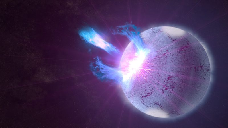
Artist’s concept of an eruption on a magnetar. The Fast Radio Burst detected in our galaxy may be associated with these sorts of eruptions. Image via NASA Goddard Visualization Studio.
SGR 1935+2154 is believed to be a magnetar, a type of neutron star with a hypermagnetic field strong enough to pull the keys from your pocket from as far away as the moon!
While the reason for this ultra-strong magnetic field – a thousand times stronger than that of a normal neutron star – is unknown, astronomers theorize that FRBs might be produced when the crust of the neutron star suffers a starquake as a result of tension between the neutron star’s intense gravity and its magnetic field. This tension may be suddenly, and incomprehensibly violently, released in the starquake.
This may mean that the neutron star’s crust, thought to be a million times stronger than steel, slips by just a millimeter; however, this tiny shift may be sufficient to generate a brief burst of radio energy so powerful it can be detected from other galaxies, which we detect as an FRB.
Maybe! It seems possible, anyway, and, in astrophysics, what’s possible is the name of the game.
However, this detection does not mean that astronomers are ready to confirm that all FRBs originate from magnetars. The burst received by CHIME was at the low end of the signal strength historically associated with FRBs, which may or may not be of significance. As yet, astronomers have not analyzed the waveform of the signal to see if it matches that from FRBs. However, if this analysis and ongoing observations of magnetar SGR 1935+2154 do demonstrate conclusively that magnetars are the origin of Fast Radio Bursts, one of astronomy’s greatest mysteries will have been solved.
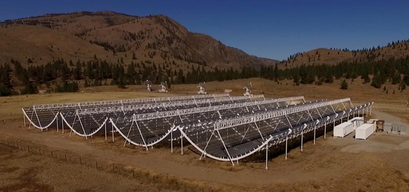
The CHIME radio telescope in Canada. It’s specifically designed to study objects such as Fast Radio Bursts. Image via CHIME.
Bottom line: Fast Radio Bursts are mysterious, short, intense bursts of radio waves coming from locations all over the sky. Before April 28, all the FRBs we knew were thought to come from outside our galaxy. The April 28 FRB, which apparently originated within our galaxy, will help astronomers unravel thorny questions in astrophysics.
from EarthSky https://ift.tt/3b2m5q0
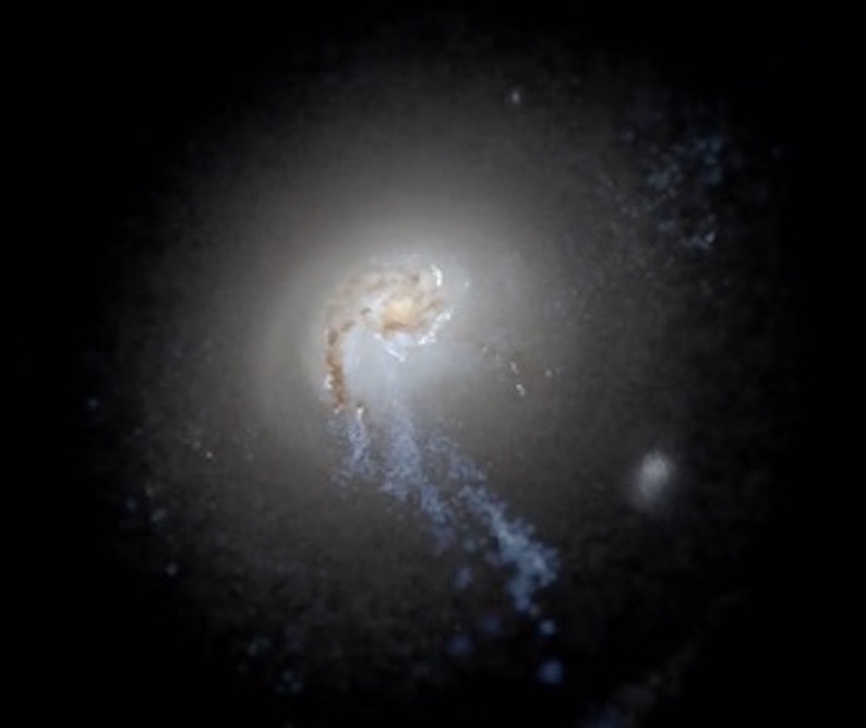
Not the Fast Radio Burst. Radio waves aren’t visible to the eye. This is something else, from the Hubble Space Telescope. See a spectrum of the burst below. Image via NASA/ ESA/ Hubble/ ScienceAlert.
Fast Radio Bursts (FRBs) are short, intense bursts of radio waves lasting perhaps a thousandth of a second, coming from all over the sky and of unknown origin. In a shock discovery that could help to solve one of astronomy’s greatest mysteries – on April 28, 2020 – astronomers used an Astronomer’s Telegram to announce a Fast Radio Burst originating from inside our Milky Way galaxy. That’s a first. All other FRBs have been extragalactic, that is to say outside our galaxy. Even more importantly, the astronomers think they’ve also identified the source of the burst.
Explanations have ranged from neutron stars to supernovae to the inevitable aliens.
Dynamic spectrum – a range frequencies over time – from the April 28, 2020, Fast Radio Burst, via Astronomer’s Telegram.
FRBs were first detected in 2007. This new detection of an FRB is, in astronomical terms, very close to home. Astronomers found it using the CHIME (Canadian Hydrogen Intensity Mapping Experiment) radio telescope in Canada, an instrument designed specifically to study phenomena such as FRBs in order to answer major questions in astrophysics. This particular telescope has greatly increased the bursts’ detection rate since its first light in September 2017.
At the time of the April 28 signal, the telescope was not pointing straight at the source. But the signal was so strong the telescope captured it, so to speak, out of the corner of its eye. The signal was of sufficient strength to be detected from another galaxy (indicating it is the same phenomenon as those earlier extragalactic bursts detected from our galaxy), and it had the typical duration of a Fast Radio Burst.
The day before, on April 27, 2020, the Swift Burst Alert Telescope had detected a series of gamma-ray bursts originating from the same point in the sky as the FRB. Those gamma rays are associated with a known object, labeled SGR 1935+2154, a so-called Soft Gamma Repeater. This object is a type of stellar remnant known for periodically generating bursts of gamma rays. The distance to this object has been estimated at about 30,000 light-years. For comparison, the Milky Way galaxy is over 150,000 light-years across.
Excitingly, at the same time there was a burst of high-energy X-rays from the same point in the sky. The X-ray burst was observed by ground- and space-based X-ray telescopes. No FRB had ever been associated with gamma- or X-rays before, making this observation, if indeed it was of a FRB, something completely new.
Now you need to know that X-ray and gamma-ray bursts are not unusual in observations of magnetars.
Artist’s concept of an eruption on a magnetar. The Fast Radio Burst detected in our galaxy may be associated with these sorts of eruptions. Image via NASA Goddard Visualization Studio.
SGR 1935+2154 is believed to be a magnetar, a type of neutron star with a hypermagnetic field strong enough to pull the keys from your pocket from as far away as the moon!
While the reason for this ultra-strong magnetic field – a thousand times stronger than that of a normal neutron star – is unknown, astronomers theorize that FRBs might be produced when the crust of the neutron star suffers a starquake as a result of tension between the neutron star’s intense gravity and its magnetic field. This tension may be suddenly, and incomprehensibly violently, released in the starquake.
This may mean that the neutron star’s crust, thought to be a million times stronger than steel, slips by just a millimeter; however, this tiny shift may be sufficient to generate a brief burst of radio energy so powerful it can be detected from other galaxies, which we detect as an FRB.
Maybe! It seems possible, anyway, and, in astrophysics, what’s possible is the name of the game.
However, this detection does not mean that astronomers are ready to confirm that all FRBs originate from magnetars. The burst received by CHIME was at the low end of the signal strength historically associated with FRBs, which may or may not be of significance. As yet, astronomers have not analyzed the waveform of the signal to see if it matches that from FRBs. However, if this analysis and ongoing observations of magnetar SGR 1935+2154 do demonstrate conclusively that magnetars are the origin of Fast Radio Bursts, one of astronomy’s greatest mysteries will have been solved.
The CHIME radio telescope in Canada. It’s specifically designed to study objects such as Fast Radio Bursts. Image via CHIME.
Bottom line: Fast Radio Bursts are mysterious, short, intense bursts of radio waves coming from locations all over the sky. Before April 28, all the FRBs we knew were thought to come from outside our galaxy. The April 28 FRB, which apparently originated within our galaxy, will help astronomers unravel thorny questions in astrophysics.
from EarthSky https://ift.tt/3b2m5q0