‘We’re missing something fundamental about the sun’

Animated illustration of a white circle on blue with gently waving threadlike wisps around it.

Isn’t this beautiful? It’s an illustration of our sun – our local star – and its outer atmosphere, or corona, extending into space. Mysteriously, the corona is hotter than the sun’s surface. It releases the solar wind, a stream of charged particles that sometimes affects earthly satellites and power grids. Space scientists launched the Parker Solar Probe to study both the corona and solar wind. Image via NASA’s Goddard Space Flight Center /Lisa Poje/Genna Duberstein.

Scientists who study the sun are buzzing this week about four new papers published in the peer-reviewed journal Nature on December 4, 2019. The papers are based on data collected by the record-setting Parker Solar Probe mission – launched in 2018 – during the spacecraft’s first two close sweeps past our parent star (late 2018 and early 2019). These early studies, the scientists say, are already providing insights into the two fundamental questions the Parker Solar Probe mission was designed to answer. First, defying all logic, why does the sun’s outer atmosphere – or corona – become much, much hotter the farther it stretches from the sun’s surface? Second, what accelerates the solar wind – a supersonic stream of protons, electrons and other particles – emanating from the corona and permeating the entire solar system?

A December 4 statement from scientists at the University of Michigan – who work with one of the instruments aboard the Parker Solar Probe – explained:

Both questions have ramifications for how we predict, detect and prepare for solar storms and coronal mass ejections that can have dramatic impacts on Earth’s power grid and on astronauts.

Justin Kasper of the University of Michigan, who serves as principal investigator for Parker’s Solar Wind Electrons Alphas and Protons (SWEAP) instrument suite. He led one of the new studies and is co-author of two others. In their statement, these scientists said that the Parker Solar Probe revealed that the sun’s rotation or spin on its axis – completing a single spin only once every 27 days at its equator – has an impact on the solar wind much farther away than previously thought. They already knew that – near the sun – the sun’s magnetic field pulls the solar wind in the same direction that the sun spins. Farther from the sun, at the distance the spacecraft measured in these first encounters, they had expected to see, at most, a weak signature of that rotation. However, Kasper said:

To our great surprise, as we neared the sun, we’ve already detected large rotational flows – 10 to 20 times greater than what standard models of the sun predict.

So we are missing something fundamental about the sun, and how the solar wind escapes.

This has huge implications. Space weather forecasting will need to account for these flows if we are going to be able to predict whether a coronal mass ejection will strike Earth, or astronauts heading to the moon or Mars.

EarthSky 2020 lunar calendars are available! They make great gifts. Order now. Going fast!
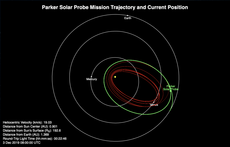
Inner planet orbits with green oval trajectory, one end close to sun, and many red lines inside it.

Parker Solar Probe’s location with respect to Mercury, Venus and Earth on December 3, 2019. The craft completed its 3rd orbit around the sun on November 15. Its next milestone will be a Venus flyby on December 26. Image via NASA/JHUAPL/Where is Parker Solar Probe?

Parker Solar Probe’s findings regarding the sun’s magnetic field – which is believed to play a role in the coronal heating mystery – were equally surprising, the scientists said. The new findings relate to what called Alfvén waves, which are waves that occur in a plasma (the sun is so hot that most of its gas exists in plasma form). Alfvén waves were detected in the solar wind long ago. Some researchers though they might be remnants of whatever mechanism is causing the mysterious heating of the sun’s outer atmosphere, or corona. Parker researchers were on the lookout for indications that might be the case, but found something unexpected. Kasper explained:

When you get closer to the sun, you start seeing these ‘rogue’ Alfvén waves that have four times the energy than the regular waves around them. They feature 300,000 mph velocity spikes that are so strong, they actually flip the direction of the magnetic field.

According to these scientists:

Those polarity-reversing velocity spikes offer another potential candidate for what may cause the corona to get hotter moving away from the sun.

That’s clearly an early result, but it gives space scientists something to be watching for as – aided by breakthrough technologies that let the craft endure heat and radiation like no previous mission – Parker Solar Probe continues to sweep closer and closer to the sun.

And sweeping close to the sun is, in fact, Parker Solar Probe’s job. It’ll ultimately come within 4 million miles of the sun’s surface.

The probe launched on August 12, 2018. On October 29 of that year, it broke its first record, coming closer to the sun than any other human-made object (passing within the previous record of 26.55 million miles from the sun’s surface, set by the German-American Helios 2 spacecraft in 1976).

As the Parker Solar Probe mission has progressed, the spacecraft has repeatedly broken its own records, coming closer and closer to the sun. Its most recent perihelion (closet point to sun) – perihelion #3 – was September 1, 2019. The next one – perihelion #4 – will be January 29, 2020. In 2024, the craft is expected to come within 4 million miles of the sun’s surface (3.83 million miles, or 6.1 million km). Click here for a timeline showing upcoming perihelions in the mission.

Data collected during the spacecraft’s first two solar orbits was released on November 12. This week, these four new papers are causing a stir.

And the Michigan scientists aren’t the only ones excited about the data from the Parker Solar Probe. Heliophysicists around the globe have a reason to be excited. For example, Joe Giacalone of the Lunar and Planetary Laboratory at the University of Arizona – team member for another instrument aboard the probe (Integrated Science Investigation of the Sun) – commented to Jasmine Demers in an article in the Arizona Daily Star on December 2, 2019:

This is an exciting time to be a heliophysicist.

The data that is now publicly available comes from a region of space we have never sampled previously. With many brilliant scientists now poring through this amazing data set, new discoveries about our star are soon coming.
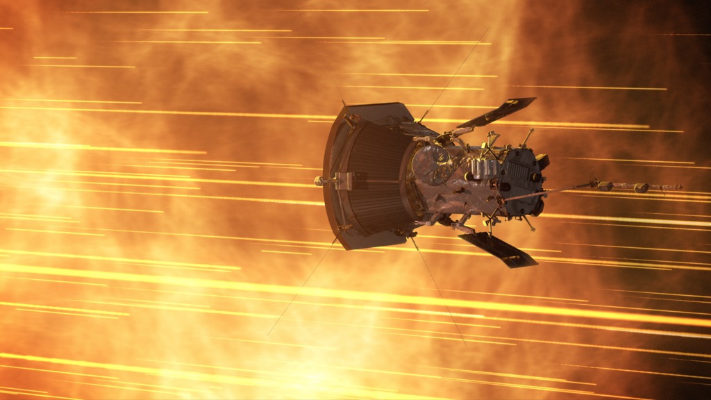
A spacecraft rushing along in what looks like a hot place!

Artist’s concept of the Parker Solar Probe sweeping close to the sun. At its closest to the sun – toward the end of its 7-year prime mission – Parker Solar Probe will come well within the mysterious solar corona, or outermost atmosphere, within 3.83 million miles of the solar surface. Image via NASA: 10 Things to Know about Parker Solar Probe.

Bottom line: Parker Solar Probe – now in its 4th orbit around our local star – is designed to endure the sun’s heat and radiation like no previous mission. Data collected during the craft’s first 2 orbits were released last month. This week, 4 new studies in Nature have space scientists buzzing.

Source: Alfvénic Velocity Spikes and Rotational Flows in the Near-Sun Solar Wind

Via University of Michigan


from EarthSky https://ift.tt/2r5Gf1M

Get ready for the Venus-Saturn conjunction

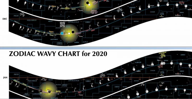
Chart showing sun's location and other details of sky.

View larger.| Zodiac Wavy Charts are giant posters, 2 feet wide and 3 feet high (.6 by 1 meter). They show in graphic form the events across the sky for each month of the year. Cool holiday gift! Read more here.

Reprinted with permission from Guy Ottewell’s blog

You can see space but you can’t see time.

Time is an ice that instantly sublimes.

You can see time only by translating it into space: into graphs, in which it is one of the dimensions. You can see, from the Zodiac Wavy Charts, above, in which one of the dimensions is months and the other is the zodiac, that 2020 is less than a month away, and that the sun is dipping deepest south in its journey through the provinces of the zodiac. And will in January begin feeling its way back north.

In the December band of the chart, you can see the first quarter moon of the middle of Wednesday, December 4, and Venus speeding ahead of the sun into the evening sky and overtaking Saturn on December 11.

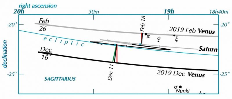
Here is a map of the part of the sky in which the Venus-Saturn encounter takes place.

EarthSky 2020 lunar calendars are available! They make great gifts. Order now. Going fast!

Ecliptic line running across chart with lines showing locations of planets relative to it.

View larger. | Sky chart showing the part of the ecliptic where Venus and Saturn will be in December 2019, via Guy Ottewell’s blog.

Saturn’s path is shown for the whole of 2019; Venus’s, for part of February and part of December. The paths are gray when the planets are in the morning sky, and black in the evening sky, as they are now.

In a year, Saturn travels only about 1/30 of the way around the sky; Venus goes roughly all around the sky, because it stays roughly near the sun. So in 2019 Venus passed Saturn in February, and will pass Saturn again in December.

Read more and see a chart: Venus-Saturn pairing on December 10

Why are there three connecting lines at each of the dates?

The red line is perpendicular to the celestial equator (which is horizontal and off the top of this map). It connects the planets at the moment of conjunction in right ascension: that is, the moment when one is exactly north of the other. This is the kind of conjunction often given in almanacs, because it suits the view in equatorially-mounted telescopes.

The green line is perpendicular to the ecliptic. It connects the planets at the moment when one passes the other in ecliptic longitude.

The black line connects them at the moment of their appulse: when the angular distance between them is shortest.

In the present case, the three moments fall only a few hours apart. But they can be up to several days apart, if the two bodies are quite far apart, or if one of them is on a strongly curving part of its path.

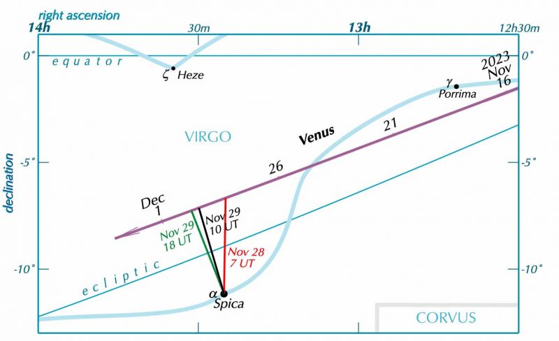
I confess that I’ve lost at least four days trying to get the programming of these geometries sorted out. I was working on it because it’s very interesting for Venus. I think I’ll show one of my diagrams, for another kind of Venus conjunction, for Venus and the star Spica in 2023.

Chart with straight line of ecliptic and path of Venus as a wavy line.

View larger. | Venus and the bright star Spica in the constellation Virgo in 2023, via Guy Ottewell’s blog.

Bottom line: A word from astronomer Guy Ottewell – plus charts – giving you some insights on the December 10, 2019, conjunction between Venus and Saturn.

Via Guy Ottewell’s blog

Visit Stellarium for a precise view from your location at any given time.


from EarthSky https://ift.tt/2RlaJaK

Active 2019 Atlantic hurricane season comes to an end


The GOES East satellite recorded this imagery of the entire Atlantic basin. You can see storms as they form off the coast of Africa and then enter the Atlantic. The video starts at June 1, though there was a subtropical storm (Andrea) that formed in May. The first hurricane in this video (Barry) appears at 0:13 in the Gulf of Mexico.

The 2019 Atlantic hurricane season officially concluded on November 30. According to a NOAA summary, the season produced a total of 18 named storms. That includes six hurricanes, three of which – Hurricanes Dorian, Humberto, and Lorenzo – were considered “major” (Category 3, 4 or 5). An average season has 12 named storms, six hurricanes, and three major hurricanes.

The annual Atlantic hurricane season begins June 1 and ends November 30. The 2019 Atlantic hurricane season was the fourth consecutive above-normal Atlantic hurricane season, said NOAA. The only other period on record that produced four consecutive above-normal seasons was 1998-2001.

The three major hurricanes this season were Dorian, Humberto and Lorenzo. Hurricane Dorian is tied with three other hurricanes — the 1935 Labor Day Hurricane, 1988’s Hurricane Gilbert and 2005’s Hurricane Wilma — as the second strongest hurricane on record in the Atlantic basin in terms of wind (185 mph).

Also this year, five tropical cyclones formed in the Gulf of Mexico, which ties a record with 2003 and 1957 for the most storms to form in that region. In all, four storms made landfall in the U.S. during the 2019 season: Barry, Imelda, Nestor and Dorian.

EarthSky 2020 lunar calendars are available! They make great gifts. Order now. Going fast!

A list of names on a blue background.

A graphic listing 2019 Atlantic tropical cyclone names selected by the World Meteorological Organization. The 18 named storms that formed are designated with a red slash through their name. How do hurricanes get their names? Image via NOAA.

The 2019 season’s activity ramped up in mid-August during the normal peak of the season, said Gerry Bell, lead seasonal hurricane forecaster at NOAA’s Climate Prediction Center. Bell said in a statement:

The above-normal activity is consistent with the ongoing high-activity era, driven largely by the Atlantic Multidecadal Oscillation, which entered a warm phase in 1995. Conditions that favored more, stronger, and longer-lasting storms this year included a stronger West African monsoon, warmer Atlantic waters, and weak vertical wind shear across the western Atlantic and Gulf of Mexico.

Satellite view of several spiral storms in white on deep blue Atlantic ocean.

Satellite image from September 3, 2019. From left to right, hurricanes Fernand, Dorian, and Gabrielle in the Gulf of Mexico and Atlantic Ocean. Image via NOAA.

Bottom line: Summary of the 2019 Atlantic hurricane season.

Via NOAA


from EarthSky https://ift.tt/33M7dbX

Sunrise at the moon’s Bhabha crater

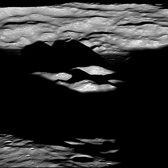
A wide crater on the moon, at sunrise. The crater floor is dark, but the central peak is illuminated.

View larger. | Sunrise at Bhabha crater, where sunlight hasn’t yet reached the crater floor after the moon’s 2-week night. You can see the crater’s central peak rising from the shadows of dawn. Note that a portion of the eastern rim (bottom of image) is still in shadow due to highstanding terrain just outside of the scene. Image via NASA/ GSFC/ Arizona State University/ LROC.

NASA’s Lunar Reconnaissance Orbiter captured this image of dawn over Bhabha crater on August 28, 2019. Bhabha, on the far side of the moon, is about 50 miles (80 km) wide. It’s named the physicist Homi Jehangir Bhabha (1909-1966), a nuclear physicist of India. It’s part of the South Pole–Aitken (SPA) basin, an immense impact crater on the moon’s far side, roughly 1,600 miles (2,500 km) in diameter. China’s Chang’e 4 spacecraft landed within this basin earlier this year. Bhabha crater is important to space scientists in its own way. NASA wrote:

Its location within SPA means that the impact event exposed material that originally resided deep within the moon, but was excavated and melted by the giant SPA impact event.

Read more from NASA about Bhabha crater

Close-up of central peak of Bhabha crater.

View larger. | A close-up of the image above, showing the central peak of Bhabha crater. Image acquired on August 28, 2019. View is seen from east-to-the west, north is to the right, visible portion of central peak complex is about 9 miles (14 km) wide. Image via NASA/GSFC/Arizona State University/LFOC.

Via LROC


from EarthSky https://ift.tt/2RhOGBC

Blood tests: using blood to detect cancer early

The idea of taking a small vial of blood and being able to detect cancer at its earliest and most treatable stages is an attractive one. And it’s something that cancer researchers are actively exploring.

But, despite their efforts, a reliable and accurate blood test to help detect cancer early has proved elusive. It turns out that hunting for cancer clues in the blood is no mean feat.

For one thing, cancer is extremely complex. There are over 200 types of cancers, and each cancer will release hundreds of different markers into the blood. But they’re not alone, the blood is also packed full of healthy cells and other molecules too. In just 1 ml of blood there are around 5 billion red blood cells.

“Researchers have been looking for a blood test for the early detection of cancer for many, many years,” says Professor Tim Aitman, a Cancer Research UK-funded genetic expert at the University of Edinburgh. “But the problem is, that these tests currently lack sensitivity and specificity. Either the test might not pick up a person’s cancer when they do have it, or it indicates someone has cancer when they don’t.”

Finding cancer in the blood, particularly early cancer, has been compared to finding a needle in a haystack. Which means scientists must be smart about what they look for.

Hunting for cancer clues in the blood

Scientists are exploring multiple ways to detect cancer in the blood. And, so far, most of the progress has been made in developing blood tests that help to monitor whether someone’s cancer has returned or to inform treatment options.

“The hope is that similar tests could be used for both early detection and monitoring,” says Aitman.

Cancer Research UK funded researchers in Manchester are looking to develop a blood test to track cancer cells that have broken free and begun to circulate in the bloodstream. When studied in the lab, these circulating tumour cells could give useful information about a person’s cancer and help scientists monitor their response to treatment.

But looking for entire, intact cancer cells isn’t the only way to hunt for cancer in the blood. Scientists are looking for even smaller clues.

Aitman describes how in the last 10 years or so scientists have found that when cancer cells die, which happens constantly as a tumour develops and grows, they release tiny bits of DNA into the blood. This free-floating DNA (known as cell-free DNA) carries a footprint of the cancer itself, which can be analysed to detect cancer.

“Once the blood sample has been collected, the cell-free DNA found can be sequenced and we can look for changes in the genome that might indicate cancers,” says Aitman.

And it’s not just the DNA code that scientists can use to help diagnose cancer. They’re also looking for markers on the DNA that affect how and when it’s read. An example of this type of change is DNA methylation, which can be found on free-floating DNA from cancer cells.

Blood tests that pick up these clues are being developed for a variety of different cancers, each relying on different markers.

But there’s also work ongoing to develop a test that can detect multiple types of cancer. Aitman explains that scientists have uncovered DNA changes that can be found in multiple cancers, which means in theory a test could be developed to detect several different cancers at once. But in order for a test like this to be useful, it would also need to signal where the cancer is growing.

The next small thing

Professor Tony Ng at King’s College London is interested in a different marker released by cancer cells – microscopic, liquid-filled bubbles called exosomes. These bubbles can sprout off cells and travel into the bloodstream, taking within them some of the cancer cell’s contents.

But while these microscope bubbles might be floating in the blood, the big question for Ng’s team is how to distinguish cancer cell exosomes from those budding off healthy cells. For now, they’re focusing on the differences in the amounts of particular proteins, which are found to be elevated in patients known to have certain types of cancers, to see if higher levels of these proteins indicate cancer. But there are other clues that could be hiding within or on these bubbles.

Work on exosomes is currently at a very early stage, with scientists still identifying the best molecules to monitor. But one day, Ng’s team hope to develop a test that could analyse the contents of exosomes, using them as an early indicator of cancer.

The challenges of detecting cancer early

Whatever marker a test is aiming to pick up, the common challenge for scientists is being able to detect cancer clues in small volumes of blood.

Take free floating DNA – these fragments are present at incredibly low concentrations, making up less than 1% of the total cell free DNA found in the blood. This makes it very difficult for scientists to find cancer cells’ DNA floating in the 10-20 ml of blood taken during a routine blood test.

And it becomes even more tricky if the aim is to detect the very early stages of cancer development where the amount of DNA shed from the tumour is even smaller.

It’s not just low concentrations of the tell-tale signs scientists have to contend with, they also need to make sure that a test won’t pick up signs of cancers that would never go on to cause harm and wouldn’t necessarily need to be treated.

Aitman’s view is that liquid biopsies may never replace traditional technologies such as tissue biopsy or imaging, but it will provide a lot of useful information that will complement existing approaches. And Ng agrees.

“Seeing is believing”

“You can’t definitively tell a patient they have cancer unless you have an image. Seeing is believing,” says Ng.

But blood tests may provide a cheap and easy way to identify people who may need more detailed (and more expensive) tests. Ng says that some people with breast cancer that’s come back may have markers that can be picked up by a blood test, even when their cancer is too small to be detected by a mammogram or CT scan. Doctors could use this information to send people for more sensitive tests.

“If someone has high levels of a marker that suggests cancer in their blood, they could then be sent for a CT scan, which could be supplemented by PET-CT should there be ambiguity regarding the nature of the lesion detected on the CT scan.”

And the same is true when it comes to detecting cancer early. Ng believes combining tests that looks for cell-free DNA and exosomes in the blood with scans could help give a more complete picture of the cancer and strengthen the accuracy of the diagnosis.

The potential of detecting cancer early

“The idea behind early detection is that the earlier you treat cancer, the more successfully you will be able to treat it,” says Ng. “We’ve never been so close to the possibility of treating cancer that people didn’t know they have. That’s a new paradigm.”

But while the promise of a ‘simple’ blood test to detect cancer is huge, Aitman thinks there’s a lot more to do.

“I’m very optimistic about the use of liquid biopsies, particularly in tumour monitoring and guiding therapy. It will change the way cancer is treated,” says Aitman. “But when it comes to the early detection of new cancers in the healthy population, we’ve still got a long way to go.”

Angharad Kolator Baldwin is a science media officer at Cancer Research UK 


from Cancer Research UK – Science blog https://ift.tt/2PclitR

Chennai engineer helped find India’s Vikram lander

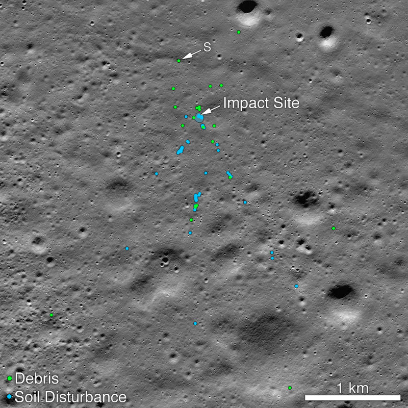
A portion of the moon with blue and green dots indicating spacecraft debris and soil disturbance.

Vikram lander impact point and associated spacecraft debris field. Green dots indicate debris (confirmed or likely). Blue dots locate disturbed soil. “S” indicates the 1st debris found; it was identified by Shanmuga Subramanian, a 33-year-old citizen scientist and IT engineer in Chennai, India. Image via NASA’s Lunar Reconnaissance Orbiter/ Goddard/ Arizona State University.

Here’s a great twist to the heartbreaking story of the loss of India’s Vikram moon lander, which had been scheduled to soft-land on September 6, 2019 (September 7 in the U.S.). Only minutes before touchdown, communications with the lander were lost, and the lander was not heard from again. It remained lost – crashed somewhere on the moon’s surface – until being found again by a Chennai-based engineer, Shanmuga Subramanian, age 33. He not only located the debris from the Vikram moon lander that scientists had been seeking. He also helped guide scientists to the spot where the lander had crashed, enabling NASA’s Lunar Reconnaissance Orbiter to acquire the images on this page.

India had hoped to become the fourth nation to soft land on the moon successfully with its Chandrayaan 2 mission, which carried the lander to the moon. If it had succeeded, it would have followed the former Soviet Union, the U.S. and, as of 2019, China. The Chandrayaan 2 mission’s Vikram lander had been targeted for a highland smooth plain about 400 miles (600 km) from the moon’s south pole. But it wasn’t to be. The news of Vikram’s crash – conveyed by the Indian Space Research Organisation (ISRO) – saddened space enthusiasts around the world, although, as NASA said in a statement:

Despite the loss, getting that close to the surface was an amazing achievement.

After the crash, space scientists around the world began scanning spacecraft images for signs of Vikram’s debris on the moon. The Lunar Reconnaissance Orbiter Camera (LROC) team acquired images to make a mosaic of the approximate location on September 17, and released them on September 26. Many people have downloaded the mosaic to search for signs of Vikram, NASA said.

It was Shanmuga Subramanian – who runs the Facebook page Chennai Rains – who contacted the NASA project with the first positive identification of debris. A December 3, 2019 article by Manasa Rao at TheNewsMinute.com – which reports and writes specifically on issues in India – quoted Subramanian as saying:

I feel very happy that I could find the debris. I kept comparing picture by picture for almost a week and used to do it for seven hours a day.

This is 33-year-old Shanmuga Subramanian. He graduated in engineering from the Government Engineering College in Tirunelveli, India. He’s been working as an IT engineer for 12 years but is also a citizen scientist whose regular updates regarding rains in Chennai – with the help of radar data and satellite imagery – has been helpful to people, according to TheNewsMinute.com. Go to that website to see a cool video interview with Subramanian, in which he describes his feelings about finding India’s Vikram lander.

After receiving Subramanian’s tip, the Lunar Reconnaissance Orbiter Camera (LROC) team confirmed the identification by comparing before and after images. NASA explained:

When the images for the first mosaic were acquired the impact point was poorly illuminated and thus not easily identifiable. Two subsequent image sequences were acquired on October 14 and 15, and November 11. The LROC team scoured the surrounding area in these new mosaics and found the impact site (70.8810°S, 22.7840°E, 834 m elevation) and associated debris field. The November mosaic had the best pixel scale (0.7 meter) and lighting conditions (72° incidence angle).

The debris first located by Shanmuga is about 750 meters northwest of the main crash site and was a single bright pixel identification in that first mosaic (1.3 meter pixels, 84° incidence angle).

The November mosaic best shows the impact crater, ray and extensive debris field. The three largest pieces of debris are each about 2×2 pixels and cast a one pixel shadow.

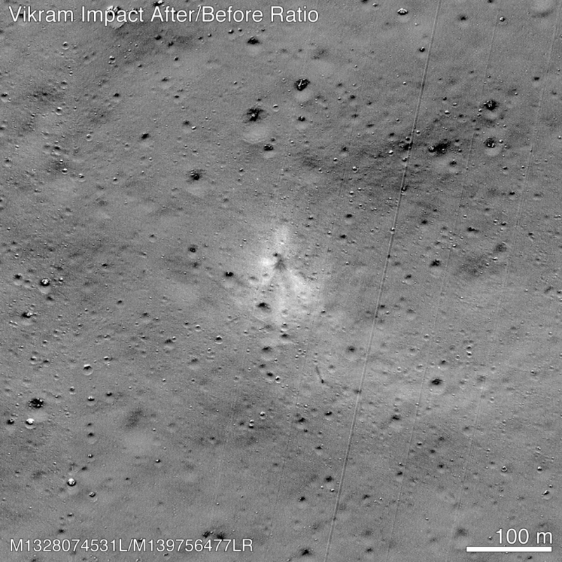
Before and after images of Vikram crash landing site.

This before and after image ratio highlights changes to the surface; the impact point is near center of the image and stands out due the dark rays and bright outer halo. Note the dark streak and debris about 100 meters to the SSE of the impact point. Diagonal straight lines are uncorrected background artifacts. Image via NASA/ Goddard/Arizona State University.

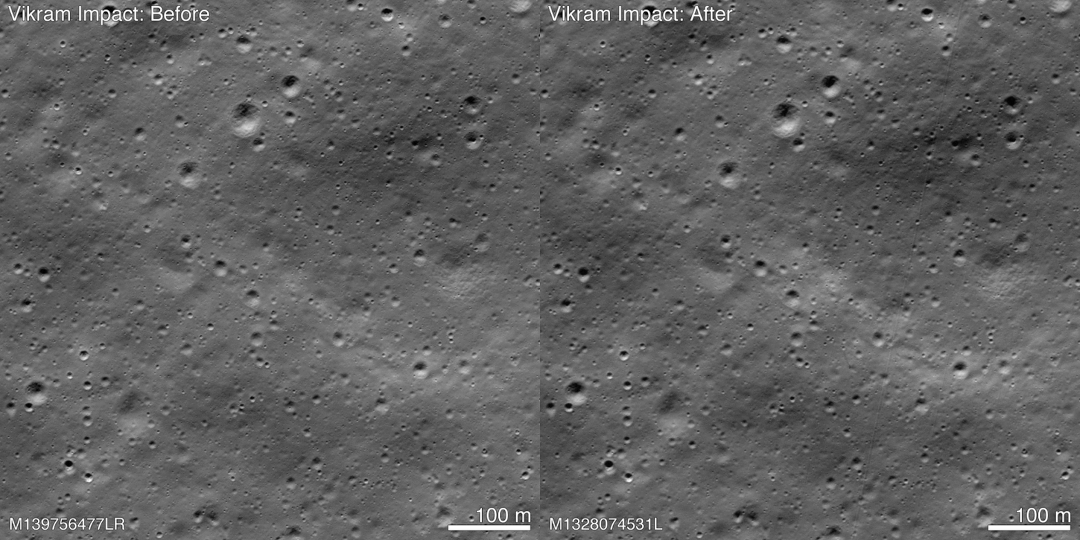
Before and after images of Vikram crash landing site.

Before and after images show the Vikram impact point. NASA thinks the changes to the moon’s surface are more easily seen in the ratio image presented above. Image via NASA/ Goddard/Arizona State University.

Bottom line: A Chennai-based engineer, Shanmuga Subramanian, age 33, helped NASA find the crash-landing site of India’s Vikram moon lander. The lander – part of India’s Chandrayaan 2 mission – was scheduled to land on the moon on September 6, 2019 (September 7 in the U.S.) and crashed moments before touchdown.


from EarthSky https://ift.tt/2RmeTzb

Artificial Intelligence Research and Development

To create a pipeline of breakthroughs for tomorrow’s economy and security, we must deepen our commitment to AI research and engineering.

from https://ift.tt/2ReUKL7
To create a pipeline of breakthroughs for tomorrow’s economy and security, we must deepen our commitment to AI research and engineering.

from https://ift.tt/2ReUKL7