We occasionally receive excellent questions and/or comments by email or via our contact form and have then usually corresponded with the emailer directly. But, some of the questions and answers deserve a broader audience, so we decided to highlight some of them in a new series of blog posts.
In Part 1, we learned about carbon isotopes: how 14C forms in the atmosphere, how different isotopes move through the Carbon Cycle, and how isotopic measurements reveal clues about our changing climate. In this post we will look at how measurements of changing isotopic ratios are described.
Here, again, is the IPCC graph (Figure 1) illustrating the rise in atmospheric CO2 (panel a, black saw-toothed line) and the decreasing 13C:12C ratio in the same CO2 (panel b, red line).
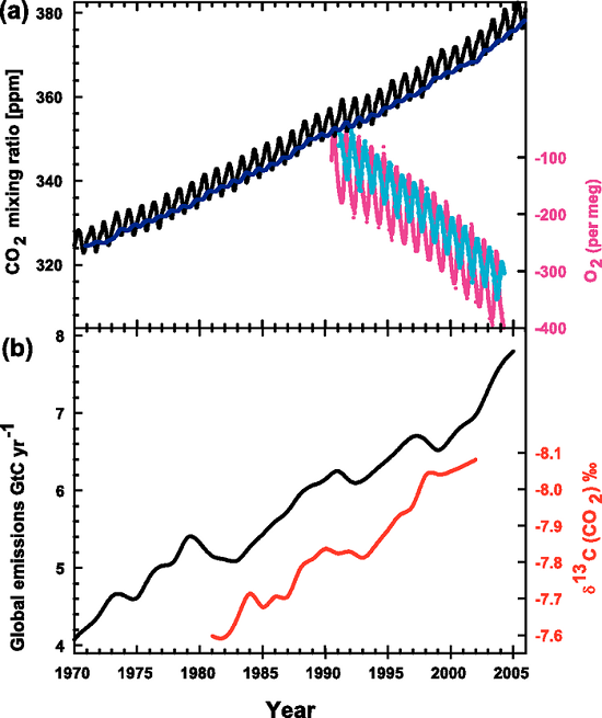
Figure 1. Recent CO2 concentrations and emissions. (a) CO2 concentrations over the period 1970 to 2005 from Mauna Loa, Hawaii (black) and Baring Head, New Zealand (blue). In the lower right of the panel, atmospheric oxygen (O2) measurements from flask samples are shown from Alert, Canada (pink) and Cape Grim, Australia (cyan). (b) Annual global CO2 emissions from fossil fuel burning and cement manufacture in GtC yr–1 (black) through 2005. Annual averages of the 13C/12C ratio measured in atmospheric CO2 at Mauna Loa from 1981 to 2002 (red) are also shown. The isotope data are expressed as δ13C(CO2) ‰ (per mil) deviation from a calibration standard. Note that this scale is inverted to improve clarity. (IPCC, AR4)
One of our readers was puzzled by this graph (which appears in our rebuttal "How do human CO2 emissions compare to natural CO2 emissions?") and emailed us these questions about it:
Can you help me interpret the red line? Does it indicate a decline (negative change) in the C13 isotope (i.e. -7.7 = -7.7 parts per thousands) or are the values showing a ratio of C13/C12 because of the delta symbol? If the red values do represent a ratio can you illustrate with a hypothetical example how a negative value was calculated; for instance how do you get a negative value by comparing C13 with C12 (I would have thought a ratio would produce a fraction of some sort)?
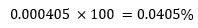
The concentration of atmospheric CO2 is most commonly measured in parts per million (ppm) as seen in the top (a) panel of the graph. The current value is about 405 ppm, which means that for every million molecules in a sample of air there are 405 CO2 molecules. This can be shown as a fraction or a ratio:

or as a decimal: 0.000405
We can also turn this into a percentage:
The carbon isotope ratios are measured in something quite different: the δ-value or notation: δ13C(CO2)‰, or "delta 13C (of CO2) per mil". The "per mil" (symbol: ‰) might lead you to think that this too is a measure of concentration, except, instead of a percentage ("per cent" or "per 100") the carbon isotopes might be a measure of "per mil" or "per 1000". But this is not the case. (Or try this link if that last one doesn’t work.)
Here is the equation used to calculate the δ-value:
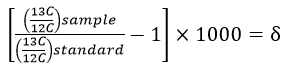
Notice that this equation contains a multiplication by 1000, which is where the "per mil" comes from. The values are multiplied by 1000 because they are very small numbers and this multiplication trick makes the values more "user-friendly". Look again at the IPCC graph which gives the δ-value in 1981 as -7.6‰, the "per mil" symbol tells us that the original value was multiplied by 1000, thus the original value was -0.0076.
But what does -0.0076 mean? Has the 13C decreased by 0.0076...somethings?
Look again at the δ-value equation. You can see that the top part of the fraction within the bracket is the ratio of 13C:12C from some sample containing carbon. The bottom part of the fraction is another 13C:12C ratio from a standard sample which has a known, unchanging ratio of 13C:12C. For carbon isotopes, the standard used is a limestone formation from South Carolina called the Pee Dee Belemnite (or PDB)1, which has an unusually high amount of 13C.
The δ-value is basically a ratio of ratios and can be thought of as a scale to compare different isotope ratios (Figure 2). The standard sample is the zero point of this scale. If there is more 13C in our sample than in the standard, then the δ-value will be positive; if there is less 13C in our sample than in the standard, then the δ-value will be negative. The δ-value doesn't give us a specific number about our sample, as in x ppm of 13C, rather it tells us the relative difference between the sample and the standard.
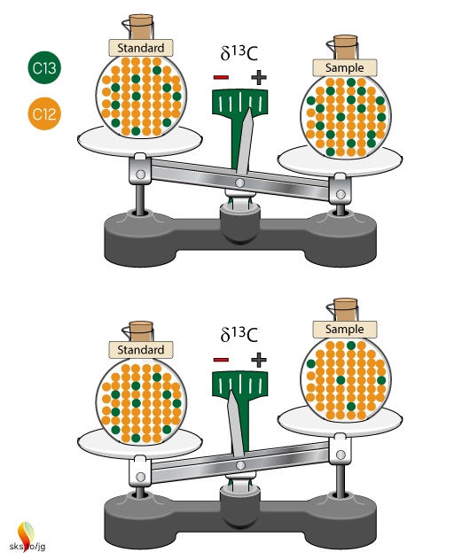
Figure 2. Isotopic ratios of samples are compared to an unchanging isotopic ratio of a standard. The standard defines the zero point of the scale. Samples with more 13C than the standard will have positive δ13C values, while samples with less 13C than the standard will have negative δ13C values.
Why not just give us the specific numbers of carbon isotopes? (Show me the data!) Isotope ratios are measured by mass spectrometers but it is impossible for these devices to perfectly measure the 13C to 12C ratio in a sample. Lauren Shoemaker, in her in-depth NOAA website on isotopes, explains:
Isotope ratio mass spectrometers measure relative isotopic ratios much better than actual ratios. By comparing to a standard, the precision of the data values are much, much better since all values are relative to a given standard.
She also points out that δ-values make it "easier to compare results both among isotope laboratories and within a single laboratory over a long time period".
Delta-values also make the numbers associated with isotopic ratios much more "user-friendly". To see this let's work through some examples using the δ-value formula. The IPCC graph shows that in 1981 the δ-value for atmospheric CO2 was -7.6‰. The PDB standard ratio is 0.011237. With these two numbers we have enough information to calculate what the 13C:12C ratio was in 1981:
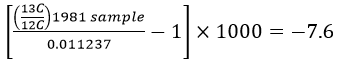
This works out to a ratio of 0.0111516 for the 1981 sample. For 2002 the δ-value was -8.1‰, which gives a ratio of 0.0111459.
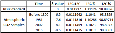
Let’s broaden our view out a bit further than that twenty year time span. This graph in Figure 3 (from CSIRO, the Australian agency for scientific research) shows that before the Industrial Revolution the δ-value was -6.5‰. In today's atmosphere, the 13C:12C ratios give a δ-value of -8.5‰.
Figure 3. There has been an increase in the atmospheric concentration of CO2 (in red), as identified by the trend in the ratio of different types (isotopes) of carbon in atmospheric CO2 (in black, from the year 1000). CO2 and the carbon-13 isotope ratio in CO2 (δ13C) are measured from air in Antarctic ice and firn (compacted snow) samples from the Australian Antarctic Science Program, and at Cape Grim (northwest Tasmania). (Copyright CSIRO Australia).
The table below shows the δ-values for various times along with the corresponding isotopic ratios, expressed both as decimals and as percentages of 13C and 12C in the atmospheric samples. You can see why scientists use δ-values rather than the actual 13C:12C ratio numbers, which only show changes far to the right of the decimal points! These ratios change by very small amounts over time, but they clearly illustrate big changes in the atmosphere's composition of 13C and 12C, pointing to the fossil fuel origins of more and more of the atmosphere's CO2.
Here is one final comparison to help make the δ-values more understandable. Annual global average temperatures are usually presented as anomalies with reference to some "base period". Figure 4 is a familiar graph of this from NASA-GISS with data from 1880 to 2016. The "base period" for this graph is 1951-19802, the annual temperatures for these thirty years are averaged together and this is set as the zero point of the anomaly scale. So, the base period is like the standard sample used as the zero point in the δ-notation scale. Then, each individual year's data point is compared to that zero point. If a year's temperature was warmer than the base period, then the anomaly for that year is positive, such as 2016's record high anomaly of 0.99°C. This is comparable to positive δ-values. Years with colder values than the base period would be negative, like 1904's record low value of -0.5°C. This is similar to the negative δ-values described above.
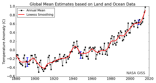
Figure 4. Land-ocean temperature index, 1880 to present, with base period 1951-1980. The solid black line is the global annual mean and the solid red line is the five-year lowess smooth. The blue uncertainty bars (95% confidence limit) account only for incomplete spatial sampling. (NASA-GISS).
In both instances, δ-values and temperature anomalies, cumbersome numbers are converted into more meaningful and useful values. In the case of δ-values, very very small changes in isotopic ratios in the natural environment are more easily described, and we can see more clearly how the Earth's climate system works and changes over time.
1. "The original PDB sample was a sample of fossilized shells of an extinct organism called a belemnite (something like a shelled squid) collected decades ago from the banks of the Pee Dee River in South Carolina. The original sample was used up long ago, but other reference standards were calibrated to that original sample. We still report carbon isotope values relative to PDB but now use the term "VPDB" ["Vienna Pee Dee Belemnite"] to indicate that the data are normalized to the values of that standard." (USGS).
2. Any time period, and any length of time, may be used. A thirty year period is often used because thirty years is a long enough time to describe "average" climate variables.
from Skeptical Science http://ift.tt/2DrLXv7
We occasionally receive excellent questions and/or comments by email or via our contact form and have then usually corresponded with the emailer directly. But, some of the questions and answers deserve a broader audience, so we decided to highlight some of them in a new series of blog posts.
In Part 1, we learned about carbon isotopes: how 14C forms in the atmosphere, how different isotopes move through the Carbon Cycle, and how isotopic measurements reveal clues about our changing climate. In this post we will look at how measurements of changing isotopic ratios are described.
Here, again, is the IPCC graph (Figure 1) illustrating the rise in atmospheric CO2 (panel a, black saw-toothed line) and the decreasing 13C:12C ratio in the same CO2 (panel b, red line).
Figure 1. Recent CO2 concentrations and emissions. (a) CO2 concentrations over the period 1970 to 2005 from Mauna Loa, Hawaii (black) and Baring Head, New Zealand (blue). In the lower right of the panel, atmospheric oxygen (O2) measurements from flask samples are shown from Alert, Canada (pink) and Cape Grim, Australia (cyan). (b) Annual global CO2 emissions from fossil fuel burning and cement manufacture in GtC yr–1 (black) through 2005. Annual averages of the 13C/12C ratio measured in atmospheric CO2 at Mauna Loa from 1981 to 2002 (red) are also shown. The isotope data are expressed as δ13C(CO2) ‰ (per mil) deviation from a calibration standard. Note that this scale is inverted to improve clarity. (IPCC, AR4)
One of our readers was puzzled by this graph (which appears in our rebuttal "How do human CO2 emissions compare to natural CO2 emissions?") and emailed us these questions about it:
Can you help me interpret the red line? Does it indicate a decline (negative change) in the C13 isotope (i.e. -7.7 = -7.7 parts per thousands) or are the values showing a ratio of C13/C12 because of the delta symbol? If the red values do represent a ratio can you illustrate with a hypothetical example how a negative value was calculated; for instance how do you get a negative value by comparing C13 with C12 (I would have thought a ratio would produce a fraction of some sort)?
The concentration of atmospheric CO2 is most commonly measured in parts per million (ppm) as seen in the top (a) panel of the graph. The current value is about 405 ppm, which means that for every million molecules in a sample of air there are 405 CO2 molecules. This can be shown as a fraction or a ratio:
or as a decimal: 0.000405
We can also turn this into a percentage:
The carbon isotope ratios are measured in something quite different: the δ-value or notation: δ13C(CO2)‰, or "delta 13C (of CO2) per mil". The "per mil" (symbol: ‰) might lead you to think that this too is a measure of concentration, except, instead of a percentage ("per cent" or "per 100") the carbon isotopes might be a measure of "per mil" or "per 1000". But this is not the case. (Or try this link if that last one doesn’t work.)
Here is the equation used to calculate the δ-value:
Notice that this equation contains a multiplication by 1000, which is where the "per mil" comes from. The values are multiplied by 1000 because they are very small numbers and this multiplication trick makes the values more "user-friendly". Look again at the IPCC graph which gives the δ-value in 1981 as -7.6‰, the "per mil" symbol tells us that the original value was multiplied by 1000, thus the original value was -0.0076.
But what does -0.0076 mean? Has the 13C decreased by 0.0076...somethings?
Look again at the δ-value equation. You can see that the top part of the fraction within the bracket is the ratio of 13C:12C from some sample containing carbon. The bottom part of the fraction is another 13C:12C ratio from a standard sample which has a known, unchanging ratio of 13C:12C. For carbon isotopes, the standard used is a limestone formation from South Carolina called the Pee Dee Belemnite (or PDB)1, which has an unusually high amount of 13C.
The δ-value is basically a ratio of ratios and can be thought of as a scale to compare different isotope ratios (Figure 2). The standard sample is the zero point of this scale. If there is more 13C in our sample than in the standard, then the δ-value will be positive; if there is less 13C in our sample than in the standard, then the δ-value will be negative. The δ-value doesn't give us a specific number about our sample, as in x ppm of 13C, rather it tells us the relative difference between the sample and the standard.
Figure 2. Isotopic ratios of samples are compared to an unchanging isotopic ratio of a standard. The standard defines the zero point of the scale. Samples with more 13C than the standard will have positive δ13C values, while samples with less 13C than the standard will have negative δ13C values.
Why not just give us the specific numbers of carbon isotopes? (Show me the data!) Isotope ratios are measured by mass spectrometers but it is impossible for these devices to perfectly measure the 13C to 12C ratio in a sample. Lauren Shoemaker, in her in-depth NOAA website on isotopes, explains:
Isotope ratio mass spectrometers measure relative isotopic ratios much better than actual ratios. By comparing to a standard, the precision of the data values are much, much better since all values are relative to a given standard.
She also points out that δ-values make it "easier to compare results both among isotope laboratories and within a single laboratory over a long time period".
Delta-values also make the numbers associated with isotopic ratios much more "user-friendly". To see this let's work through some examples using the δ-value formula. The IPCC graph shows that in 1981 the δ-value for atmospheric CO2 was -7.6‰. The PDB standard ratio is 0.011237. With these two numbers we have enough information to calculate what the 13C:12C ratio was in 1981:
This works out to a ratio of 0.0111516 for the 1981 sample. For 2002 the δ-value was -8.1‰, which gives a ratio of 0.0111459.
Let’s broaden our view out a bit further than that twenty year time span. This graph in Figure 3 (from CSIRO, the Australian agency for scientific research) shows that before the Industrial Revolution the δ-value was -6.5‰. In today's atmosphere, the 13C:12C ratios give a δ-value of -8.5‰.
Figure 3. There has been an increase in the atmospheric concentration of CO2 (in red), as identified by the trend in the ratio of different types (isotopes) of carbon in atmospheric CO2 (in black, from the year 1000). CO2 and the carbon-13 isotope ratio in CO2 (δ13C) are measured from air in Antarctic ice and firn (compacted snow) samples from the Australian Antarctic Science Program, and at Cape Grim (northwest Tasmania). (Copyright CSIRO Australia).
The table below shows the δ-values for various times along with the corresponding isotopic ratios, expressed both as decimals and as percentages of 13C and 12C in the atmospheric samples. You can see why scientists use δ-values rather than the actual 13C:12C ratio numbers, which only show changes far to the right of the decimal points! These ratios change by very small amounts over time, but they clearly illustrate big changes in the atmosphere's composition of 13C and 12C, pointing to the fossil fuel origins of more and more of the atmosphere's CO2.
Here is one final comparison to help make the δ-values more understandable. Annual global average temperatures are usually presented as anomalies with reference to some "base period". Figure 4 is a familiar graph of this from NASA-GISS with data from 1880 to 2016. The "base period" for this graph is 1951-19802, the annual temperatures for these thirty years are averaged together and this is set as the zero point of the anomaly scale. So, the base period is like the standard sample used as the zero point in the δ-notation scale. Then, each individual year's data point is compared to that zero point. If a year's temperature was warmer than the base period, then the anomaly for that year is positive, such as 2016's record high anomaly of 0.99°C. This is comparable to positive δ-values. Years with colder values than the base period would be negative, like 1904's record low value of -0.5°C. This is similar to the negative δ-values described above.
Figure 4. Land-ocean temperature index, 1880 to present, with base period 1951-1980. The solid black line is the global annual mean and the solid red line is the five-year lowess smooth. The blue uncertainty bars (95% confidence limit) account only for incomplete spatial sampling. (NASA-GISS).
In both instances, δ-values and temperature anomalies, cumbersome numbers are converted into more meaningful and useful values. In the case of δ-values, very very small changes in isotopic ratios in the natural environment are more easily described, and we can see more clearly how the Earth's climate system works and changes over time.
1. "The original PDB sample was a sample of fossilized shells of an extinct organism called a belemnite (something like a shelled squid) collected decades ago from the banks of the Pee Dee River in South Carolina. The original sample was used up long ago, but other reference standards were calibrated to that original sample. We still report carbon isotope values relative to PDB but now use the term "VPDB" ["Vienna Pee Dee Belemnite"] to indicate that the data are normalized to the values of that standard." (USGS).
2. Any time period, and any length of time, may be used. A thirty year period is often used because thirty years is a long enough time to describe "average" climate variables.
from Skeptical Science http://ift.tt/2DrLXv7