aads

‘There are scientists from all over the world at my institute, working to accelerate progress in cancer research’  

Photo of Ines Figuiredo.

Ines Figueiredo, originally from Portugal, works as a research scientist at The Institute of Cancer Research (ICR) in London, where she focuses on prostate cancer. Typical of cancer research projects in the UK, Ines is part of a multinational team and works with scientists based across the globe. 

With the Government redesigning the immigration system, a change that will apply to all scientists coming to the UK for research purposes, we spoke to Ines about her experiences of moving to and working in the UK.

“Working at the ICR is amazing. I get to work with incredible people and every day you learn new things.”

A big draw for Ines was getting to work in a diverse research team, bringing together a unique mix of skills and expertise from across the world. “My team is so international – there are scientists from all over the world at the ICR working to accelerate progress in cancer research.”

Ines works as a higher scientific officer, collecting and analysing tissue samples from patients and splits her time between assisting clinical trials and working in the lab.

Research teams with a mix of UK and international researchers, like Ines’, have been key to driving progress in cancer survival. In the 1970s, 1 in 4 survived their cancer for 5 years or more compared to 1 in 2 today, a shift that’s been underpinned by increasingly international teams – drawing talent from around the world.

And this holds true today: 50% of PhD students and 76% of post-doctoral researchers we fund at Cancer Research UK are not originally from the UK.

UK research is international

Ines’ route to working in the UK was an interesting one: “I applied to the EU Da Vinci programme in 2011, which paid for EU citizens to take up research positions in another EU country. I was successful and got my first choice of England.”

Ines was subsequently offered a permanent position at the ICR and has worked there ever since, gaining promotion along the way. “For me, it’s all about helping patients. If my research and work can give patients extra time to look forward to after they’ve received a diagnosis, that, for me, is a great thing.”

To drive progress, her team works with research groups from around the world. “We have a lot of collaborative projects with teams from across the world – in Europe, in the US and in Australia.” This lets scientists in different countries share tissue samples, which Ines says can help to “bring together different pieces of a puzzle from across the world.”

And the collaboration isn’t limited to sharing samples. “Colleagues sometimes go to labs abroad for 2 or 3 months to learn a specific technique or skill before coming back. And people come to our labs and train before returning to their lab, too.”

For Ines this is vitally important, as it allows UK scientists to travel abroad and learn techniques where there might not be expertise in the UK to do so.

‘It could definitely be more difficult’

Ines at the 2012 Olympics in London. Ines has loved her time at the ICR so far, but she’s concerned for when the UK withdraws from the EU. “It could definitely be more difficult, depending on what the relationship will be like with the EU,” she says.

Under current proposals, it’s not clear if scientists like Ines would have been allowed into the UK, as she had a relatively low wage when joining the ICR. And even for those scientists who do earn enough to meet proposed immigration controls, they would have to pay relatively high visa fees compared to other leading science nations.

While Government have said they want to introduce a new visa for scientific talent, which we’ve blogged about before, it’s not clear if this will include all levels of researchers.

Ines is also concerned about funding. Her team receives a variety of grants and research funding, with a core part of this coming from the EU. She’s worried that UK-based scientists may lose access to this type of funding, which could not only hurt research projects like hers but also have a knock-on effect on enticing scientists to live and work in the UK.  “If we don’t qualify to get these grants then it’s already bad, but this could also mean we can’t attract the people who have the experience and expertise and are willing to work.”

She also has questions about how the UK will be able to participate in clinical trials involving the EU, which could have a big impact on her team.

And more personally, Ines also worries that visiting her family in Europe will become more difficult. “I love my life and my friends here, but if it wasn’t easy to travel back to Portugal to see my family, I wouldn’t be here.”

Ines is one of over 4,000 scientists, nurses and doctors supported by Cancer Research UK to help us beat cancer. To continue making significant progress towards that goal, Government must design a new, modern immigration system that encourages skilled international scientists to come to the UK and build an environment where scientific endeavour can thrive.

Ben Moore is a policy advisor at Cancer Research UK 


from Cancer Research UK – Science blog https://ift.tt/2ZNKfiz
Photo of Ines Figuiredo.

Ines Figueiredo, originally from Portugal, works as a research scientist at The Institute of Cancer Research (ICR) in London, where she focuses on prostate cancer. Typical of cancer research projects in the UK, Ines is part of a multinational team and works with scientists based across the globe. 

With the Government redesigning the immigration system, a change that will apply to all scientists coming to the UK for research purposes, we spoke to Ines about her experiences of moving to and working in the UK.

“Working at the ICR is amazing. I get to work with incredible people and every day you learn new things.”

A big draw for Ines was getting to work in a diverse research team, bringing together a unique mix of skills and expertise from across the world. “My team is so international – there are scientists from all over the world at the ICR working to accelerate progress in cancer research.”

Ines works as a higher scientific officer, collecting and analysing tissue samples from patients and splits her time between assisting clinical trials and working in the lab.

Research teams with a mix of UK and international researchers, like Ines’, have been key to driving progress in cancer survival. In the 1970s, 1 in 4 survived their cancer for 5 years or more compared to 1 in 2 today, a shift that’s been underpinned by increasingly international teams – drawing talent from around the world.

And this holds true today: 50% of PhD students and 76% of post-doctoral researchers we fund at Cancer Research UK are not originally from the UK.

UK research is international

Ines’ route to working in the UK was an interesting one: “I applied to the EU Da Vinci programme in 2011, which paid for EU citizens to take up research positions in another EU country. I was successful and got my first choice of England.”

Ines was subsequently offered a permanent position at the ICR and has worked there ever since, gaining promotion along the way. “For me, it’s all about helping patients. If my research and work can give patients extra time to look forward to after they’ve received a diagnosis, that, for me, is a great thing.”

To drive progress, her team works with research groups from around the world. “We have a lot of collaborative projects with teams from across the world – in Europe, in the US and in Australia.” This lets scientists in different countries share tissue samples, which Ines says can help to “bring together different pieces of a puzzle from across the world.”

And the collaboration isn’t limited to sharing samples. “Colleagues sometimes go to labs abroad for 2 or 3 months to learn a specific technique or skill before coming back. And people come to our labs and train before returning to their lab, too.”

For Ines this is vitally important, as it allows UK scientists to travel abroad and learn techniques where there might not be expertise in the UK to do so.

‘It could definitely be more difficult’

Ines at the 2012 Olympics in London. Ines has loved her time at the ICR so far, but she’s concerned for when the UK withdraws from the EU. “It could definitely be more difficult, depending on what the relationship will be like with the EU,” she says.

Under current proposals, it’s not clear if scientists like Ines would have been allowed into the UK, as she had a relatively low wage when joining the ICR. And even for those scientists who do earn enough to meet proposed immigration controls, they would have to pay relatively high visa fees compared to other leading science nations.

While Government have said they want to introduce a new visa for scientific talent, which we’ve blogged about before, it’s not clear if this will include all levels of researchers.

Ines is also concerned about funding. Her team receives a variety of grants and research funding, with a core part of this coming from the EU. She’s worried that UK-based scientists may lose access to this type of funding, which could not only hurt research projects like hers but also have a knock-on effect on enticing scientists to live and work in the UK.  “If we don’t qualify to get these grants then it’s already bad, but this could also mean we can’t attract the people who have the experience and expertise and are willing to work.”

She also has questions about how the UK will be able to participate in clinical trials involving the EU, which could have a big impact on her team.

And more personally, Ines also worries that visiting her family in Europe will become more difficult. “I love my life and my friends here, but if it wasn’t easy to travel back to Portugal to see my family, I wouldn’t be here.”

Ines is one of over 4,000 scientists, nurses and doctors supported by Cancer Research UK to help us beat cancer. To continue making significant progress towards that goal, Government must design a new, modern immigration system that encourages skilled international scientists to come to the UK and build an environment where scientific endeavour can thrive.

Ben Moore is a policy advisor at Cancer Research UK 


from Cancer Research UK – Science blog https://ift.tt/2ZNKfiz

ALMA images show what’s happening beneath Jupiter’s storms


Artists’ animation showing Jupiter in radio waves with ALMA and in visible light with the Hubble Space Telescope (HST). Via ALMA (ESO/NAOJ/NRAO), I. de Pater et al.; NRAO/AUI NSF, S. Dagnello; NASA/Hubble

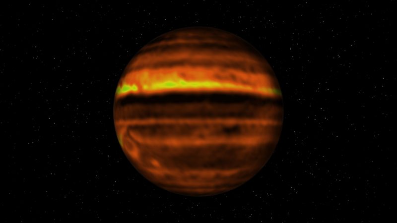
The National Radio Astronomy Observatory published these new radio images of Jupiter on August 20, 2019. They’re made with the Atacama Large Millimeter/submillimeter Array (ALMA) in northern Chile. They show Jupiter’s atmosphere down to 30 miles (50 km) below the planet’s topmost, visible cloud deck, which is made up of ammonia ice. NRAO wrote:

Swirling clouds, big colorful belts, giant storms – the beautiful and turbulent atmosphere of Jupiter has been showcased many times. But what is going on below the clouds? What is causing the many storms and eruptions that we see on the ‘surface’ of the planet? To see this, visible light is not enough. We need to study Jupiter using radio waves.

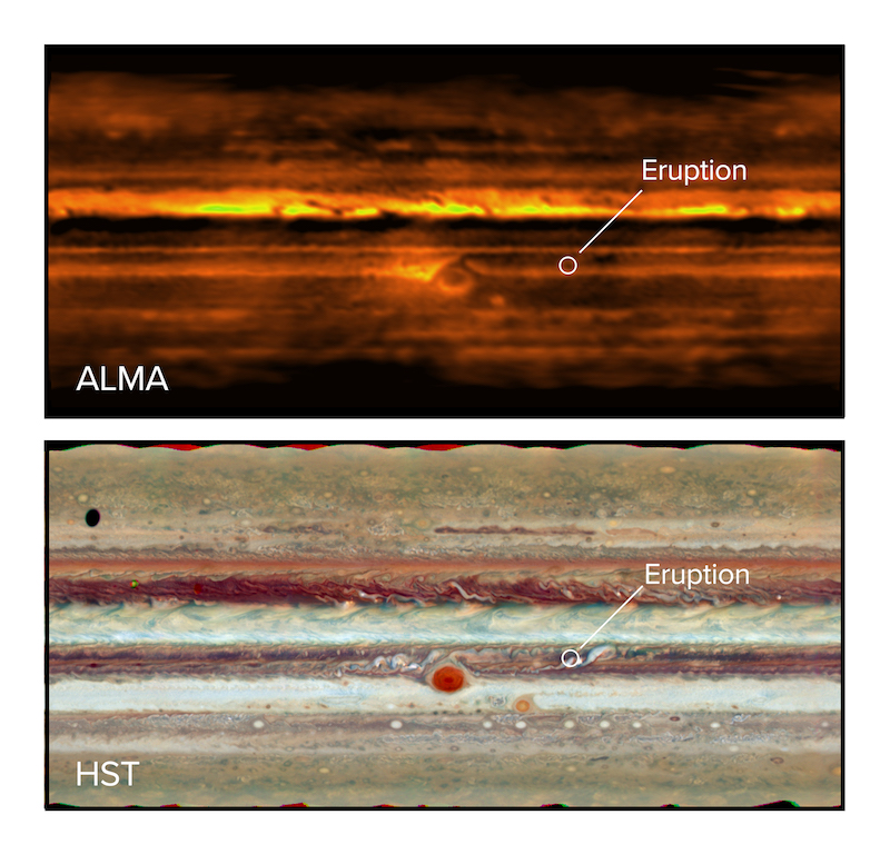
Imke de Pater of the University of California, Berkeley is lead author of the new radio study of Jupiter’s storms. Her team acquired the images with the ALMA telescope a few days after amateur astronomers spotted an eruption in Jupiter’s South Equatorial Belt in January 2017. According to NRAO:

A small bright white plume was visible first and then a large-scale disruption in the belt was observed that lasted for weeks after the eruption.

Such eruptions on Jupiter can be compared to thunderstorms on Earth and are often associated with lightning events, NRAO said.

Imke de Pater explained:

ALMA enabled us to make a three-dimensional map of the distribution of ammonia gas below the clouds. And for the first time, we were able to study the atmosphere below the ammonia cloud layers after an energetic eruption on Jupiter.

Orange ball with dark and yellow stripes.

View larger. | Spherical ALMA map of Jupiter showing the distribution of ammonia gas below Jupiter’s cloud deck. Image via ALMA (ESO/NAOJ/NRAO), I. de Pater et al.; NRAO/AUI NSF, S. Dagnello.

De Pater and her colleagues used ALMA to study the atmosphere below the plume and the disrupted belt at radio wavelengths and compared these to UV-visible light and infrared images made with other telescopes at approximately the same time. She said:

Our ALMA observations are the first to show that high concentrations of ammonia gas are brought up during an energetic eruption. The combination of observations simultaneously at many different wavelengths enabled us to examine the eruption in detail. This led us to confirm the current theory that energetic plumes are triggered by moist convection at the base of water clouds, which are located deep in the atmosphere.

The plumes bring up ammonia gas from deep in the atmosphere to high altitudes, well above the main ammonia cloud deck.

Upper picture dark orange and yellow; lower picture natural color, spot labeled Eruption.

Flat map of Jupiter in radio waves with ALMA (top) and visible light with the Hubble Space Telescope (bottom). The eruption in the South Equatorial Belt is visible in both images. Image via ALMA (ESO/NAOJ/NRAO), I. de Pater et al.; NRAO/AUI NSF, S. Dagnello; NASA/Hubble.

Bottom line: After amateur astronomers spotted an eruption in Jupiter’s South Equatorial Belt in January 2017, astronomers used the ALMA telescope to acquire radio images of the planet, showing high concentrations of ammonia gas brought up during the eruption.

Source: First ALMA Millimeter Wavelength Maps of Jupiter, with a Multi-Wavelength Study of Convection

Via NRAO


from EarthSky https://ift.tt/32xVZay

1st quarter moon is September 5-6

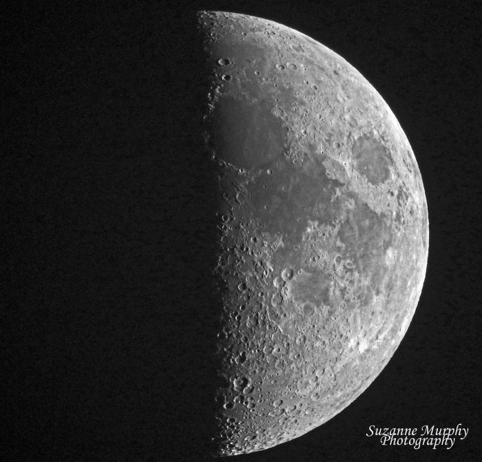
Half of the moon visible against black background.

Nearly first quarter moon from Suzanne Murphy in Wisconsin.

A first quarter moon rises around noon and sets around midnight. You’ll likely spot it in late afternoon or early evening, high up in the sky. At this moon phase, the moon is showing us precisely half of its lighted half. Or you might say that – at first quarter moon – we’re seeing half the moon’s day side.

We call this moon a quarter and not a half because it is one quarter of the way around in its orbit of Earth, as measured from one new moon to the next. Also, although a first quarter moon appears half-lit to us, the illuminated portion we see of a first quarter moon truly is just a quarter. We’re now seeing half the moon’s day side, that is. Another lighted quarter of the moon shines just as brightly in the direction opposite Earth!

And what about the term half moon? That’s a beloved term, but not an official one.

Read more: 4 keys to understanding moon phases

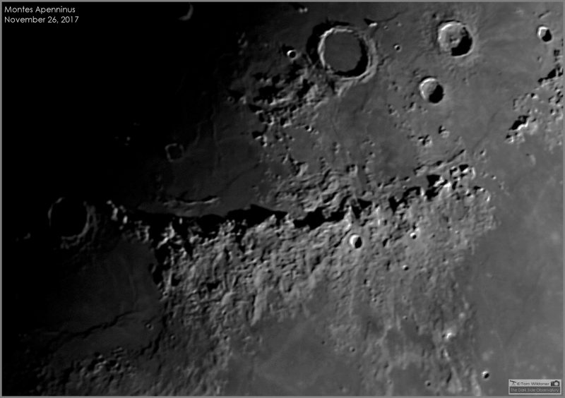
Telescopic closeup of band of mountains on moon with a few large craters.

Tom Wildoner wrote: “One of my favorite areas to photograph on the moon near the 1st quarter! I captured this view of the sun lighting up the mountain range called Montes Apenninus. The moon was casting a nice shadow on the back side of the mountains. This mountain range is about 370 miles (600 km) long with some of the peaks rising as high as 3.1 miles (5 km).”

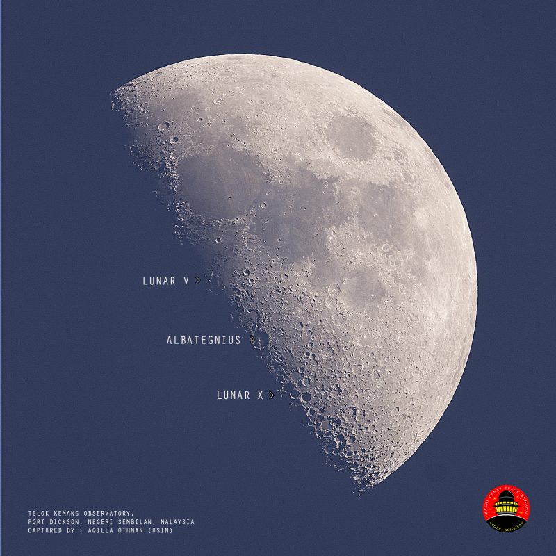
Half of the moon with Lunar V, Albategnius, and Lunar X labeled along straight edge.

Here’s something else to look for on a 1st quarter moon. Aqilla Othman in Port Dickson, Negeri Sembilan, Malaysia, caught this photo. Notice that he caught Lunar X and Lunar V. These are similar features on the moon that fleetingly take an X or V shape when the moon appears in a 1st quarter phase from Earth.

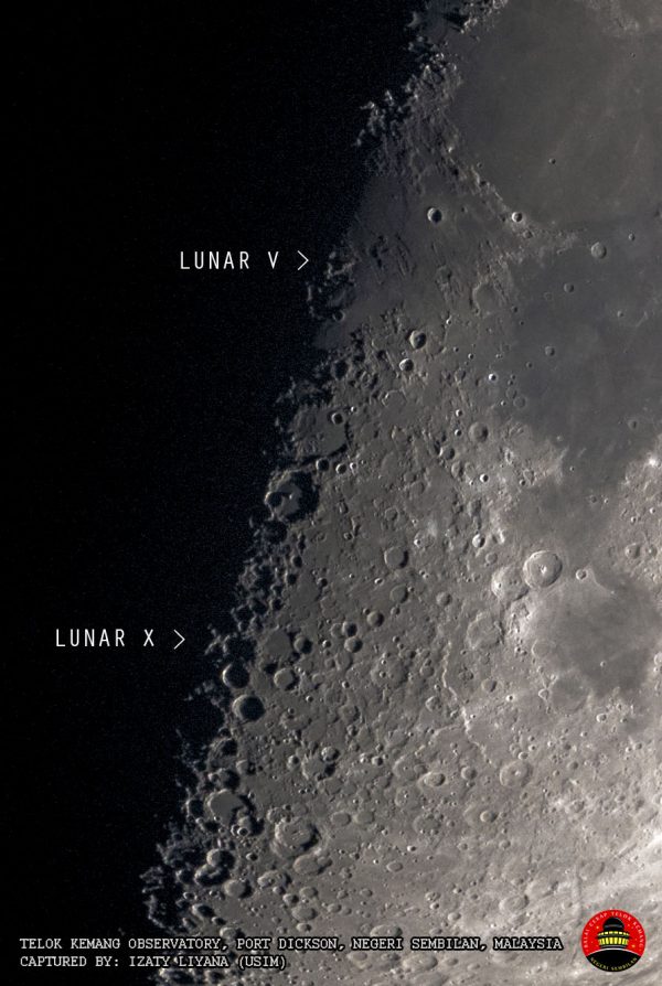
Closeup of boundary between light and dark areas of the moon with Lunar V and X labeled.

Here’s a closer look at Lunar X and Lunar V. Photo by Izaty Liyana in Port Dickson, Negeri Sembilan, Malaysia. What is Lunar X?

Bottom line: The moon reaches its first quarter phase on Thursday, September 6, 2019, at 03:10 UTC. As viewed from the whole Earth, it’s high up at sunset on September 5 and 6, looking like half a pie.

Check out EarthSky’s guide to the bright planets.

Help EarthSky keep going! Please donate.


from EarthSky https://ift.tt/2OIzLvs

Hurricane Dorian: Why it’s so destructive

Aerial footage shows total devastation in Abaco, Bahamas after Hurricane Dorian.

Get the most current updates on Dorian from NOAA here.

By Dale Dominey-Howes, University of Sydney

At least seven people have died in the wake of Hurricane Dorian in the Bahamas, although that figure is expected to rise as rescue work continues.

Dorian began life as a small tropical depression southeast of the Lesser Antilles on August 24, 2019, and grew to be a Category 5 hurricane as it devastated the Bahamas.

At the time of writing, Dorian has been downgraded to a Category 2 storm and is currently tracking northward parallel to the US coast.

Path of Hurricane Dorian from its birth southeast of the Lesser Antilles to Tuesday September 3, 2019. Image via NOAA

Where Dorian decides to travel next is still hard to forecast. It does not look like Dorian will make landfall in the United States, but the US National Hurricane Center currently expects it to turn northwards by Wednesday evening, followed by a turn towards the north-northeast on Thursday morning local time.

On this track, the core of Hurricane Dorian will move dangerously close to the Florida east coast and the Georgia coast. The center of Dorian is forecast to move near or over the coast of South Carolina and North Carolina on Thursday through Friday morning.

Dorian is the second most powerful Atlantic hurricane on record, packing sustained winds of more than 170 miles (270 km) per hour, with peak gusts approaching 350km/h. At its peak the storm system was more than 400 miles (700 km) in diameter, causing massive rainfall and a huge storm surge peaking at more than 23 feet (7 meters) above sea level – both contributing to substantial flooding.

As a Category 2 storm, it still has 110 miles (177 km) per hour winds and tremendous destructive capacity.

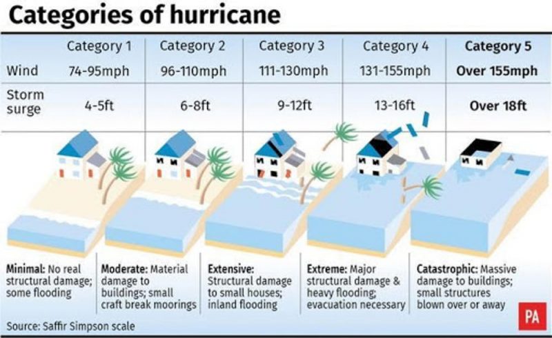
The Saffir-Simpson Scale for measuring the size and effects of hurricanes in the Atlantic. Image via PA Graphics.

Path of devastation

As Dorian passed over the Bahamas absolutely the worst scenario occurred: it more or less stopped dead in its tracks.

Slow-moving hurricanes do immense amounts of damage. Rather than moving on quickly, high winds, heavy rainfall and large storm surges all combine to hammer the landscape and of course, people, buildings and crucial infrastructure. Dorian sat over the Bahamas for more than 20 hours, maximizing the amount of damage.

The official death toll is currently seven, but Prime Minister Hubert Minnis and national and international emergency management agencies expect that number to rise sharply as response and recovery teams start to gain access to heavily damaged areas.

Aerial footage is emerging of extensive damage across wide areas, with total devastation of built structures and massive impact on the natural environment.

A massive rescue effort in the Bahamas has begun in the wake of Hurricane Dorian. Image via EPA/Petty Officer 3rd Class Hunter Medley/US Coast Guard.

Is Dorian linked to climate change?

Many people are understandably asking if there is a direct connection between human-induced climate change and Hurricane Dorian. The short answer is it’s hard to say.

Here’s what we know. By adding greenhouse warming gases to the atmosphere, more heat is trapped in the atmosphere and oceans. Increasing heat equals increasing energy in the atmosphere-ocean system, and increased heat fuels extreme events such as hurricanes, heatwaves, storms, and floods. A new science called “attribution” investigates the statistical probability that a particular event such as Hurricane Dorian is more likely in a human-warmed climate. Work is now under way to gather the data necessary to determine mathematically whether Dorian was likely connected to a warming world.

Regardless, previous work shows Atlantic hurricanes have been getting larger and more intense, and significantly more destructive.

Dale Dominey-Howes, Professor of Hazards and Disaster Risk Sciences, University of Sydney

This article is republished from The Conversation under a Creative Commons license. Read the original article.

The Conversation

Bottom line: Information on Hurricane Dorian.


from EarthSky https://ift.tt/2ZHu6iC

All you need to know: Zodiacal light

Starry sky with wide, fuzzy triangle of light sticking up from the horizon.

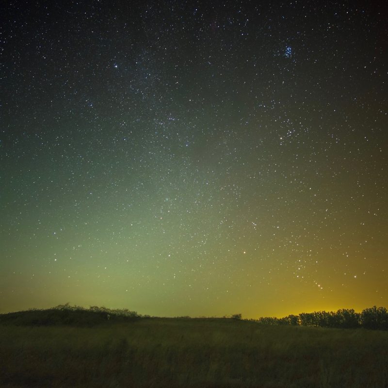
View larger. | Lubomir Lenko Photography wrote from Brehov, Slovakia, on August 18, 2018: “The rise of Orion is back with the fine shine of zodiacal light.” Orion is in the lower right. See its Belt, the 3 stars in a short, straight row? The zodiacal light nearly fills the frame in this photo. Can you see that the light is pyramid-shaped?

We passed a new moon in late August, and the moon is still out of the early morning sky. That means now is a good time – from Earth’s Northern Hemisphere – to try looking for the zodiacal light, or false dawn, an eerie light in the east before sunrise, visible in clear dark skies in the months around the autumn equinox. If you’re in the Southern Hemisphere, look in the west after sunset instead, for the same phenomenon, now called the false dusk.

The light looks like a hazy pyramid. It appears in the sky just before true dawn lights the sky. It’s comparable in brightness to the Milky Way, but even milkier in appearance.

Maybe you’ve seen the zodiacal light in the sky already and not realized it. Maybe you glimpsed it while driving on a highway or country road. This strange light is a seasonal phenomenon. Springtime and autumn are best for seeing it, no matter where you live on Earth.

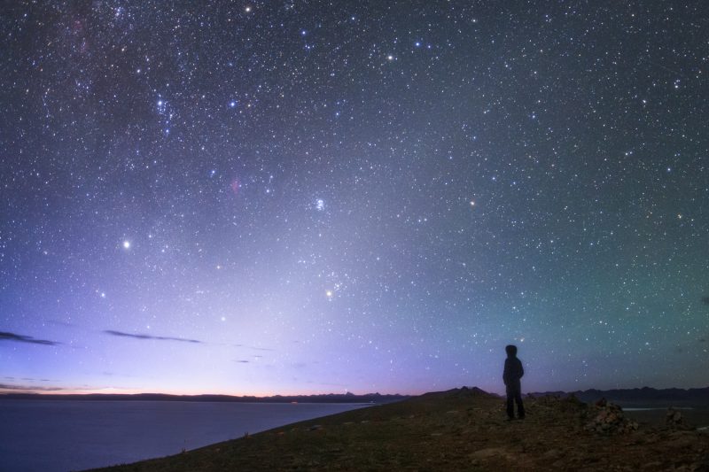
Person standing watching hazy triangular area of light from horizon to near zenith.

Zodiacal light before dawn via Jeff Dai.

How can I see the zodiacal light? Suppose you’re driving toward the east – in the hour before dawn – in autumn. You catch sight of what you think is the light of a nearby town, just over the horizon. But it might not be a town. It might be the zodiacal light. The light extends up from the eastern horizon, shortly before morning twilight begins. The zodiacal light can be extremely bright and easy to see from latitudes like those in the southern U.S.

We also sometimes hear from skywatchers in the northern U.S. or Canada who’ve captured images of the zodiacal light.

You’ll need a dark sky location to see the zodiacal light, someplace where city lights aren’t obscuring the natural lights in the sky.

The zodiacal light is most visible before dawn in autumn because autumn is when the ecliptic – or path of the sun and moon – stands nearly straight up with respect to your eastern horizon before dawn. Likewise, the zodiacal light is easiest to see just after true night falls in your springtime months, because then the ecliptic is most perpendicular to your western horizon in the evening. That’s true no matter where you are on Earth.

In autumn, the zodiacal light can be seen in the hour before true dawn begins. Or, in spring, it can be seen for up to an hour after all traces of evening twilight leave the sky. Unlike true dawn or dusk, though, there’s no rosy color to the zodiacal light. The reddish skies at dawn and dusk are caused by Earth’s atmosphere, while the zodiacal light originates far outside our atmosphere, as explained below.

The darker your sky, the better your chances of seeing it. Your best bet is to pick a night when the moon is out of the sky, although it’s definitely possible, and very lovely, to see a slim crescent moon in the midst of this strange milky pyramid of light.

If you see it, let us know! If you catch a photo, submit it here.

Very bright long exposure of zodiacal light with observatory to one side.

Zodiacal Light over the Faulkes Telescope, Haleakala, Maui. Photo via Rob Ratkowski.

Springtime? Autumn? When should I look? Is there a Northern/ Southern Hemisphere difference between the best time of year to view the zodiacal light? Yes and no. For both hemispheres, springtime is the best time to see the zodiacal light in the evening. Autumn is the best time to see it before dawn.

No matter where you live on Earth, look for the zodiacal light in the east before dawn around the time of your autumn equinox. Look for it in the west after sunset around the time of your spring equinox.

Of course, spring and autumn fall in different months for Earth’s Northern and Southern Hemispheres.

So if you’re in the Northern Hemisphere look for the zodiacal light before dawn from about late August through early November.

In those same months, if you’re in the Southern Hemisphere, look for the light in the evening.

Likewise, if you’re in the Northern Hemisphere, look for the evening zodiacal light from late February through early May. During those months, from the Southern Hemisphere, look for the light in the morning.

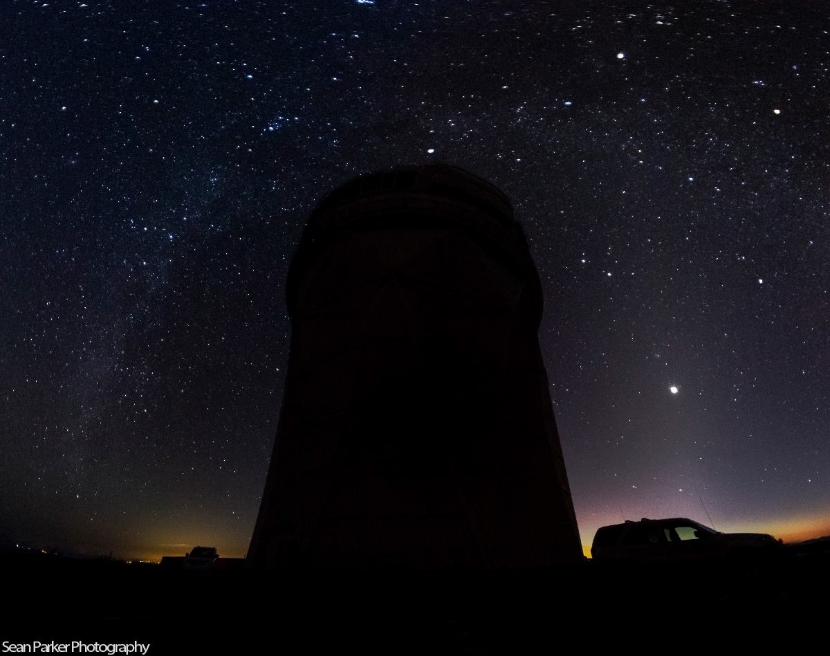
Silhouette of big observatory tower with light streak on left and hazy pyramid of light on right.

Milky Way on left in this photo. Zodiacal light on right. This photo is from EarthSky Facebook friend Sean Parker Photography. He captured it at Kitt Peak National Observatory in Arizona.

What is zodiacal light? People used to think zodiacal light originated somehow from phenomena in Earth’s upper atmosphere, but today we understand it as sunlight reflecting off dust grains that circle the sun in the inner solar system. These grains are thought to be left over from the process that created our Earth and the other planets of our solar system 4.5 billion years ago.

These dust grains in space spread out from the sun in the same flat disc of space inhabited by Mercury, Venus, Earth, Mars and the other planets in our sun’s family. This flat space around the sun – the plane of our solar system – translates on our sky to a narrow pathway called the ecliptic. This is the same pathway traveled by the sun and moon as they journey across our sky.

The pathway of the sun and moon was called the zodiac or Pathway of Animals by our ancestors in honor of the constellations seen beyond it. The word zodiacal stems from the word zodiac.

In other words, the zodiacal light is a solar system phenomenon. The grains of dust that create it are like tiny worlds – ranging from meter-sized to micron-sized – densest around the immediate vicinity of the sun and extending outward beyond the orbit of Mars. Sunlight shines on these grains of dust to create the light we see. Since they lie in the flat sheet of space around the sun, we could, in theory, see them as a band of dust across our entire sky, marking the same path that the sun follows during the day. And indeed there are sky phenomena associated with this band of dust, such as the gegenschein.

But seeing such elusive sky phenomena as the gegenschein is difficult. Most of us see only the more obvious part of this dust band – the zodiacal light – in either spring or fall.

Hazy zodiacal light at an angle against a starry sky.

The zodiacal light is the diffuse cone-shaped light extending up from the horizon on the right side of this photo. Photo by Richard Hasbrouck in Truchas, New Mexico.

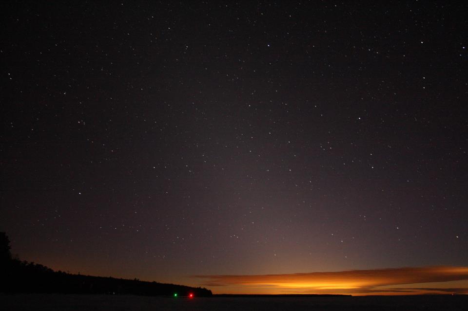
Hazy pyramid of light over yellow sunset clouds at horizon.

The zodiacal light is easier to see as you get closer to Earth’s equator. But it can be glimpsed from northerly latitudes, too. Here’s the zodiacal light seen by EarthSky Facebook friend Jim Peacock on the evening of February 5, 2013, over Lake Superior in northern Wisconsin. Thank you, Jim!

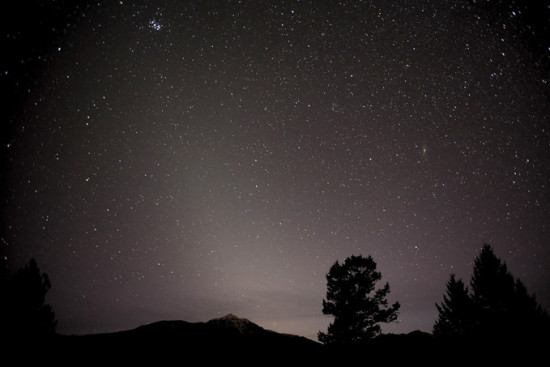
Hazy pyramid of zodiacal light with trees and mountain silhouettes.

Here’s the zodiacal light as captured on film in Canada. This wonderful capture is from Robert Ede in Invermere, British Columbia.

Starry sky with cone of hazy light at angle from horizon.

Zodiacal light on the morning of August 31, 2017, with Venus in its midst, captured at Mono Lake in California. Eric Barnett wrote: “I woke from sleeping in the car thinking sunrise was coming. My photographer friend, Paul Rutigliano, said it was the zodiacal light. I jumped up, got my camera into position and captured about a dozen or so shots.”

Bottom line: The zodiacal light – aka false dawn or dusk – is a hazy pyramid of light, really sunlight reflecting off dust grains in the plane of our solar system. Northern Hemisphere dwellers, look east before dawn. Southern Hemisphere … look west when all traces of evening twilight are gone.


from EarthSky https://ift.tt/2MUOCXf

Wow! Night skies and petroglyphs

Cinematographer Harun Mehmedinovic describes the new Skyglow Project video as an ode to the indigenous stargazers of North America.

It’s an awesome montage of skies over ancient astronomy petroglyphs – rock carvings – and archaeoastronomy structures – sites that people in the past have used to understood the phenomena in the sky – taken in U.S. National Parks in California, Arizona, Colorado, and New Mexico. It’s a glimpse, Harun said, of how the night sky might have appeared to the ancient inhabitants of those lands.

….And don’t miss the January 2018 Super Blue Moon lunar eclipse (at 1:03).

The rock carvings and structures featured in the video were created by a diverse group of tribes, from Native Hawaiians, to the Paiute people of Bishop, California, and the Ancestral Puebloans of the Southwest. Harun said:

These petroglyphs and structures reflect the long standing interest in ancient astronomy which grew stronger as many of the tribes went from the hunter-gatherer to the agrarian societal orders. From references to the sun carved in the rock, and interest in using the sun to predict seasons (entire buildings built to serve as sundials and calendars, a critical element in the farming communities) to those of 13 moons (lunar annual calendar), to carvings of stars and constellations, interest in celestial bodies is ever present across the indigenous communities of the United States.

This video, by Harun Mehmedinovic and Gavin Heffernan, was filmed as part of Skyglow Project, an ongoing crowdfunded quest to explore the effects and dangers of urban light pollution in contrast with some of the most incredible dark sky areas in North America. You can find out more about this video here.

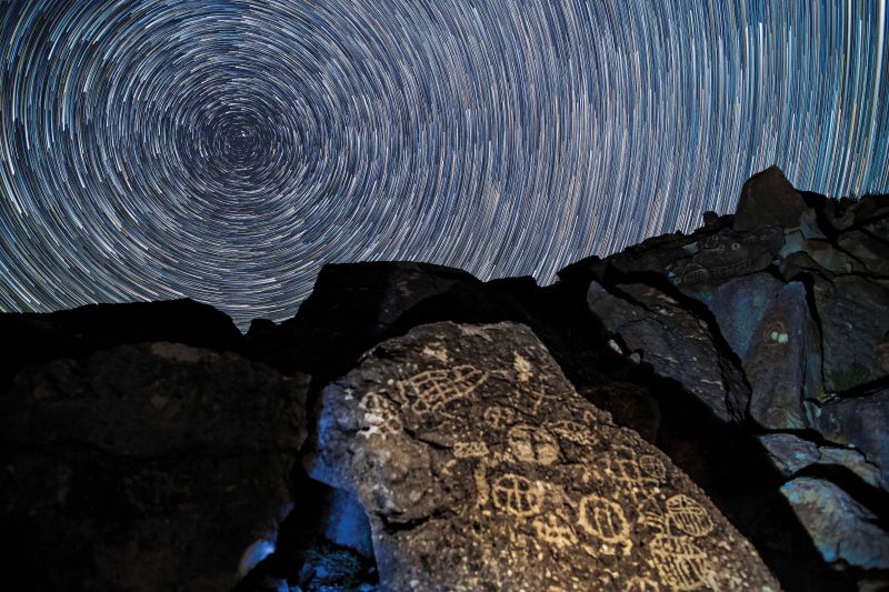
Concentric white circles filling the sky over large rock with symbols carved into it.

Star trails over Paiute petroglyphs in Bishop, California. Image via Skyglow Project.

Bottom line: Video montage of skies over petroglyphs in national parks in the western United States.


from EarthSky https://ift.tt/2ZvZvFG

Evolution doesn’t proceed in a straight line

Chimpanzee, walking ape, cave man with club, Neanderthal man with spear, blond modern man.

Evolution doesn’t proceed in a straight line. So why draw it that way? Image via Uncle Leo/Shutterstock.com.

By Quentin Wheeler, State University of New York College of Environmental Science and Forestry; Antonio G. Valdecasas, CSIC – Consejo Superior de Investigaciones Científicas, and Cristina Cánovas, CSIC – Consejo Superior de Investigaciones Científicas

Evolution doesn’t follow a preordained, straight path. Yet images abound that suggest otherwise. From museum displays to editorial cartoons, evolution is depicted as a linear progression from primitive to advanced.

You’ve certainly seen the pictures of a chimpanzee gradually straightening up and progressing through various hominids all the way to a modern human being. Yes, they can be humorous. But these kinds of popular representations about evolution get it all wrong.

Logo on a t-shirt. Illustration of band instruments and monkey-to-man sequence.

A high school marching band’s T-shirt places a horn-playing Homo sapiens at the end of the evolutionary process. Image via Brian Kloppenburg, Jordan Summers, Main Street Logo.

As three scholars of biodiversity and biology, these images bother us because they misrepresent how the process of evolution really works – and run the risk of reinforcing the public’s misconceptions.

Climbing a ladder to perfection

This misunderstanding is a holdover from before 1859, the year Charles Darwin first published his scientific theory of evolution via natural selection.

Antique etching of tower of created beings with plants at the bottom and angels at the top.

The scala naturae presents a hierarchy of creation. Image by Retorica Christiana, Didacus Valdes, 1579, via The Conversation.

Until then, the traditional view of how the world was organized was through a “progression in perfection.” This concept is explicit in the idea of the “great chain of being,” or “scala naturae” in Latin: All beings on earth, animate and inanimate, could be organized according to an increasing scale of perfection from, say, mushrooms at the bottom up through lobsters and rabbits, all the way to human beings at the top.

Originating with Plato and Aristotle, this view gets three main things wrong.

First, it holds that nature is organized hierarchically. It is not a random assortment of beings.

Secondly, it envisions two organizing criteria: things progress from simple to perfect and from primitive to modern.

And thirdly, it supposes there are no intermediary stages between levels in this hierarchy. Each level is a watertight compartment of similar complexity – a barnacle and a coral reef on the same rung are equally complex. No one is halfway between two steps.

In the 1960s a variation of the scala naturae conceived by Jesuit philosopher Pierre Teilhard de Chardin became popular. His idea was that, although life is somewhat branched, there is direction in evolution, a progression toward greater cognitive complexity and, ultimately, to identification with the divine, that is, God.

Gradual changes, in every direction

At least since Darwin, though, scientists’ idea of the world is organized through transitions – from inanimate molecules to life, from earlier organisms to different kinds of plants and animals, and so on. All life on Earth is the product of gradual transformations, which diversified and gave rise to the exuberance of organisms that we know today.

Two transitions are of particular interest to evolutionary biologists. There’s the jump from the inanimate to the animate: the origin of life. And there’s the appearance of the human species from a monkey ancestor.

Sequence of monkey, ape-man, photo of standing modern man (the author).

Book covers are just one place you might see a riff on this evolutionary march. Image via Howling at the Moon Press/Amazon.

The most popular way to represent the emergence of human beings is as linear and progressive. You’ve probably seen images, logos and political and social propaganda that draw on this representation.

But none of these representations capture the dynamics of Darwin’s theory. The one image he included in his book “On the Origin of Species” is a tree diagram, the branching of which is a metaphor for the way species originate, by splitting. The absence of an absolute time scale in the image is an acknowledgment that gradual change happens on timescales that vary from organism to organism based on the length of a generation.

A tree with yellow leaves and name of type of creature at the tip of every branch.

Forget a hierarchy – each organism alive now is the most evolved of its kind. Image via Zern Liew/Shutterstock.com.

According to Darwin, all current organisms are equally evolved and are all still affected by natural selection. So, a starfish and a person, for example, are both at the forefront of the evolution of their particular building plans. And they happen to share a common ancestor that lived about 580 million years ago.

Darwin’s theory doesn’t presuppose any special direction in evolution. It assumes gradual change and diversification. And, as evolution is still operating today, all present organisms are the most evolved of their kind.

Antique etching of many life forms with white-bearded bald man in center.

‘Man Is But A Worm’ caricature of Darwin’s theory in the Punch almanac for 1882. Image via Edward Linley Sambourne.

An enduring misconception

Having been around nearly 2,000 years, the idea of the scala naturae did not disappear during Darwin’s time. It might actually have been reinforced by something so unexpected as a cartoon. Illustrator Edward Linley Sambourne’s immensely popular caricature of evolution “Man Is But a Worm,” published in Punch’s Almanack for 1882, combined two concepts that were never linked in Darwin’s mind: gradualism and linearity.

Given centuries of religious belief in a “great chain of being,” the idea of linearity was an easy sell. The iconic version of this concept is, of course, the depiction of a supposed ape-to-human “progression.” Variations of all kinds have been made of this depiction, some with a humorous spirit, but most to ridicule the monkey-to-man theory.

A linear depiction of evolution may, consciously or not, confirm false preconceptions about evolution, such as intelligent design – the idea that life has an intelligent creator behind it. Historians can work to unravel how such a simple caricature could have helped distort Darwin’s theory. Meanwhile, science writers and educators face the challenge of explaining the gradual branching processes that explain the diversity of life.

While less pithy, it might be better for the public’s knowledge of science if these T-shirts and bumper stickers ditch the step by step images and use branching diagrams to make a more nuanced and correct point about evolution. Contrary to the Sambourne picture, evolution is better represented as a process producing continuous branching and divergence of populations of organisms.

Quentin Wheeler, Senior Fellow for Biodiversity Studies, State University of New York College of Environmental Science and Forestry; Antonio G. Valdecasas, Senior Researcher in Biodiversity at the Museo Nacional de Ciencias Naturales, CSIC – Consejo Superior de Investigaciones Científicas, and Cristina Cánovas, Biologist at the Natural History Museum in Madrid, CSIC – Consejo Superior de Investigaciones Científicas

This article is republished from The Conversation under a Creative Commons license. Read the original article.

Bottom line: Evolution does not proceed as an orderly march toward a preordained finish line.

The Conversation


from EarthSky https://ift.tt/316rSXq

adds 2