Ten years ago, Thomas Peterson, William Connolley and John Fleck published a paper in the Bulletin of the American Meteorological Society which looked back at the climate science of the 1970s: "The Myth of the Global Cooling Scientific Consensus" (hereafter called PCF08). The goal of the paper was to look at the peer-reviewed literature of the time to see what scientists were saying about the future projections of climate. In the decades since the 1970s, some "skeptics" of global warming/climate change have made claims that "all the scientists" in the 1970s were predicting "global cooling" or an "imminent ice age". But, the PCF08 survey of papers from 1965 to 1979 showed that while there were some concerns about future "cooling", especially at the beginning of the time period, there were many more concerns about future warming caused by human emissions of carbon dioxide.
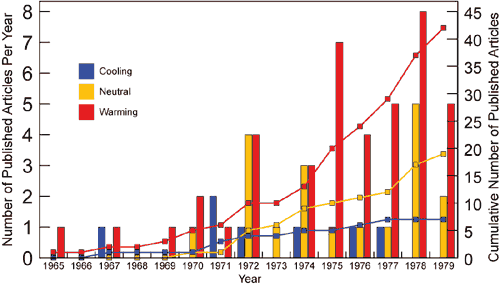
Figure 1. The number of papers classified as predicting, implying, or providing supporting evidence for future global cooling, warming, and neutral categories. During the period from 1965 through 1979, the PCF08 literature survey found 7 cooling, 20 neutral, and 44 warming papers. (Peterson 2008)
Many of today's "skeptics" of AGW remain unconvinced. A few years ago, Kenneth Richard, at the blog site NoTricksZone, penned a critique of PCF08, claiming to find hundreds of papers in support of a 1970's "cooling consensus": "Massive Cover-up Exposed: 285 Papers From 1960s-’80s Reveal Robust Global Cooling Scientific ‘Consensus’" (hereafter called NTZ). PCF08 only found seven peer-reviewed papers supporting a future cooling consensus. Did NTZ really stumble upon a "massive cover-up": a treasure trove of 285 more peer-reviewed papers foretelling a future cooling trend leading to the next ice age?
The short answer, of course, is "no". But, I thought it would be good to take a close look at PCF08 and NTZ to see "what's going on". What were scientists in the 1970s saying about the possible future trajectory of the climate? What facts were well-known and what questions were scientists still trying to answer? How could PCF08 and NTZ come to different conclusions about 1970s climate science from looking at the period's many peer-reviewed papers?
No 1970s Global Cooling Consensus
PCF08 tried to answer a very specific question: was there a scientific consensus in the 1970s "that either global cooling or a full-fledged ice age was imminent"? To answer this question they conducted a review of the peer-reviewed literature from 1965 to 1979, using specific search terms: "to capture the relevant topics, we used global temperature, global warming, and global cooling". The focus of this search was on projections of future climate: "our literature survey was limited to those papers projecting climate change on, or even just discussing an aspect of climate forcing relevant to, time scales from decades to a century". But they noted that many papers grappled with the uncertainties of climate forcings without making clear predictions about future climate.
Their findings? Only 7 papers projected cooling verses 44 warming papers. There were also 20 "neutral" papers that "project no change, that discuss both warming and cooling influences without specifically indicating which are likely to be dominant, or that state not enough is known to make a sound prediction" (See Figure 1)
A side benefit of this literature survey is that it "shows the remarkable way in which the individual threads of climate science of the time—each group of researchers pursuing their own set of questions—was quickly woven into the integrated tapestry that created the basis for climate science as we know it today". These "individual threads of climate science" were:
- The realization that slow changes in Earth's orbit and tilt (Milankovitch cycles) had played a large part in past ice ages and interglacials. Some scientists extended these cycles into the future to determine the Earth's possible climate trajectory.
- The first global average temperature series compiled by scientists showed a cooling trend since the 1940s.
- Scientists working on aerosols and dust (both natural and human-caused) were trying to determine what influence (if any) they had on climate (cooling or warming).
- Scientists were also quantifying the “greenhouse effect” of another part of our increasing pollution: carbon dioxide, which should cause the climate to warm.
Throughout the time period covered by the PCF08 survey, scientists were researching these separate but related topics:
As the various threads of climate research came together in the late 1970s into a unified field of study—ice ages, aerosols, greenhouse forcing, and the global temperature trend—greenhouse forcing was coming to be recognized as the dominant term in the climate change equations for time scales from decades to centuries. (PCF08)
No Tricks Zone's Critique of PCF08
PCF08's focus was on what climate scientists of the 1970s were predicting about the Earth's future climate trajectory, but NTZ shifted the focus to the past—to what scientists were saying about the "global cooling" since the 1940s, seen in the newly developed temperature reconstructions:
the global cooling scare during the 1970s was not narrowly or exclusively focused upon what the temperatures might look like in the future, or whether or not an ice age was “imminent”. It was primarily about the ongoing cooling that had been taking place for decades, the negative impacts this cooling had already exerted (on extreme weather patterns, on food production, etc.), and uncertainties associated with the causes of climatic changes. (NTZ)
This "shifts the goal posts" from the narrow purpose and the narrow definition of "global cooling" used by PCF08 to something entirely different. Yes, as PCF08 showed, one of the main threads of 1970s climate science was a look back at the recent global temperature record, to document and to explain the recent "global cooling". Many papers did so without making specific claims about the future trajectory of climate, which was what the laser-like focus of PCF08 was concerned with.
NTZ also complained about the span of years used by PCF08 in their literature review: 1965-1979. NTZ broadened the 1970s to reach from 1960 to 1989!1 Again, PCF08 had a laser-like focus on the 1970s, while NTZ moved the goal posts to cover the whole field.
NTZ's expanded search found a treasure trove of all types of "cooling" papers, but did this search turn up any additional "warming" papers? We have no way of knowing because, unlike PCF08, he never described what search terms he used or how the search was conducted. He didn't add a single paper to PCF08's 44 "warming" papers, nor to their 20 "neutral" papers, so I think it is safe to say that his focus was entirely one-sided.
NTZ made a bizarre statement about the supposed purpose of PCF08: "the claim that there were only 7 publications from that era disagreeing with the presupposed CO2-warming “consensus” is preposterous" (my emphasis). What "presupposed CO2-warming 'consensus'"? NTZ alluded to this further in this passage:
According to Stewart and Glantz (1985), in the early 1970s it was the “prevailing view” among scientists that the Earth was headed into another ice age. It wasn’t until the late ’70s that scientists changed their minds and the “prevailing view” began shifting to warming. This is in direct contradiction to the claims of PCF08, who allege warming was the prevailing view among scientists in the 1960s and early 1970s too. (my emphasis)
PCF08 never claim that there was a "CO2-warming 'consensus'" throughout the time period in question. This is a straw-man argument. PCF08 fully understand the development of climate science throughout the 1970s and how the "various threads" of research converged at the end of the period on an emphasis on future "warming". An emphasis is not a consensus.
The Full List of 285 "Papers"
In Part II I will focus on the content of NTZ's 35 highlighted "papers" from his main blog post. But first, let's look briefly at NTZ's full list of 285 "papers" given in three posts: Part 1, Part 2, and Part 3.
A close look at the numbered list shows some odd counting discrepancies. The last paper listed in Part 3 is numbered 307, but NTZ writes about 285 papers. Going through the counts I noticed these errors:
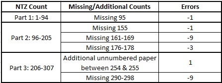
There are also three papers which are included twice in the full list. Collis (1975) is #28 in Part 1 and #98 in Part 2. Fletcher (1968) is #37 in Part 1 and #228 in Part 3. Sancetta et al (1972) is #56 in Part 1 and #141 in Part 2. For that last one, NTZ uses the exact same quote in both instances.
These counting errors are minor mistakes, but they do show the sloppy treatment NTZ gives to his data, especially when you consider the papers which were double counted. This is also seen in the arrangement of the lists: they don't appear to be in any logical order. They aren't arranged chronologically or alphabetically by author. The full list is just a pile of quotes from the papers.
NTZ does arrange the full list into sub-sections as shown in the table below:
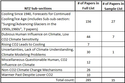
A look at these categories shows NTZ's one-sided "cooling" bias. In NTZ's expanded time span from 1960 to 1989 were there no additional papers forecasting global warming? Were there no papers showing high CO2 climate sensitivity? Or did he only look for "cooling" quotes and ignore anything dealing with global warming?
Finally, just how original are NTZ's 285 papers which he claims should be added to those found by the PCF08 review? Figure 2 below reproduces Table 1 from PCF08 which lists their papers, arranged by year and categorized into three groups: "cooling", "neutral" and "warming". Circled in blue are papers which also appear in NTZ's list of 285 papers. (The papers highlighted by red stars appear in NTZ's main blog post of 35 papers, see Part II.) NTZ has double counted 25% of PCF08's list of papers; and he has categorized them all as "cooling". Notice that he has reused five of PCF08's seven "cooling" papers! This again shows the careless treatment NTZ gives to the vast number of papers he "uncovered", as well as an apparent lack of awareness of what papers PCF08 had in their review.
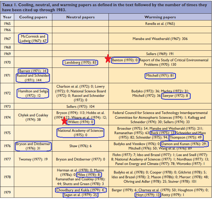 Figure 2. Table 1 from PCF08. Blue circles are papers included in NTZ's list of 285 "cooling" papers. The two red stars indicate papers from NTZ's sample list of 35 papers, see Part II. (Click on figure for larger image.)
NTZ's massive list of papers is meant to impress and overwhelm the casual "skeptic". Most people will never dig much deeper than a quick scroll through NTZ's never-ending stream of quotes from papers which he claims all support a 1970s "global cooling consensus". But, a close look at this treasure trove shows a less than careful treatment of the data. And NTZ's critique of PCF08 reveals shifting goal posts and straw-man arguments which distort our understanding of 1970s climate science. In Part II I'll dig a bit deeper into the content of some of NTZ's selected papers, to show how he further distorts the science.
Footnotes
1. Actually, one of NTZ's papers is from 1940! More about this in Part II.
from Skeptical Science https://ift.tt/2wfrHOy
Ten years ago, Thomas Peterson, William Connolley and John Fleck published a paper in the Bulletin of the American Meteorological Society which looked back at the climate science of the 1970s: "The Myth of the Global Cooling Scientific Consensus" (hereafter called PCF08). The goal of the paper was to look at the peer-reviewed literature of the time to see what scientists were saying about the future projections of climate. In the decades since the 1970s, some "skeptics" of global warming/climate change have made claims that "all the scientists" in the 1970s were predicting "global cooling" or an "imminent ice age". But, the PCF08 survey of papers from 1965 to 1979 showed that while there were some concerns about future "cooling", especially at the beginning of the time period, there were many more concerns about future warming caused by human emissions of carbon dioxide.
Figure 1. The number of papers classified as predicting, implying, or providing supporting evidence for future global cooling, warming, and neutral categories. During the period from 1965 through 1979, the PCF08 literature survey found 7 cooling, 20 neutral, and 44 warming papers. (Peterson 2008)
Many of today's "skeptics" of AGW remain unconvinced. A few years ago, Kenneth Richard, at the blog site NoTricksZone, penned a critique of PCF08, claiming to find hundreds of papers in support of a 1970's "cooling consensus": "Massive Cover-up Exposed: 285 Papers From 1960s-’80s Reveal Robust Global Cooling Scientific ‘Consensus’" (hereafter called NTZ). PCF08 only found seven peer-reviewed papers supporting a future cooling consensus. Did NTZ really stumble upon a "massive cover-up": a treasure trove of 285 more peer-reviewed papers foretelling a future cooling trend leading to the next ice age?
The short answer, of course, is "no". But, I thought it would be good to take a close look at PCF08 and NTZ to see "what's going on". What were scientists in the 1970s saying about the possible future trajectory of the climate? What facts were well-known and what questions were scientists still trying to answer? How could PCF08 and NTZ come to different conclusions about 1970s climate science from looking at the period's many peer-reviewed papers?
No 1970s Global Cooling Consensus
PCF08 tried to answer a very specific question: was there a scientific consensus in the 1970s "that either global cooling or a full-fledged ice age was imminent"? To answer this question they conducted a review of the peer-reviewed literature from 1965 to 1979, using specific search terms: "to capture the relevant topics, we used global temperature, global warming, and global cooling". The focus of this search was on projections of future climate: "our literature survey was limited to those papers projecting climate change on, or even just discussing an aspect of climate forcing relevant to, time scales from decades to a century". But they noted that many papers grappled with the uncertainties of climate forcings without making clear predictions about future climate.
Their findings? Only 7 papers projected cooling verses 44 warming papers. There were also 20 "neutral" papers that "project no change, that discuss both warming and cooling influences without specifically indicating which are likely to be dominant, or that state not enough is known to make a sound prediction" (See Figure 1)
A side benefit of this literature survey is that it "shows the remarkable way in which the individual threads of climate science of the time—each group of researchers pursuing their own set of questions—was quickly woven into the integrated tapestry that created the basis for climate science as we know it today". These "individual threads of climate science" were:
- The realization that slow changes in Earth's orbit and tilt (Milankovitch cycles) had played a large part in past ice ages and interglacials. Some scientists extended these cycles into the future to determine the Earth's possible climate trajectory.
- The first global average temperature series compiled by scientists showed a cooling trend since the 1940s.
- Scientists working on aerosols and dust (both natural and human-caused) were trying to determine what influence (if any) they had on climate (cooling or warming).
- Scientists were also quantifying the “greenhouse effect” of another part of our increasing pollution: carbon dioxide, which should cause the climate to warm.
Throughout the time period covered by the PCF08 survey, scientists were researching these separate but related topics:
As the various threads of climate research came together in the late 1970s into a unified field of study—ice ages, aerosols, greenhouse forcing, and the global temperature trend—greenhouse forcing was coming to be recognized as the dominant term in the climate change equations for time scales from decades to centuries. (PCF08)
No Tricks Zone's Critique of PCF08
PCF08's focus was on what climate scientists of the 1970s were predicting about the Earth's future climate trajectory, but NTZ shifted the focus to the past—to what scientists were saying about the "global cooling" since the 1940s, seen in the newly developed temperature reconstructions:
the global cooling scare during the 1970s was not narrowly or exclusively focused upon what the temperatures might look like in the future, or whether or not an ice age was “imminent”. It was primarily about the ongoing cooling that had been taking place for decades, the negative impacts this cooling had already exerted (on extreme weather patterns, on food production, etc.), and uncertainties associated with the causes of climatic changes. (NTZ)
This "shifts the goal posts" from the narrow purpose and the narrow definition of "global cooling" used by PCF08 to something entirely different. Yes, as PCF08 showed, one of the main threads of 1970s climate science was a look back at the recent global temperature record, to document and to explain the recent "global cooling". Many papers did so without making specific claims about the future trajectory of climate, which was what the laser-like focus of PCF08 was concerned with.
NTZ also complained about the span of years used by PCF08 in their literature review: 1965-1979. NTZ broadened the 1970s to reach from 1960 to 1989!1 Again, PCF08 had a laser-like focus on the 1970s, while NTZ moved the goal posts to cover the whole field.
NTZ's expanded search found a treasure trove of all types of "cooling" papers, but did this search turn up any additional "warming" papers? We have no way of knowing because, unlike PCF08, he never described what search terms he used or how the search was conducted. He didn't add a single paper to PCF08's 44 "warming" papers, nor to their 20 "neutral" papers, so I think it is safe to say that his focus was entirely one-sided.
NTZ made a bizarre statement about the supposed purpose of PCF08: "the claim that there were only 7 publications from that era disagreeing with the presupposed CO2-warming “consensus” is preposterous" (my emphasis). What "presupposed CO2-warming 'consensus'"? NTZ alluded to this further in this passage:
According to Stewart and Glantz (1985), in the early 1970s it was the “prevailing view” among scientists that the Earth was headed into another ice age. It wasn’t until the late ’70s that scientists changed their minds and the “prevailing view” began shifting to warming. This is in direct contradiction to the claims of PCF08, who allege warming was the prevailing view among scientists in the 1960s and early 1970s too. (my emphasis)
PCF08 never claim that there was a "CO2-warming 'consensus'" throughout the time period in question. This is a straw-man argument. PCF08 fully understand the development of climate science throughout the 1970s and how the "various threads" of research converged at the end of the period on an emphasis on future "warming". An emphasis is not a consensus.
The Full List of 285 "Papers"
In Part II I will focus on the content of NTZ's 35 highlighted "papers" from his main blog post. But first, let's look briefly at NTZ's full list of 285 "papers" given in three posts: Part 1, Part 2, and Part 3.
A close look at the numbered list shows some odd counting discrepancies. The last paper listed in Part 3 is numbered 307, but NTZ writes about 285 papers. Going through the counts I noticed these errors:
There are also three papers which are included twice in the full list. Collis (1975) is #28 in Part 1 and #98 in Part 2. Fletcher (1968) is #37 in Part 1 and #228 in Part 3. Sancetta et al (1972) is #56 in Part 1 and #141 in Part 2. For that last one, NTZ uses the exact same quote in both instances.
These counting errors are minor mistakes, but they do show the sloppy treatment NTZ gives to his data, especially when you consider the papers which were double counted. This is also seen in the arrangement of the lists: they don't appear to be in any logical order. They aren't arranged chronologically or alphabetically by author. The full list is just a pile of quotes from the papers.
NTZ does arrange the full list into sub-sections as shown in the table below:
A look at these categories shows NTZ's one-sided "cooling" bias. In NTZ's expanded time span from 1960 to 1989 were there no additional papers forecasting global warming? Were there no papers showing high CO2 climate sensitivity? Or did he only look for "cooling" quotes and ignore anything dealing with global warming?
Finally, just how original are NTZ's 285 papers which he claims should be added to those found by the PCF08 review? Figure 2 below reproduces Table 1 from PCF08 which lists their papers, arranged by year and categorized into three groups: "cooling", "neutral" and "warming". Circled in blue are papers which also appear in NTZ's list of 285 papers. (The papers highlighted by red stars appear in NTZ's main blog post of 35 papers, see Part II.) NTZ has double counted 25% of PCF08's list of papers; and he has categorized them all as "cooling". Notice that he has reused five of PCF08's seven "cooling" papers! This again shows the careless treatment NTZ gives to the vast number of papers he "uncovered", as well as an apparent lack of awareness of what papers PCF08 had in their review.
Figure 2. Table 1 from PCF08. Blue circles are papers included in NTZ's list of 285 "cooling" papers. The two red stars indicate papers from NTZ's sample list of 35 papers, see Part II. (Click on figure for larger image.)
NTZ's massive list of papers is meant to impress and overwhelm the casual "skeptic". Most people will never dig much deeper than a quick scroll through NTZ's never-ending stream of quotes from papers which he claims all support a 1970s "global cooling consensus". But, a close look at this treasure trove shows a less than careful treatment of the data. And NTZ's critique of PCF08 reveals shifting goal posts and straw-man arguments which distort our understanding of 1970s climate science. In Part II I'll dig a bit deeper into the content of some of NTZ's selected papers, to show how he further distorts the science.
Footnotes
1. Actually, one of NTZ's papers is from 1940! More about this in Part II.
from Skeptical Science https://ift.tt/2wfrHOy