These next several mornings – May 4, 5 and 6, 2018 – the bright waning gibbous moon will be putting a damper on the predawn Eta Aquariid meteor shower. But this bright moon will show you Saturn and Mars in the starry sky. Saturn and Mars are easily as brilliant as 1st-magnitude stars, so you should have no trouble seeing them in the moon’s glare. The only requirement (besides a clear sky) will be to stay up very late, or to rise before the sun on these mornings. Saturn and Mars will be the two brilliant “stars” near the moon.
Both Saturn and Mars are shining in front of the constellation Sagittarius the Archer right now. Saturn will stay within Sagittarius’ boundaries for the rest of the year, but – by mid-May 2018 – Mars will cross over into the neighboring constellation to the east, Capricornus the Sea-goat.
Still, Sagittarius – with its famous Teapot asterism – is a great constellation to learn to identify. It marks the direction toward the center of our Milky Way galaxy, and many wonderful binocular sights lie in this part of the sky. Let the moon show you bright planet Saturn over the next few days. Then let Saturn be your guide to the constellation Sagittarius for the rest of 2018.
This sky chart, via IAU, highlights the Teapot asterism in western Sagittarius. The sun resides in the constellation Sagittarius on the December solstice (where the ecliptic crosses 18 hours of right ascension). Right ascension on the sky’s dome is the equivalent of latitude here on Earth.
The sun will enter the constellation Sagittarius on December 18, 2018. It’ll remain in front of Sagittarius until January 19, 2019, at which time the sun will enter the constellation Capricornus the Sea-goat. But you can’t see Sagittarius in December and January. That’s because the sun is in front of this constellation during a Northern Hemisphere winter or Southern Hemisphere summer.
Once the moon leaves this part of the sky, Saturn serves as your faithful guide to the constellation Sagittarius for many months to come. Although modern eyes have a tough time seeing Sagittarius as a centaur with a drawn-out bow and arrow, the “Teapot” asterism in western Sagittarius is fairly easy to make out on a dark night. What’s more, you can see the starlit boulevard of stars known as the Milky Way – an edgewise view of our home galaxy – passing right though “the Teapot” in a dark sky free of moonlight and pesky artificial lights.
Use the planet Saturn to locate the Teapot asterism in 2018.
If you’re not one to wake up early, simply wait for another month or two. By that time, Saturn and the Teapot will be yours to behold in the evening sky.
Bottom line: If you’re an early bird, get up before dawn on May 4, 5 and 6, 2018 to see the moon, Saturn and Mars – and possibly, some of the brighter Eta Aquariid meteors in moonlight.
from EarthSky https://ift.tt/2IcyPQA
These next several mornings – May 4, 5 and 6, 2018 – the bright waning gibbous moon will be putting a damper on the predawn Eta Aquariid meteor shower. But this bright moon will show you Saturn and Mars in the starry sky. Saturn and Mars are easily as brilliant as 1st-magnitude stars, so you should have no trouble seeing them in the moon’s glare. The only requirement (besides a clear sky) will be to stay up very late, or to rise before the sun on these mornings. Saturn and Mars will be the two brilliant “stars” near the moon.
Both Saturn and Mars are shining in front of the constellation Sagittarius the Archer right now. Saturn will stay within Sagittarius’ boundaries for the rest of the year, but – by mid-May 2018 – Mars will cross over into the neighboring constellation to the east, Capricornus the Sea-goat.
Still, Sagittarius – with its famous Teapot asterism – is a great constellation to learn to identify. It marks the direction toward the center of our Milky Way galaxy, and many wonderful binocular sights lie in this part of the sky. Let the moon show you bright planet Saturn over the next few days. Then let Saturn be your guide to the constellation Sagittarius for the rest of 2018.
This sky chart, via IAU, highlights the Teapot asterism in western Sagittarius. The sun resides in the constellation Sagittarius on the December solstice (where the ecliptic crosses 18 hours of right ascension). Right ascension on the sky’s dome is the equivalent of latitude here on Earth.
The sun will enter the constellation Sagittarius on December 18, 2018. It’ll remain in front of Sagittarius until January 19, 2019, at which time the sun will enter the constellation Capricornus the Sea-goat. But you can’t see Sagittarius in December and January. That’s because the sun is in front of this constellation during a Northern Hemisphere winter or Southern Hemisphere summer.
Once the moon leaves this part of the sky, Saturn serves as your faithful guide to the constellation Sagittarius for many months to come. Although modern eyes have a tough time seeing Sagittarius as a centaur with a drawn-out bow and arrow, the “Teapot” asterism in western Sagittarius is fairly easy to make out on a dark night. What’s more, you can see the starlit boulevard of stars known as the Milky Way – an edgewise view of our home galaxy – passing right though “the Teapot” in a dark sky free of moonlight and pesky artificial lights.
Use the planet Saturn to locate the Teapot asterism in 2018.
If you’re not one to wake up early, simply wait for another month or two. By that time, Saturn and the Teapot will be yours to behold in the evening sky.
Bottom line: If you’re an early bird, get up before dawn on May 4, 5 and 6, 2018 to see the moon, Saturn and Mars – and possibly, some of the brighter Eta Aquariid meteors in moonlight.
The next NASA robot to explore Mars, called InSight (Interior Exploration using Seismic Investigations, Geodesy and Heat Transport), is scheduled to launch Saturday, May 5, 2018 with the lander due to set down on Mars’ surface in November 2018.
InSight, the first planetary mission to take off from the West Coast, is targeted to launch at 4:05 a.m. PDT (11:05 UTC; translate UTC to your time) from Space Launch Complex-3 at Vandenberg Air Force Base in California aboard a United Launch Alliance (ULA) Atlas V rocket.
You can watch the launch live on NASA TV. Coverage begins at 3:30 a.m PDT (10:30 UTC). Watch here. The prelaunch briefing and launch commentary will also be streamed live on YouTube here. There are two official launch viewing sites for the public in Lompoc, California. Information on these sites here.
Launching on the same rocket is a separate NASA technology experiment known as Mars Cube One (MarCO). MarCO consists of two mini-spacecraft and will be the first test of CubeSat technology in deep space. They are designed to test new communications and navigation capabilities for future missions and may aid InSight communications.
The Atlas V rocket will have an initial trajectory towards the south-southeast, and NASA said:
Weather permitting, InSight’s pre-dawn launch may be visible for more than 10 million Californians without a need for them to drive to a special location. Just wake up early, check the InSight website for assurance the launch is still on schedule, go outside, look at the western sky, marvel at the rocket’s flare as it travels southward…
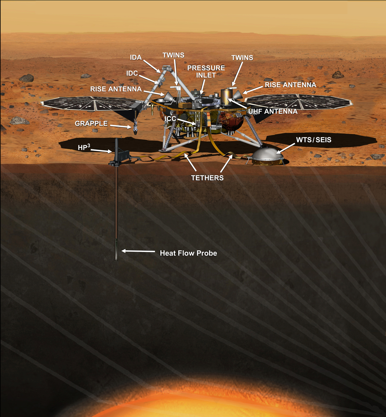
In past decades, orbiters have peered down on Mars from above, and robotic rovers have crept along its surface. Mars InSight is designed to study what’s inside Mars. The stationary lander – similar to the 2008 Phoenix lander on the red planet – will help scientists understand how the rocky planets in our solar system – like Mars, Venus and Earth – formed. The mission’s objective is to detect seismic activity on Mars and analyse the subsurface by studying the thickness and size of Mars’ core, mantle and crust.
InSight will also detect the frequency of ongoing meteorite impacts. Mars is closer than Earth to the asteroid belt, which lies between it and the next planet outward, Jupiter. Mars’ atmosphere is thinner than Earth’s. These two conditions might contribute to hundreds of small space rocks reaching the surface of our neighboring planet.
The solar-powered lander will deploy a seismometer built by the Centre national d’études spatiales (CNES) from the French Space Agency. It also contains a heat probe to monitor heat flow from Mars’ interior, which was provided by the German Aerospace Center, and other instruments built by Italy, Spain, and NASA’s JPL. The mission is scheduled to last two years.
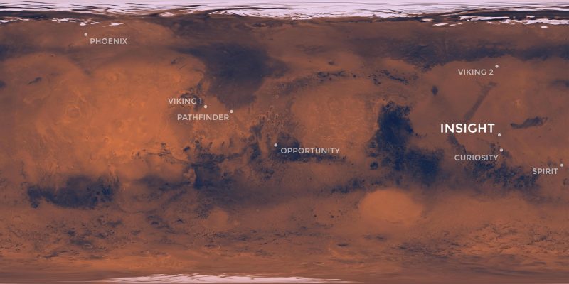
Mars InSight mission landing site on Mars via NASA/JPL.
Landing on Mars is hard, and some spacecraft have crashed while attempting it. Before the Curiosity rover mission landed in 2012, the mission team described the lander’s planned descent through Mars’ thin atmosphere and (ultimately successful) landing attempt as seven minutes of terror.
InSight will be landing in a way similar to Curiosity. InSight will enter Mars’ atmosphere at 14,100 miles per hour (22,692 km/h). During the entry phase, it will use very small rockets to adjust its initial trajectory toward the surface. Then it uses a large parachute, and then 12 descent engines or “retrojets,” whose firings will be continuously adjusted by an onboard computer in order to keep the spacecraft leveled and slowing down until the moment of touchdown. This type of landing technology was successfully used by the Viking 1 and 2 landers in 1976, and by the Phoenix lander in 2008. The Curiosity rover, which descended on Mars on 2012, added a skycrane with cables to this technology, to avoid dust over the rover’s instruments and cameras.
InSight will attempt to land in Elysium Planitia, an area not far from the Curiosity’s landing site, along the equator of the red planet.
By the way, Mars will be having a close encounter with Earth this summer. It’ll be the best Mars viewing since 2003, which was the best viewing in some 60,000 years. In addition to providing earthly skywatchers with grand views of the red planet’s features through a telescope, this 2018 opposition of Mars also provides a good opportunity to send a Mars spacecraft winging its way.
Bon voyage, Mars InSight!
Mars InSight carries a suite of instruments designed to measure Mars on the inside. Illustration via NASA/JPL.
Bottom line: Mars InSight is scheduled to launch May 5, 2018. Californians will be able to see the launch, which will be at Vandenberg Air Force Base.
from EarthSky https://ift.tt/2Ejgzir
The next NASA robot to explore Mars, called InSight (Interior Exploration using Seismic Investigations, Geodesy and Heat Transport), is scheduled to launch Saturday, May 5, 2018 with the lander due to set down on Mars’ surface in November 2018.
InSight, the first planetary mission to take off from the West Coast, is targeted to launch at 4:05 a.m. PDT (11:05 UTC; translate UTC to your time) from Space Launch Complex-3 at Vandenberg Air Force Base in California aboard a United Launch Alliance (ULA) Atlas V rocket.
You can watch the launch live on NASA TV. Coverage begins at 3:30 a.m PDT (10:30 UTC). Watch here. The prelaunch briefing and launch commentary will also be streamed live on YouTube here. There are two official launch viewing sites for the public in Lompoc, California. Information on these sites here.
Launching on the same rocket is a separate NASA technology experiment known as Mars Cube One (MarCO). MarCO consists of two mini-spacecraft and will be the first test of CubeSat technology in deep space. They are designed to test new communications and navigation capabilities for future missions and may aid InSight communications.
The Atlas V rocket will have an initial trajectory towards the south-southeast, and NASA said:
Weather permitting, InSight’s pre-dawn launch may be visible for more than 10 million Californians without a need for them to drive to a special location. Just wake up early, check the InSight website for assurance the launch is still on schedule, go outside, look at the western sky, marvel at the rocket’s flare as it travels southward…
In past decades, orbiters have peered down on Mars from above, and robotic rovers have crept along its surface. Mars InSight is designed to study what’s inside Mars. The stationary lander – similar to the 2008 Phoenix lander on the red planet – will help scientists understand how the rocky planets in our solar system – like Mars, Venus and Earth – formed. The mission’s objective is to detect seismic activity on Mars and analyse the subsurface by studying the thickness and size of Mars’ core, mantle and crust.
InSight will also detect the frequency of ongoing meteorite impacts. Mars is closer than Earth to the asteroid belt, which lies between it and the next planet outward, Jupiter. Mars’ atmosphere is thinner than Earth’s. These two conditions might contribute to hundreds of small space rocks reaching the surface of our neighboring planet.
The solar-powered lander will deploy a seismometer built by the Centre national d’études spatiales (CNES) from the French Space Agency. It also contains a heat probe to monitor heat flow from Mars’ interior, which was provided by the German Aerospace Center, and other instruments built by Italy, Spain, and NASA’s JPL. The mission is scheduled to last two years.
Mars InSight mission landing site on Mars via NASA/JPL.
Landing on Mars is hard, and some spacecraft have crashed while attempting it. Before the Curiosity rover mission landed in 2012, the mission team described the lander’s planned descent through Mars’ thin atmosphere and (ultimately successful) landing attempt as seven minutes of terror.
InSight will be landing in a way similar to Curiosity. InSight will enter Mars’ atmosphere at 14,100 miles per hour (22,692 km/h). During the entry phase, it will use very small rockets to adjust its initial trajectory toward the surface. Then it uses a large parachute, and then 12 descent engines or “retrojets,” whose firings will be continuously adjusted by an onboard computer in order to keep the spacecraft leveled and slowing down until the moment of touchdown. This type of landing technology was successfully used by the Viking 1 and 2 landers in 1976, and by the Phoenix lander in 2008. The Curiosity rover, which descended on Mars on 2012, added a skycrane with cables to this technology, to avoid dust over the rover’s instruments and cameras.
InSight will attempt to land in Elysium Planitia, an area not far from the Curiosity’s landing site, along the equator of the red planet.
By the way, Mars will be having a close encounter with Earth this summer. It’ll be the best Mars viewing since 2003, which was the best viewing in some 60,000 years. In addition to providing earthly skywatchers with grand views of the red planet’s features through a telescope, this 2018 opposition of Mars also provides a good opportunity to send a Mars spacecraft winging its way.
Bon voyage, Mars InSight!
Mars InSight carries a suite of instruments designed to measure Mars on the inside. Illustration via NASA/JPL.
Bottom line: Mars InSight is scheduled to launch May 5, 2018. Californians will be able to see the launch, which will be at Vandenberg Air Force Base.
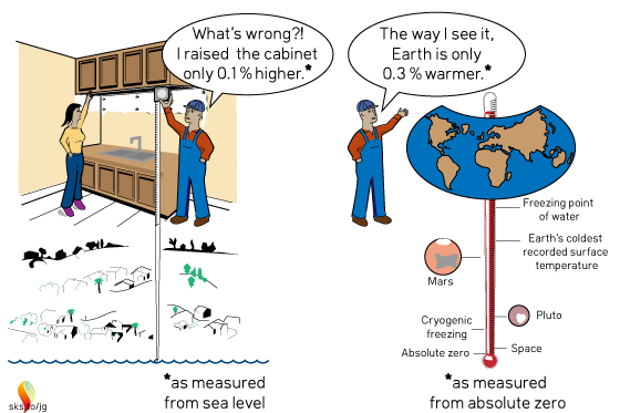
The altitude of an airplane landing on a runway is only useful if measured relative to the ground, and not to sea level.
Elevator Statement
While determining the optimum height for kitchen cabinets, an industrious husband in Minnesota asks his wife
“Should we move the kitchen cabinets up by 0.1% from the position we originally discussed?”
“Why on earth are you bothering me about such a trivial amount?” came the reply. “Now if you were considering something ridiculous like raising them 1 ft. I would complain.”
In fact, the husband was considering raising the kitchen cabinets by 1 ft. His reference to 0.1% used the height above sea level of 1000 ft. as the reference point for making his measurements. A ridiculous analogy you say? Climate-change deniers and not-so-well-informed skeptics make similar errors, but they are not as obvious. Read on if you want to learn the error that a Nobel Laureate made by miscommunicating in a similar manner as this industrious husband.
Climate Science
Nobel Laureate Ivar Giaever stated the following in a talk he gave on climate science,1
“From ~1880 to 2013 temperature increased from ~288K to 288.8K (0.3%). If this is true, to me it means that the temperature has been amazingly stable.”
A 0.3% increase is kind of like the 0.1% the husband raised the kitchen cabinets. Dr. Giaever was using an absolute temperature scale for his comparison. Unlike the Celsius temperature scale where 0°C is the point where ice melts, 0K on the absolute temperature scale is the point where atoms “melt” and start moving. For comparison, on the temperature scale that Dr. Giaever was using, ice melts at a blisteringly hot 273K. If you live in a coastal city prone to flooding, do you care more about the temperature at which atoms “melt” and start moving (i.e., 0K), or do you care more about the temperature at which ice melts (i.e., 273K = 0°C) and continues moving ever closer to your home?
So why did Dr. Giaever choose to use as his reference point the temperature at which atoms “melt” instead of the more useful reference point where ice melts?
For measuring the height of kitchen cabinets the distance to the floor is the most logical and useful reference point.
For airplanes landing on runways, the distance to the ground is the most useful reference point for calculating altitude.
Considering that sea level is one of the most damaging aspects of global warming, the change of temperature relative to the melting point of ice is a more relevant reference point than the melting point of atoms. In this context, the temperature change has not been amazingly stable as Dr. Giaever stated, but in 2013 had already increased by a relatively large 5.3% (i.e., 0.8°C)2, and by now (i.e., 2018) has increased by an even larger 6.7% (i.e., 1°C warming)!
Noting that the main target of the Paris Accord is to keep warming to less than 2°C above pre-industrial global average temperature, that is a 13.3% increase with respect to the melting point of ice. Warming of 3°C3 represents a 20% increase!
Don’t let a Nobel laureate confuse you. Warming of 2 or 3°C within this century is a massive increase!
Footnotes
1. Click here for a description of misleading statements by Dr. Giaever, or click here to watch a video of his talk on global warming. Dr. Giaever's misleading quote about the temperature only changing by 0.3% is taken from a slide he used, which is shown starting at 6:06 in the video.
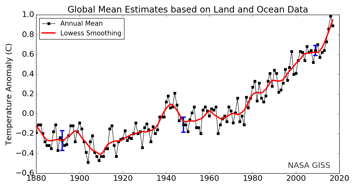
2. The temperature increases referred to here are relative to the temperature in 1880. Figure 1 shows the GISS (Goddard Institute for Space Studies) graph of temperature anomalies since 1880.
3. By some estimates, the INDCs (Intended Nationally Determined Contributions) associated with the Paris Accord would take us to nearly 3°C warming.
The altitude of an airplane landing on a runway is only useful if measured relative to the ground, and not to sea level.
Elevator Statement
While determining the optimum height for kitchen cabinets, an industrious husband in Minnesota asks his wife
“Should we move the kitchen cabinets up by 0.1% from the position we originally discussed?”
“Why on earth are you bothering me about such a trivial amount?” came the reply. “Now if you were considering something ridiculous like raising them 1 ft. I would complain.”
In fact, the husband was considering raising the kitchen cabinets by 1 ft. His reference to 0.1% used the height above sea level of 1000 ft. as the reference point for making his measurements. A ridiculous analogy you say? Climate-change deniers and not-so-well-informed skeptics make similar errors, but they are not as obvious. Read on if you want to learn the error that a Nobel Laureate made by miscommunicating in a similar manner as this industrious husband.
Climate Science
Nobel Laureate Ivar Giaever stated the following in a talk he gave on climate science,1
“From ~1880 to 2013 temperature increased from ~288K to 288.8K (0.3%). If this is true, to me it means that the temperature has been amazingly stable.”
A 0.3% increase is kind of like the 0.1% the husband raised the kitchen cabinets. Dr. Giaever was using an absolute temperature scale for his comparison. Unlike the Celsius temperature scale where 0°C is the point where ice melts, 0K on the absolute temperature scale is the point where atoms “melt” and start moving. For comparison, on the temperature scale that Dr. Giaever was using, ice melts at a blisteringly hot 273K. If you live in a coastal city prone to flooding, do you care more about the temperature at which atoms “melt” and start moving (i.e., 0K), or do you care more about the temperature at which ice melts (i.e., 273K = 0°C) and continues moving ever closer to your home?
So why did Dr. Giaever choose to use as his reference point the temperature at which atoms “melt” instead of the more useful reference point where ice melts?
For measuring the height of kitchen cabinets the distance to the floor is the most logical and useful reference point.
For airplanes landing on runways, the distance to the ground is the most useful reference point for calculating altitude.
Considering that sea level is one of the most damaging aspects of global warming, the change of temperature relative to the melting point of ice is a more relevant reference point than the melting point of atoms. In this context, the temperature change has not been amazingly stable as Dr. Giaever stated, but in 2013 had already increased by a relatively large 5.3% (i.e., 0.8°C)2, and by now (i.e., 2018) has increased by an even larger 6.7% (i.e., 1°C warming)!
Noting that the main target of the Paris Accord is to keep warming to less than 2°C above pre-industrial global average temperature, that is a 13.3% increase with respect to the melting point of ice. Warming of 3°C3 represents a 20% increase!
Don’t let a Nobel laureate confuse you. Warming of 2 or 3°C within this century is a massive increase!
Footnotes
1. Click here for a description of misleading statements by Dr. Giaever, or click here to watch a video of his talk on global warming. Dr. Giaever's misleading quote about the temperature only changing by 0.3% is taken from a slide he used, which is shown starting at 6:06 in the video.
2. The temperature increases referred to here are relative to the temperature in 1880. Figure 1 shows the GISS (Goddard Institute for Space Studies) graph of temperature anomalies since 1880.
3. By some estimates, the INDCs (Intended Nationally Determined Contributions) associated with the Paris Accord would take us to nearly 3°C warming.
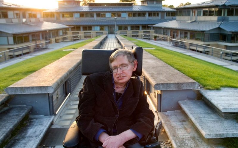
Stephen Hawking said: “My goal is simple. It is a complete understanding of the universe, why it is as it is and why it exists at all.” Image via Eleanor Bentall/ Telegraph.co.uk.
Does Stephen Hawking’s last study – published May 2, 2018 in the peer-reviewedJournal of High Energy Physics – prove or disprove the existence of parallel worlds? No. It’s a theory, one of many ideas in modern cosmology, many of which lead to the multiverse concept, the idea that our universe of stars and galaxies is just one of many possible separate universes. Some physicists told media sources that Hawking’s final paper did:
… set out the groundbreaking mathematics needed for a spacecraft to find traces of multiple Big Bangs.
The paper makes no statements about observational tests. It’s not entirely uninteresting, but it’s one of literally several thousand ideas for what might possibly have happened in the early universe.
In fact, the study has been commented on extensively, since it first appeared online in July 2017, in the preprint journal arXiv. Hawking and Thomas Hertog, a former student and frequent collaborator at Belgium’s Catholic University Leuven, posted an updated version of the study on arXiv on March 4, 2018, just 10 days before Hawking’s death on March 14 in Cambridge, England.
The study centers on the decades-long conflict between Albert Einstein’s general relativity theory (nature at very large scales, for example, how gravity works), and quantum mechanics (nature at very small scales; for example, the attempt to understand subatomic particles).
It deals specifically with a sub-set of Big Bang theory, called eternal inflation. Most modern Big Bang theories incorporate the idea of a inflation, which calls for an exponential expansion of space in the universe’s first fraction of a second. Eternal inflation suggests that some pockets of space keep expanding exponentially forever, while some (like the one we inhabit) don’t.
If this theory is an accurate description of the cosmos, then we live in a multiverse consisting of many isolated bubble universes.
Hawking in the 1960s with his first wife Jane. He said: “We are all different, but we share the same human spirit.” Image via Vintage News.
If it’s true, then our entire known cosmos of galaxies and stars exists inside a sort of bubble, but many other bubbles – forever unknowable – exist outside ours. Some might have laws of physics similar to (or even the same as) ours. Some would operate very differently. The University of Cambridge issued a statement about Hawking’s final study this week. The statement explained:
The observable part of our universe would then be just a hospitable pocket universe, a region in which inflation has ended and stars and galaxies formed.
Hawking said in one of his last interviews:
The usual theory of eternal inflation predicts that globally our universe is like an infinite fractal, with a mosaic of different pocket universes, separated by an inflating ocean. The local laws of physics and chemistry can differ from one pocket universe to another, which together would form a multiverse.
But I have never been a fan of the multiverse. If the scale of different universes in the multiverse is large or infinite the theory can’t be tested.
And indeed, in their new study, Hawking and Hertog say this account of eternal inflation as a theory of the Big Bang is wrong. Hertog said:
We predict that our universe, on the largest scales, is reasonably smooth and globally finite. So it is not a fractal structure.
Their statement explained more and showed how Hawking and Hertog’s study incorporated some of the most far-out physics of our time:
The theory of eternal inflation that Hawking and Hertog put forward is based on string theory: a branch of theoretical physics that attempts to reconcile gravity and general relativity with quantum physics, in part by describing the fundamental constituents of the universe as tiny vibrating strings. Their approach uses the string theory concept of holography, which postulates that the universe is a large and complex hologram: physical reality in certain 3D spaces can be mathematically reduced to 2D projections on a surface.
Hawking and Hertog developed a variation of this concept of holography to project out the time dimension in eternal inflation. This enabled them to describe eternal inflation without having to rely on Einstein’s theory.
Hertog said:
When we trace the evolution of our universe backwards in time, at some point we arrive at the threshold of eternal inflation, where our familiar notion of time ceases to have any meaning.
The new study harks back to Hawking’s earlier no boundary theory, which predicted that – if you go back in time to the beginning of the universe – the universe shrinks and closes off like a sphere. The new study is a step away from the earlier work, Hertog explained, and he said:
Now we’re saying that there is a boundary in our past.
Hertog said he now plans to study the implications of the new theory on smaller scales that are within reach of our space telescopes. He believes that primordial gravitational waves — ripples in spacetime — generated at the exit from eternal inflation constitute the most promising “smoking gun” to test the model. Hawking and Hertog’s statement explained:
The expansion of our universe since the beginning means such gravitational waves would have very long wavelengths, outside the range of the current LIGO detectors. But they might be heard by the planned European space-based gravitational wave observatory, LISA, or seen in future experiments measuring the cosmic microwave background.
Bottom line: Stephen Hawking’s last study was published May 2, 2018 in the peer-reviewedJournal of High Energy Physics.
Remember the year 2000? Bill Clinton was president of the United States, Faith Hill and Santana topped Billboard music charts, and the world’s computers had just “survived” the Y2K bug. It also was the year that NASA’s Terra satellite began collecting images of Earth.
Eighteen years later, the versatile satellite — with five scientific sensors — is still operating. For all of that time, the satellite’s Moderate Resolution Imaging Spectroradiometer (MODIS) has been collecting daily data and imagery of the Arctic — and the rest of the planet, too.
If you knew where to look and were willing to wait patiently for file downloads, the images have always been available on specialized websites used by scientists. But there was no quick-and-easy way for the public to browse the imagery. With the recent addition of the full record of MODIS data into NASA’s Worldview browser, checking on what was happening anywhere in the world on any day since 2000 has gotten much easier.
Say you want to check on the weather in your hometown on the day you or your child was born. Just navigate to the date on Worldview, and make sure that the MODIS data layer is turned on. (In the image below, you can tell the Terra MODIS data layer is on because it is light gray.)
This Worldview screenshot shows the first day that Terra MODIS collected data — February 24, 2000. The very first Terra scene showed northern Argentina and Chile. image via EOSDIS.
One of the things I love about having all this MODIS data at my fingertips is that it makes it possible to see the passage of relatively long periods of time in just a few minutes. Look, for instance, at the animation at the top of this page, generated by Delft University of Technology ice scientist Stef Lhermitte using Worldview.
Lhermitte summoned every natural-color MODIS image of the Arctic that Terra and Aqua (which also has a MODIS instrument) have collected since April 2003. The result — a product of 71,000 satellite overpasses — is a remarkable six-minute time capsule of swirling clouds, bursts of wildfire smoke, the comings and goings of snow, and the ebb and flow of sea ice.
Though beautiful, Lhermitte’s animation also has a troubling side to it. If you look carefully, you can see the downward trend in sea ice extent. Look, for instance, at mid-August and September 2012 — the period when Arctic sea ice extent hit a record-low minimum of 3.4 million square miles (8.8 square km). Between the heavy cloud cover, you will see lots of dark open water. Compare that to the same period in 2003, when the minimum extent was 6.2 million square miles (16 million square km). Scientists attribute the loss of sea ice to global warming.
Earth Matters had a conversation with Lhermitte to find why he made the clip and what stands out about it. MODIS images of notable events that Lhermitte mentioned are interspersed throughout the interview. All of the images come from the archives of NASA Earth Observatory, a website that was founded in 1999 in conjunction with the launch of Terra.
What prompted you to create this animation?
The extension of the MODIS record back to the beginning of the mission in the Worldview website triggered me to make the animation. As a remote sensing scientist, I often use Worldview to put things into context (e.g. for studying changes over ice sheets and glaciers). Previously, Worldview only had data until 2010.
What do you think are the most interesting events or patterns visible in the clip?
I think the strength of the video is that it contains so many of them, and it allows you to see them all in one video. The ones that are most striking to me are:
An Aqua MODIS image of a bloom in the Barents Sea on August 14, 2011. Image via Jeff Schmaltz, MODIS Rapid Response Team at NASA GSFC.
+ algal blooms in the Barents Sea
+ declining sea ice extent. You can see this both annually and over the longer term.
+ changing snow extent. You can see this each summer, especially over Canada and Siberia.
+ summer wildfire smoke in Canada (2004, 2005, 2009, 2014, 2017) and Russia (2006, 2011, 2012, 2013, 2014, 2016)
+ albedo reductions (reduction in brightness) over the Greenland Ice Sheet in 2010 and 2012 related to strong melt years.
+ overall eastward atmospheric circulation
+ the Grímsvötn ash plume (21 May 2011)
How did you make it? Was it difficult from a technical standpoint?
It was simple. I just downloaded the MODIS quicklook data from the Worldview archive using an automated script. Afterwards, I slightly modified the images for visualization purposes (e.g. overlaying country borders, clipping to a circular area). and stitched everything together in a video.
When you sit back and watch the whole video, how does it make you feel?
On the one hand, I am fascinated by the beauty and complexity of our planet. On the other hand, as a scientist, it makes me want to understand its processes even better. The video shows so many different processes at different scales, from natural processes (annual changes in snow cover and the Vatnajökull ash plume) to climate change related changes (e.g. the long term decrease in sea ice).
There are some gaps during the winter where the extent of the sea ice abruptly changes. Can you explain why?
I used the standard reflectance products, which show the reflected sunlight. I decided to leave all dates out where part of the Arctic is without sunlight during satellite overpasses (approximately 10:30 a.m. and 1:30 p.m. local time). The missing data due to the polar night are very prominent if you compile the complete record including winter months, and I did not want it to distract the viewer from the more subtle changes in the video.
Last week the much-awaited second batch of data from ESA’s Gaia mission was released, providing information on a phenomenal 1.7 billion stars – the richest star catalogue to date.
According to a European Space Agency (ESA) statement:
To put that vast number into context, if you were to count ‘only’ to one billion at a rate of one count per second, it would take more than 30 years. The new data will surely keep astronomers busy for even longer.
The dataset has already revealed fine details about the make-up of the Milky Way’s stellar population and about how stars move, essential information for investigating the formation and evolution of our home galaxy.
The treasure trove of data also includes information about stars beyond our own Milky Way galaxy. One example is illustrated in this image, which focuses on one of the nearest galaxies to our Milky Way, the Large Magellanic Cloud, or LMC.
This image combines the total density of stars detected by Gaia in each pixel with information about the proper motion of stars – their velocity across the sky – which is represented as the texture of the image, giving it a fingerprint-like appearance.
Measuring the proper motion of several million stars in the LMC, astronomers were able to see an imprint of the stars rotating clockwise around the centre of the galaxy. The impression of motion is evoked by the swirling nature of the line texture.
Bottom line: Image from the ESA’s Gaia mission of the rotation of the Large Magellanic Cloud (LMC) looks like a giant fingerprint in space.
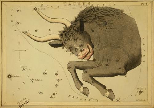
Tonight – May 2, 2018 – the dazzling planet Venus and the 1st-magnitude star Aldebaran – fiery eye of the Bull in the constellation Taurus – pair up in the west after the sun goes down. It’ll be a loose coupling, with Venus passing about 7 degrees north of Aldebaran. A typical binocular field covers about 5 degrees of sky, so the twosome probably won’t fit in same field of view.
If you live at mid-northern latitudes (US, Canada, Europe, Russia), look for Aldebaran to the lower left of Venus.
From latitudes at and close to the equator (0o latitude), Venus and Aldebaran shine pretty much side by side. So look for Aldebaran to the immediate left of Venus.
At temperate latitudes in the Southern Hemisphere (southern South America, South Africa, Australia and New Zealand), look for Aldebaran to the Venus’ upper left.
So maybe you can begin to see that we all see the same sky. It’s just our vantage points on the sky – from our various locations on Earth’s surface – that change the orientation of stars with respect to your local horizon.
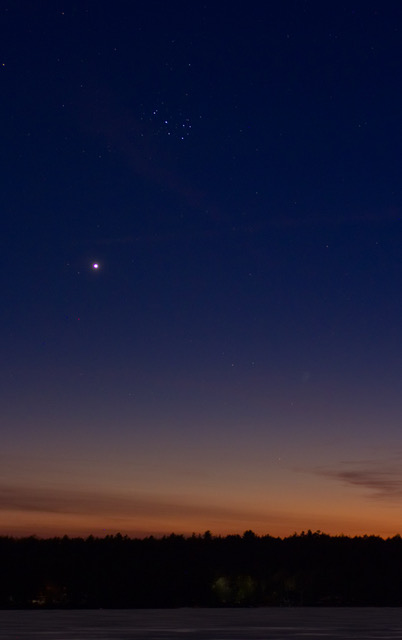
The stars of Taurus have been sinking into the sunset behind Venus. Here’s a shot of Venus from April 23, 2018 near another prominent sight in Taurus, the tiny dipper-shaped Pleiades star cluster, also known as the Seven Sisters. Photo by Alastair Borthwick at Lake Kennisis, Ontario, Canada.
What time should you look? As soon as the sky begins to darken. People with exceptional eyesight might see Venus, the third-brightest celestial body after the sun and moon, as soon as 15 minutes (or less) after sunset. Given a clear sky and an unobstructed western horizon, people around the globe will see Venus blazing away some 30 to 45 minutes after sundown.
Aldebaran is fainter. You might have to wait about an hour after sunset to spot it. Although it ranks as one of the sky’s brightest stars, Aldebaran pales next to Venus. Venus outshines this star by nearly 90 times. Binoculars will bring Aldebaran into view faster in the deepening twilight.
Just don’t wait too late to see the pair. They’ll set behind the sun in early evening.
Also, while you’re out there looking west, turn around to spot Jupiter ascending in the eastern sky. Jupiter is the sky’s second-brightest planet. If you have an unobstructed horizon in both directions, you might see both Venus and Jupiter at the same time. As the month progresses, Venus and Jupiter will become easier and easier to view in the same sky. They’ll be like two ends of a seesaw, balancing one another in the May evening twilight.
After this evening, the planet Venus will climb upward, away from the sunset. It’ll adorn the evening sky for many months to come. Meanwhile, the star Aldebaran will sink into the setting sun, to disappear from our evening sky for another season.
The constellation Taurus the Bull. Aldebaran is the Bull’s bright eye. Image via Old Book Art Image Gallery
Bottom line: On May 2, 2018, at nightfall, look for the planet Venus to pair up with the star Aldebaran in the western sky.
Tonight – May 2, 2018 – the dazzling planet Venus and the 1st-magnitude star Aldebaran – fiery eye of the Bull in the constellation Taurus – pair up in the west after the sun goes down. It’ll be a loose coupling, with Venus passing about 7 degrees north of Aldebaran. A typical binocular field covers about 5 degrees of sky, so the twosome probably won’t fit in same field of view.
If you live at mid-northern latitudes (US, Canada, Europe, Russia), look for Aldebaran to the lower left of Venus.
From latitudes at and close to the equator (0o latitude), Venus and Aldebaran shine pretty much side by side. So look for Aldebaran to the immediate left of Venus.
At temperate latitudes in the Southern Hemisphere (southern South America, South Africa, Australia and New Zealand), look for Aldebaran to the Venus’ upper left.
So maybe you can begin to see that we all see the same sky. It’s just our vantage points on the sky – from our various locations on Earth’s surface – that change the orientation of stars with respect to your local horizon.
The stars of Taurus have been sinking into the sunset behind Venus. Here’s a shot of Venus from April 23, 2018 near another prominent sight in Taurus, the tiny dipper-shaped Pleiades star cluster, also known as the Seven Sisters. Photo by Alastair Borthwick at Lake Kennisis, Ontario, Canada.
What time should you look? As soon as the sky begins to darken. People with exceptional eyesight might see Venus, the third-brightest celestial body after the sun and moon, as soon as 15 minutes (or less) after sunset. Given a clear sky and an unobstructed western horizon, people around the globe will see Venus blazing away some 30 to 45 minutes after sundown.
Aldebaran is fainter. You might have to wait about an hour after sunset to spot it. Although it ranks as one of the sky’s brightest stars, Aldebaran pales next to Venus. Venus outshines this star by nearly 90 times. Binoculars will bring Aldebaran into view faster in the deepening twilight.
Just don’t wait too late to see the pair. They’ll set behind the sun in early evening.
Also, while you’re out there looking west, turn around to spot Jupiter ascending in the eastern sky. Jupiter is the sky’s second-brightest planet. If you have an unobstructed horizon in both directions, you might see both Venus and Jupiter at the same time. As the month progresses, Venus and Jupiter will become easier and easier to view in the same sky. They’ll be like two ends of a seesaw, balancing one another in the May evening twilight.
After this evening, the planet Venus will climb upward, away from the sunset. It’ll adorn the evening sky for many months to come. Meanwhile, the star Aldebaran will sink into the setting sun, to disappear from our evening sky for another season.
The constellation Taurus the Bull. Aldebaran is the Bull’s bright eye. Image via Old Book Art Image Gallery
Bottom line: On May 2, 2018, at nightfall, look for the planet Venus to pair up with the star Aldebaran in the western sky.