aads

Measuring up: how does the UK compare internationally on cancer survival?

Illustrated map of the world.

Our ambition is that 3 in 4 people will survive their cancer by 2034. And while cancer outcomes may differ from country to country, the goal of improving cancer survival is one that’s reflected across the world.

A good way for countries to monitor their progress in improving cancer care is by comparing how many people get cancer (incidence), how many survive (survival) and how many die from their cancer (mortality) to see how they measure up. If survival is higher, and incidence and mortality are lower, it’s clear that a country is on the right track.

“No one country manages cancer perfectly,” says John Butler, a consultant specialising in gynaecological cancer surgery. “ But international studies enable countries to learn lessons from one another to with the aim of improving their own cancer policies.”

And in the latest study, published in Lancet Oncology by the International Cancer Benchmarking Partnership, some promising trends have emerged. Survival has improved for the 7 cancer types studied in all countries between 1995 and 2014.

But the figures also underline how much progress still needs to be made in the UK to equal the best outcomes globally. With the exception of ovarian and oesophageal, the UK has the lowest survival figures for the cancers studied.

What do the latest figures show?

Big, international studies like this are a task for the International Cancer Benchmarking Partnership (ICBP). Led by clinicians, researchers and policymakers from around the world, the team compare trends in cancer survival, incidence and mortality rates across seven countries with similar healthcare systems: UK, Australia, Canada, New Zealand, Denmark, Norway and Ireland. Something that’s never been done before.

Comparisons like this can be tricky – mainly because countries collect and record data in slightly different ways, something the ICBP is looking at in more detail. But despite the challenges, the latest figures from the ICBP are the best available and will only get better as more analysis is done.

The team has been collecting data from seven cancer types – ovary, lung, colon, rectum, pancreas, oesophagus and stomach – since 1995.

And the latest figures, covering 1995 to 2014, reveal some stark differences in cancer survival between countries. Generally, cancer survival is higher in Australia, Canada and Norway than in Denmark, Ireland, New Zealand and the UK.

Similar trends can be seen for individual cancer types, like lung cancer. From the graphs we can see that Australia has the highest lung cancer survival, and Ireland has made the greatest increase in survival over time. But despite big improvements in lung cancer survival, the UK remains bottom of the list for this cancer type.

The latest lung cancer survival figures from ICBP.

The latest lung cancer survival figures from ICBP.

Why is the UK lagging behind?

There are many, complex reasons that could explain why we have lower survival compared to other countries.

Butler, the lead clinical advisor for ICBP, says there are some factors that will affect survival in all cancer types. “The UK health system is under great pressure, with increasing demands on cancer diagnostics and more urgent referrals”. And that could affect survival figures. Diagnosing and treating cancer early gives patients the best chance of surviving their cancer, but it relies on having enough NHS staff and funding in place to make this a reality – something the NHS doesn’t currently have.

But there are also more specific reasons that may explain differences between countries for some cancers.
Take ovarian cancer for example. Patients diagnosed in the UK appear to be diagnosed at similar stages to other countries, but survival is lower. This suggests there could be improvements in how these patients are treated.

And as Butler elaborated, this is amplified in older patients.

Older patients are more likely to have other health problems, which often make it more challenging to perform surgery or deliver chemotherapy. More is needed to be done to understand these patients’ complex needs and improve treatments for them, as we’ve blogged about before, as well as to understand why this is an issue particularly for the UK.

But when looking at survival as a whole, it’s useful to consider where we started. In 1995, the UK had some of the lowest survival estimates of the seven countries studied. This means that even though we have made improvements in certain cancers, we’re starting from a lower baseline. Which makes it that much harder for us to catch up with the countries who have higher survival.

And it’s where comparing our progress to other countries can help.

What can we learn from other countries?

Denmark was in a similar place to the UK with their survival in 1995. But as Jesper Fisker, chief executive officer of the Danish Cancer Society, told us “There’s been great progress in Danish cancer survival – which is the result of massive efforts and investments in the cancer field over the past 20 years”.

They’ve also made major strides towards centralising their cancer services, meaning cancer patients are treated in fewer, more specialised centres, with the best clinicians for their cancer type.

And it’s paid off – Denmark has seen real improvements in cancer survival – such as increasing their 1-year survival of lung cancer from 27.5% to 46.2% (from 1995-1999 to 2010-2014). The UK has made similar efforts to improve cancer services, with some success, but much more needs to be done.

And it’s not quite as straightforward as it sounds. While Denmark has made big improvements overall, this has not been universal for every cancer type. The same is true for all the countries studied and it’s something the ICBP is working to understand. They’re looking into variations in access people have to diagnostic tests, scans and treatment, as well as differences in healthcare systems that could help to explain the disparity.

Progress for the UK

On the bright side, the UK has made particularly good progress in increasing cancer survival in rectal, ovarian, and oesophageal cancers.

For example, from 1995-1999, 48 in 100 patients were estimated to survive their rectal cancer for 5 years. This has now increased to 62 in 100 patients for 2010-2014, only 8.7% behind Australia, who had the highest rectal cancer survival of the countries studied.

Butler called the progress “encouraging” and said there were lots of factors that could be behind the improvements. The UK produced its first national cancer plan in 2000 and appointed a national cancer director, who helps provide advice and leadership for our cancer services. Since then there’s been more guidance and greater scrutiny of how cancer services are performing, as well as more funding.

There’s also been a move towards cancers being treated in specialised centres, where there will be more relevant cancer expertise.

How can the UK catch up?

But despite the improvements, there’s clearly more work to be done in the UK.

For Butler, investigations into how well cancer services are performing could be a good way to start. For example, national audits in the UK for lung cancer have increased the number of people having surgery, as well as the number of specialised lung cancer surgeons. Replicating this approach could help the NHS direct its efforts to improve outcomes for other types of cancer.

And while the UK government have introduced a range of policies between 1995-2014 to improve cancer services and speed up diagnosis and treatment, these have added to the strain on NHS services.

It’s crucial that investment into cancer services is increased to match the ever-growing demand. As Butler told us, “one of the biggest challenges the UK faces is capacity of diagnostic services.”

>> Join us in telling the Government that enough is enough with NHS staff shortages

Charlotte Lynch is a research officer in the ICBP team at Cancer Research UK 


from Cancer Research UK – Science blog https://ift.tt/2Q64OY8
Illustrated map of the world.

Our ambition is that 3 in 4 people will survive their cancer by 2034. And while cancer outcomes may differ from country to country, the goal of improving cancer survival is one that’s reflected across the world.

A good way for countries to monitor their progress in improving cancer care is by comparing how many people get cancer (incidence), how many survive (survival) and how many die from their cancer (mortality) to see how they measure up. If survival is higher, and incidence and mortality are lower, it’s clear that a country is on the right track.

“No one country manages cancer perfectly,” says John Butler, a consultant specialising in gynaecological cancer surgery. “ But international studies enable countries to learn lessons from one another to with the aim of improving their own cancer policies.”

And in the latest study, published in Lancet Oncology by the International Cancer Benchmarking Partnership, some promising trends have emerged. Survival has improved for the 7 cancer types studied in all countries between 1995 and 2014.

But the figures also underline how much progress still needs to be made in the UK to equal the best outcomes globally. With the exception of ovarian and oesophageal, the UK has the lowest survival figures for the cancers studied.

What do the latest figures show?

Big, international studies like this are a task for the International Cancer Benchmarking Partnership (ICBP). Led by clinicians, researchers and policymakers from around the world, the team compare trends in cancer survival, incidence and mortality rates across seven countries with similar healthcare systems: UK, Australia, Canada, New Zealand, Denmark, Norway and Ireland. Something that’s never been done before.

Comparisons like this can be tricky – mainly because countries collect and record data in slightly different ways, something the ICBP is looking at in more detail. But despite the challenges, the latest figures from the ICBP are the best available and will only get better as more analysis is done.

The team has been collecting data from seven cancer types – ovary, lung, colon, rectum, pancreas, oesophagus and stomach – since 1995.

And the latest figures, covering 1995 to 2014, reveal some stark differences in cancer survival between countries. Generally, cancer survival is higher in Australia, Canada and Norway than in Denmark, Ireland, New Zealand and the UK.

Similar trends can be seen for individual cancer types, like lung cancer. From the graphs we can see that Australia has the highest lung cancer survival, and Ireland has made the greatest increase in survival over time. But despite big improvements in lung cancer survival, the UK remains bottom of the list for this cancer type.

The latest lung cancer survival figures from ICBP.

The latest lung cancer survival figures from ICBP.

Why is the UK lagging behind?

There are many, complex reasons that could explain why we have lower survival compared to other countries.

Butler, the lead clinical advisor for ICBP, says there are some factors that will affect survival in all cancer types. “The UK health system is under great pressure, with increasing demands on cancer diagnostics and more urgent referrals”. And that could affect survival figures. Diagnosing and treating cancer early gives patients the best chance of surviving their cancer, but it relies on having enough NHS staff and funding in place to make this a reality – something the NHS doesn’t currently have.

But there are also more specific reasons that may explain differences between countries for some cancers.
Take ovarian cancer for example. Patients diagnosed in the UK appear to be diagnosed at similar stages to other countries, but survival is lower. This suggests there could be improvements in how these patients are treated.

And as Butler elaborated, this is amplified in older patients.

Older patients are more likely to have other health problems, which often make it more challenging to perform surgery or deliver chemotherapy. More is needed to be done to understand these patients’ complex needs and improve treatments for them, as we’ve blogged about before, as well as to understand why this is an issue particularly for the UK.

But when looking at survival as a whole, it’s useful to consider where we started. In 1995, the UK had some of the lowest survival estimates of the seven countries studied. This means that even though we have made improvements in certain cancers, we’re starting from a lower baseline. Which makes it that much harder for us to catch up with the countries who have higher survival.

And it’s where comparing our progress to other countries can help.

What can we learn from other countries?

Denmark was in a similar place to the UK with their survival in 1995. But as Jesper Fisker, chief executive officer of the Danish Cancer Society, told us “There’s been great progress in Danish cancer survival – which is the result of massive efforts and investments in the cancer field over the past 20 years”.

They’ve also made major strides towards centralising their cancer services, meaning cancer patients are treated in fewer, more specialised centres, with the best clinicians for their cancer type.

And it’s paid off – Denmark has seen real improvements in cancer survival – such as increasing their 1-year survival of lung cancer from 27.5% to 46.2% (from 1995-1999 to 2010-2014). The UK has made similar efforts to improve cancer services, with some success, but much more needs to be done.

And it’s not quite as straightforward as it sounds. While Denmark has made big improvements overall, this has not been universal for every cancer type. The same is true for all the countries studied and it’s something the ICBP is working to understand. They’re looking into variations in access people have to diagnostic tests, scans and treatment, as well as differences in healthcare systems that could help to explain the disparity.

Progress for the UK

On the bright side, the UK has made particularly good progress in increasing cancer survival in rectal, ovarian, and oesophageal cancers.

For example, from 1995-1999, 48 in 100 patients were estimated to survive their rectal cancer for 5 years. This has now increased to 62 in 100 patients for 2010-2014, only 8.7% behind Australia, who had the highest rectal cancer survival of the countries studied.

Butler called the progress “encouraging” and said there were lots of factors that could be behind the improvements. The UK produced its first national cancer plan in 2000 and appointed a national cancer director, who helps provide advice and leadership for our cancer services. Since then there’s been more guidance and greater scrutiny of how cancer services are performing, as well as more funding.

There’s also been a move towards cancers being treated in specialised centres, where there will be more relevant cancer expertise.

How can the UK catch up?

But despite the improvements, there’s clearly more work to be done in the UK.

For Butler, investigations into how well cancer services are performing could be a good way to start. For example, national audits in the UK for lung cancer have increased the number of people having surgery, as well as the number of specialised lung cancer surgeons. Replicating this approach could help the NHS direct its efforts to improve outcomes for other types of cancer.

And while the UK government have introduced a range of policies between 1995-2014 to improve cancer services and speed up diagnosis and treatment, these have added to the strain on NHS services.

It’s crucial that investment into cancer services is increased to match the ever-growing demand. As Butler told us, “one of the biggest challenges the UK faces is capacity of diagnostic services.”

>> Join us in telling the Government that enough is enough with NHS staff shortages

Charlotte Lynch is a research officer in the ICBP team at Cancer Research UK 


from Cancer Research UK – Science blog https://ift.tt/2Q64OY8

Artificial Intelligence – A Game Changer and Decisive Edge

Nations around the world are working to adopt artificial intelligence into all facets of government, industry and national security. U.S. Air Force Lt. Gen. Jack Shanahan explains how the military can address the global acceleration of AI-enabled technology.

from https://ift.tt/305QgaE
Nations around the world are working to adopt artificial intelligence into all facets of government, industry and national security. U.S. Air Force Lt. Gen. Jack Shanahan explains how the military can address the global acceleration of AI-enabled technology.

from https://ift.tt/305QgaE

Scientists detect towering balloon-like feature near Milky Way’s center

Wiggly gray outline with a bright yellow-orange blob at right angles, against black background.

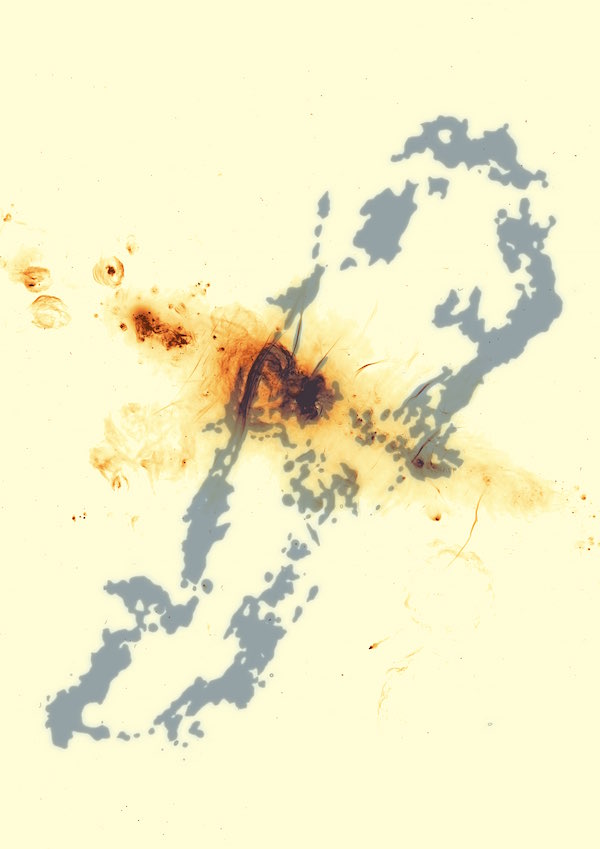
The complex radio emission from the galactic center, as imaged by the South African MeerKAT telescope. The newly-discovered giant radio bubbles are the structures running top to bottom in this image. Image via SARAO/Oxford.

Our Milky Way is considered to be a relatively quiescent galaxy, and yet it’s known to have a 4-million-solar-mass black hole at its heart, which is the source of all sorts of fascinating and dynamic processes. Today – September 11, 2019 – an international team of astronomers announced the discovery of yet another of those processes, which generates what they’re calling “one of the largest features ever observed” in the center of the Milky Way. This feature is a pair of enormous radio-emitting bubbles that tower hundreds of light-years above and below the central region of our galaxy. Some of you might recall the discovery of Fermi Bubbles nine years ago – seen at higher-energy wavelengths of light and extending vastly farther into space – and might wonder how this newly found structure relates. More about that below.

In the meantime, think about this new discovery, published today in the peer-reviewed journal Nature. Like the Fermi Bubbles, scientists describe this new feature as being hourglass-shaped. They said in a statement that it:

… dwarfs all other radio structures in the galactic center [and] is likely the result of a phenomenally energetic burst that erupted near the Milky Way’s supermassive black hole a few million years ago.

In other words, said these scientists, they believe features have formed formed from a violent eruption, presumably emanating from the vicinity of the galactic center and its supermassive black hole, which – over a short period of time – punched through the interstellar medium in opposite directions.

Long gray blob outline with dark orange blob across the center.

Image via SARAO/Oxford.

The team of astronomers that made the discovery was led by Ian Heywood of the University of Oxford in England. They used the South African Radio Astronomy Observatory (SARAO) MeerKAT telescope to map out broad regions in the center of the galaxy. They conducted their radio observations at wavelengths near 23 centimeters (about 9 inches), which, they said:

… indicates energy generated in a process known as synchrotron radiation, in which free-floating electrons are accelerated as they interact with powerful magnetic fields. This produces a characteristic radio signal that can be used to trace energetic regions in space. The radio light seen by MeerKAT penetrates the dense clouds of dust that block visible light from the center of our galaxy.

Heywood, who processed the large amount of observational data leading to this result, said:

The center of our galaxy is relatively calm when compared to other galaxies with very active central black holes. Even so, the Milky Way’s central black hole can become uncharacteristically active, flaring up as it periodically devours massive clumps of dust and gas. It’s possible that one such feeding frenzy triggered powerful outbursts that inflated this previously unseen feature.

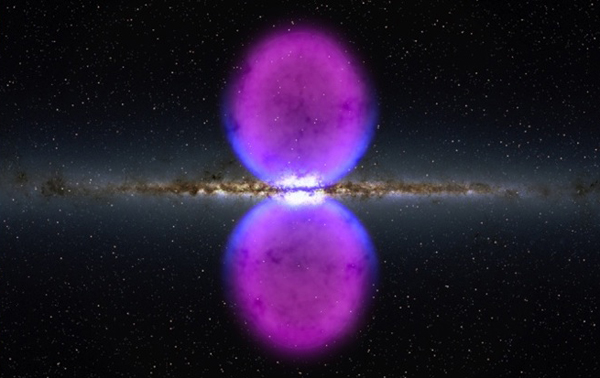
Unseen? Yes, in the radio part of the spectrum. But there’s another structure previously known by astronomers that may (or may not) be related to the discovery announced on September 11, 2019. And that is the so-called Fermi Bubbles, confirmed by high-energy gamma ray observations in 2010.

Edge-on galaxy with huge blue and magent ovals above and below it.

Hints of the Fermi Bubbles’ edges were first observed in X-rays (blue) by ROSAT, a joint German, U.S. and British X-ray observatory, which operated in space throughout the 1990s. Later, the Fermi Gamma-ray Space Telescope – launched in 2008 – confirmed the outlines of 2 vast bubbles extending for tens of thousands of light-years on either side of our galaxy’s core. Those observations are marked in magenta in this illustration. Image via NASA’s Goddard Space Flight Center.

I asked one of the authors on this new paper – Fernando Camilo, SARAO Chief Scientist in Cape Town, South Africa – how the new discovery relates to the Fermi Bubbles. He replied by email:

That’s a very good question.

The Fermi bubbles are much larger than the MeerKAT radio bubbles (about 50 times larger: some 75,000 light years in size for Fermi, 1,400 light years for MeerKAT). They are also much more energetic: the amount of energy involved in the event that inflated the MeerKAT bubbles is no more than 1% of the energy content of the Fermi bubbles.

However, they are both huge bi-polar structures, symmetric about the galactic center, near the central supermassive black hole, and so your question does arise.

Our view is that the MeerKAT bubbles may well represent a less energetic version of a process similar to that which created the Fermi Bubbles (the origin of the Fermi bubbles themselves continues to be greatly debated, and I expect that the origin of the MeerKAT bubbles will likewise elicit a range of views).

If that’s the case, the MeerKAT bubbles may well be an example of a series of such intermittent events that occasionally take place near the center of the Milky Way, governed by the black hole, the cumulative effect of which is responsible for other large scale structures seen at higher galactic latitudes (that is, away from the plane of the Milky Way), including structures seen in X-rays and, indeed, the Fermi gamma-ray Bubbles.

Camilo added:

These enormous bubbles have until now been hidden by the glare of extremely bright radio emission from the center of the galaxy. Teasing out the bubbles from the background ‘noise’ was a technical tour de force, only made possible by MeerKAT’s unique characteristics and propitious location in the Southern Hemisphere. With this unexpected discovery we’re witnessing in the Milky Way a novel manifestation of galaxy-scale outflows of matter and energy, ultimately governed by the central black hole.

A white parabolic antenna structure with swirly blue shapes against a dark sky.

A composite of the radio bubbles and the MeerKAT telescope. A radio image of the center of the Milky Way with a portion of the MeerKAT telescope array in the foreground. The plane of the galaxy is marked by a series of bright features, exploded stars and regions where new stars are being born, and runs diagonally across the image from lower right to top center. The black hole at the center of the Milky Way is hidden in the brightest of these extended regions. The radio bubbles extend from between the two nearest antennas to the upper right corner. Many magnetized filaments can be seen running parallel to the bubbles. In this composite view, the sky to the left of the second nearest antenna is the night sky visible to the unaided eye, and the radio image to the right has been enlarged to highlight its fine features. Image via SARAO/Oxford.

Bottom line: Radio astronomers have spied a pair of enormous radio-emitting bubbles that tower hundreds of light-years above and below the central region of our galaxy.

Source: Inflation of 430-Parsec Bipolar Radio Bubbles in the Galactic Centre by an Energetic Event

Via University of Oxford


from EarthSky https://ift.tt/32DzT6N

Scientists detect water vapor on distant exoplanet

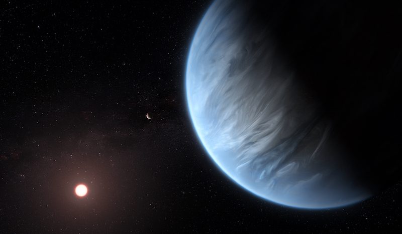
Blue planet with streaks of white and distant sun-like star.

Artist’s concept of super-Earth K2-18b, a distant world now known to have both water vapor in its atmosphere and relatively moderate temperatures. Can it – does it – support life? Image via ESA/Hubble/M. Kornmesser/UCL News.

Scientists announced another exciting discovery today (September 11, 2019) regarding potentially habitable exoplanets! For the first time, they’ve detected water vapor in the atmosphere of a distant world, in this case a super-Earth called K2-18b, orbiting a star in the direction of our constellation Leo. A star’s habitable zone is the zone where liquid water might exist. And water is essential for life as we know it. But this is the first-ever actual detection of water vapor for any exoplanet, and this planet does indeed orbit in its star’s habitable zone. That means it also has relatively moderate temperatures, by earthly standards. With confirmed water vapor and habitable temperatures, K2-18b has just become a very intriguing target in the search for life.

The peer-reviewed discovery was published in a paper today (September 11, 2019) in Nature Astronomy, by researchers from University College London (UCL). Another paper (draft version) was also published on ArXiv on September 10, 2019.

The new work marks the first overall successful atmospheric analysis of an exoplanet in the habitable zone of its star. Such studies have proven difficult due to the distances of these worlds and their smaller sizes as compared to gas giants like Jupiter.

According to Angelos Tsiaras at the UCL’s Centre for Space Exochemistry Data (CSED) and first author of the new paper:

Finding water in a potentially habitable world other than Earth is incredibly exciting. K2-18b is not ‘Earth 2.0’ as it is significantly heavier and has a different atmospheric composition. However, it brings us closer to answering the fundamental question: Is the Earth unique?

The analysis of K2-18b’s atmosphere was based on data from the Hubble Space Telescope. In this analysis, the scientists also found atmospheric hydrogen and helium. They believe nitrogen and methane might also be present, but further studies are needed to confirm that, or not. Scientists also need to figure out how cloudy the atmosphere is and how much water vapor there is, percentage-wise. They also think it’s likely that there are water clouds in K2-18b’s atmosphere as well, and possibly even rain. From the second paper:

Given the relatively low irradiation by the star, K2-18b’s temperature is low enough that the detected water vapor can plausibly condense to form liquid droplets. It is therefore possible that liquid water rain precipitates in the mid-atmosphere of K2-18b.

Co-author Giovanna Tinetti said:

Our discovery makes K2-18b one of the most interesting targets for future study. Over 4,000 exoplanets have been detected but we don’t know much about their composition and nature. By observing a large sample of planets, we hope to reveal secrets about their chemistry, formation and evolution.

As Tsiaras added:

This study contributes to our understanding of habitable worlds beyond our solar system and marks a new era in exoplanet research, crucial to ultimately place the Earth, our only home, into the greater picture of the cosmos.

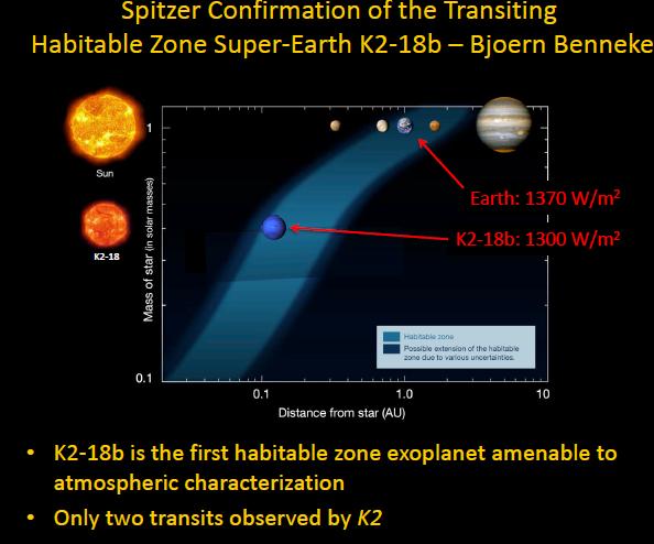
Diagram of habitable zones for different size stars.

K2-18b is the first exoplanet in a star’s habitable zone ideally suited for atmospheric analysis. Image via Upcosmos.com.

As I mentioned, K2-18b is a super-Earth, a planet larger than Earth but smaller than Neptune. It orbits the red dwarf star K2-18 every 33 days, and is 110 light-years away in the direction of the constellation Leo the Lion. NASA’s Kepler Space Telescope discovered this world in 2015. The actual conditions on the surface of the planet still aren’t known, but its red dwarf star is quite active, meaning that the planet is exposed to ultraviolet radiation that red dwarfs are famous for. However, current studies suggest that K2-18b receives about the same amount of radiation from its star as Earth does from the sun. That would be a good thing for the possibility of life. Still, there are many unknowns when it comes to other factors affecting possible habitability for this world.

A previous study said that the planet is probably either a mostly rocky planet with a small gaseous atmosphere – like Earth, but bigger – or a mostly water planet with a thick layer of ice on top of it. According to Ryan Cloutier, a Ph.D. student in the Université de Montréal Institute for Research on Exoplanets (iREx):

With the current data, we can’t distinguish between those two possibilities. But with the James Webb Space Telescope we can probe the atmosphere and see whether it has an extensive atmosphere or it’s a planet covered in water.

The Webb telescope will also have the capability of analyzing K2-18b’s atmosphere for possible biosignatures, in this case gases like oxygen or methane, that could indicate not just the possibility, but the presence of life. False positives would need to ruled out, however, as both of those gases can also be created without life being involved.

K2-18 also has another super-Earth, K2-18c, but that planet is closer to the star and not likely to be in the habitable zone. It was discovered by Cloutier in 2017.

Patchy reddish planet with hazy atmosphere orbiting a red dwarf star.

An earlier artist’s concept of K2-18b, also showing K2-18c and the red dwarf star in the background. Image via Alex Boersma/iREx.

Kepler and other telescopes have been finding exoplanets by the thousands in recent years, and many of those are super-Earths, like K2-18b. Scientists expect that many more exoplanets will continue to be discovered, some of which will be potentially habitable. As co-author Ingo Waldmann noted:

With so many new super-Earths expected to be found over the next couple of decades, it is likely that this is the first discovery of many potentially habitable planets. This is not only because super-Earths like K2-18b are the most common planets in our galaxy, but also because red dwarfs – stars smaller than our sun – are the most common stars.

Bottom line: The discovery of water vapor in the atmosphere of K2-18b is the first time that water has been found on a potentially habitable super-Earth exoplanet.

Source: Water Vapour in the Atmosphere of the Habitable-Zone Eight Earth-Mass Planet K2-18 b

Source: Water Vapor on the Habitable-Zone Exoplanet K2-18b

Via UCL News


from EarthSky https://ift.tt/2NbNHlq

Chameleons inspire 'smart skin' that changes color in the sun


A chameleon can alter the color of its skin so it either blends into the background to hide or stands out to defend its territory and attract a mate. The chameleon makes this trick look easy, using photonic crystals in its skin. Scientists, however, have struggled to make a photonic crystal “smart skin” that changes color in response to the environment, without also changing in size.

The journal ACS Nano published research led by chemists at Emory University that found a solution to the problem. They developed a flexible smart skin that reacts to heat and sunlight while maintaining a near constant volume.

“Watching a chameleon change colors gave me the idea for the breakthrough,” says first author Yixiao Dong, a PhD candidate in Emory’s Department of Chemistry. “We’ve developed a new concept for a color-changing smart skin, based on observations of how nature does it.”

Read the whole story and watch videos of the color-changing process here.

Getty Images

from eScienceCommons https://ift.tt/2I0UGcm

All you need to know: 2019’s Harvest Moon

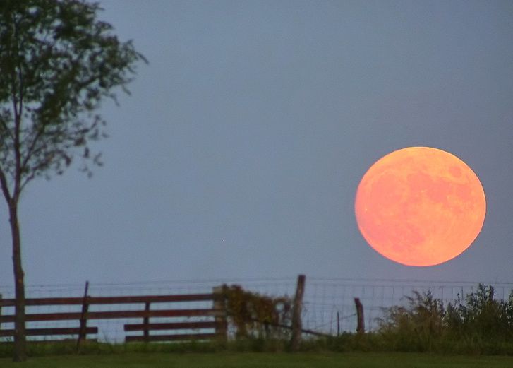
Big bright orange moon rising behind rustic country fence.

A Harvest Moon via Dan Bush of Missouri Skies.

Here in the Northern Hemisphere, we call the full moon closest to the autumn equinox the Harvest Moon. Depending on your time zone, 2019’s autumn equinox for the Northern Hemisphere comes on September 22 or 23. And the September full moon comes on the night of Friday, September 13, for the most of North America, and on September 14 for much of the rest of the world. Thus, for the Northern Hemisphere, this upcoming full moon – the full moon closest to our autumn equinox – is our Harvest Moon.

For the Southern Hemisphere, the Harvest Moon always comes in March or early April.

Harvest Moon is just a name. In some ways, it’s like any other full moon name. But these autumn full moons do have special characteristics, related to the time of moonrise. Nature is particularly cooperative in giving us full-looking moons near the horizon after sunset, for several evenings in a row, around the time of the Harvest Moon.

Left: Orange sunset over the seashore. Right: Pink full moon floating above rocky coast in twilight.

Harvest Moon sunset and moonrise – September 19, 2013 – as seen by EarthSky Facebook friend Andy Somers in Noumea, New Caledonia. One of the characteristics of the Harvest Moon is that it rises around the time of sunset for several evenings in a row.

What is a Harvest Moon? On average, the moon rises about 50 minutes later each day. But when a full moon happens close to an autumn equinox, the moon rises closer to the time of sunset. For mid-temperate latitudes, it rises only about 25 to 30 minutes later daily for several days before and after the full Harvest moon.

For very high northern latitudes, there’s even less time between successive moonrises.

The difference between 50 minutes and 30 minutes might not seem like much. But it means that, in the nights after a full Harvest Moon, you’ll see the moon ascending in the east relatively soon after sunset. The moon will rise during or near twilight on these nights, making it seem as if there are several full moons – for a few nights in a row – around the time of the Harvest Moon.

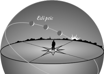
Why does this happen? Check out the illustrations below:

Diagram of celestial sphere with slanted circle around it.

In autumn, the ecliptic – marking the moon’s approximate path across our sky – makes a narrow angle with the evening horizon. Image via classicalastronomy.com.

Diagram of horizon with slanted line with several moons along it.

The narrow angle of the ecliptic means the moon rises noticeably farther north on the horizon from one night to the next. So there is no long period of darkness between sunset and moonrise. Image via classicalastronomy.com.

Is the Harvest Moon bigger, or brighter or more colorful? Not necessarily.

Because the moon’s orbit around Earth isn’t a perfect circle, the Harvest Moon’s distance from Earth – and apparent size in our sky – is a bit different from year to year. In 2019, the Harvest Moon is actually a micro-moon or mini-moon: the most distant and smallest full moon of the year. But four years ago – September 28, 2015 – the Harvest Moon was the year’s closest and biggest supermoon.

Still, in any year, you might think the Harvest Moon looks bigger or brighter or more orange. That’s because the Harvest Moon has such a powerful mystique. Many people look for it shortly after sunset around the time of full moon. After sunset around the time of any full moon, the moon will always be near the horizon. It’ll just have risen. It’s the location of the moon near the horizon that causes the Harvest Moon – or any full moon – to look big and orange in color.

The orange color of a moon near the horizon is a true physical effect. It stems from the fact that – when you look toward the horizon – you’re looking through a greater thickness of Earth’s atmosphere than when you gaze up and overhead.

The bigger-than-usual size of a moon seen near the horizon is something else entirely. It’s a trick that your eyes are playing – an illusion – called the Moon Illusion. You can find many lengthy explanations of the Moon Illusion by doing an online search for those words.

Green-lit suspension bridge with low yellow moon in deep twilight.

Jarred Donkersley caught this photo of 2016’s Harvest Moon at the Vincent Thomas Bridge in San Pedro, California.

When is the Harvest Moon in 2019? The exact time of this September’s full moon is September 14 at 04:33 Universal Time. At U.S. time zones, that translates to September 14, at 12:33 a.m. EDT – yet on Friday, September 13, at 11:33 a.m. CDT, 10:33 a.m. MDT, 9:33 a.m. PDT, 8:33 a.m. AKDT (Alaska Daylight Time), and 6:33 a.m. HST (Hawaiian Standard Time).

So watch for the Harvest Moon on September 13 or 14 … or any of the nights around then.

By the way, more often than not, the September full moon is the Northern Hemisphere’s Harvest Moon. But if the full moon occurs in early October – as it did in 2017 and will again in 2020 – the October full moon is that year’s Harvest Moon.

Large, bright, fuzzy white circle behind sharp-edged spiky leaves in silhouette.

Ed and Bettina Berg in Las Vegas, Nevada, contributed this image of the 2016 Harvest Moon.

How did the Harvest Moon get its name? The shorter-than-usual lag time between moonrises around the full Harvest Moon means no long period of darkness between sunset and moonrise for days in succession.

In the days before tractor lights, the lamp of the Harvest Moon helped farmers to gather their crops, despite the diminishing daylight hours. As the sun’s light faded in the west, the moon would soon rise in the east to illuminate the fields throughout the night.

Who named the Harvest Moon? That name probably sprang to the lips of farmers throughout the Northern Hemisphere, on autumn evenings, as the Harvest Moon aided in bringing in the crops.

The name was popularized in the early 20th century by the song below.

Shine On Harvest Moon
By Nora Bayes and Jack Norworth (1903)

Shine on, shine on harvest moon
Up in the sky,
I ain’t had no lovin’
Since January, February, June or July
Snow time ain’t no time to stay
Outdoors and spoon,
So shine on, shine on harvest moon,
For me and my gal.

And don’t miss this more recent version of the song by Leon Redbone.

Bottom line: According to skylore, the closest full moon to the autumn equinox is the Harvest Moon. In 2019, the autumnal equinox for the Northern Hemisphere comes on September 22 or 23, depending on time zone. So this hemisphere’s Harvest Moon is the full moon on the night of September 13 or 14, 2019.

Read more: What are the full moon names?


from EarthSky https://ift.tt/32EUQym

Did underground explosions create Titan’s lakes?

Looking through yellow-brown haze at a large brown Titan lake with steep walls.

Artist’s concept of a lake at the north pole of Saturn’s large moon Titan. This image illustrates the raised rims and rampart-like features seen by NASA’s Cassini spacecraft around some Titan lakes. Scientists think these features might indicate underground explosions, which carved out the lake beds long ago. Image via NASA/JPL-Caltech.

During its 13 years of scrutinizing Saturn and its moons, the Cassini spacecraft executed dozens of close flybys of the system’s largest moon, Titan. It found that Titan has a cycle much like our water cycle, with a kind of “rain,” although Titan’s rain consists of liquid methane and other organic compounds, not water. Cassini also revealed that Titan’s methane rain has filled basins on its surface, so that this frigid moon is the only world in our solar system, besides Earth, known to have stable surface lakes and seas (albeit not made of water). This week, using radar data from Cassini, scientists published a new scenario to explain why some methane-filled lakes on Titan are surrounded by steep rims that reach hundreds of feet high. The models suggests that explosions of warming nitrogen created the lake basins in the moon’s crust.

The new work was published September 9, 2019, in the peer-reviewed journal Nature Geoscience.

The study suggests that some of Titan’s smaller lakes – just tens of miles across – might have formed when pockets of liquid nitrogen in Titan’s crust warmed, turning into explosive gas that blew out craters, which then filled with liquid methane. Giuseppe Mitri of Italy’s G. d’Annunzio University and Jonathan Lunine of Cornell University in Ithaca, New York, co-authored the new study. They said their theory explains why some of the smaller lakes near Titan’s north pole, like Winnipeg Lacus, appear in radar imaging to have such very steep rims. The rims, their statement said:

… tower above [Titan’s] sea level.

Click here for a large map of Titan’s north polar lakes and seas

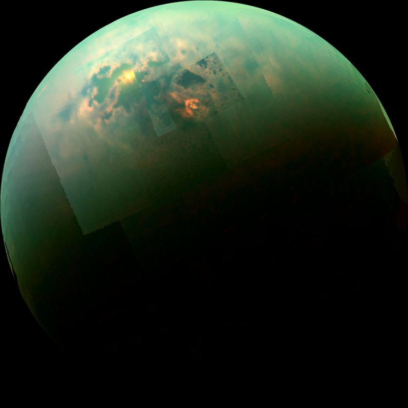
Half-lit blue-green orb. Large irregular dark area with yellow patch of sunlight.

Infrared view of seas and lakes in Titan’s northern hemisphere, taken by Cassini in 2014. Sunlight can be seen glinting off the southern part of Titan’s largest sea, Kraken Mare. Image via NASA/JPL-Caltech/University of Arizona/University of Idaho.

The rampart-like rims around some small Titan lakes are hard to explain with other models. Most alternate models of lake formation on Titan show liquid methane dissolving the moon’s bedrock of ice and solid organic compounds, carving reservoirs that fill with the liquid. On Earth, bodies of water that formed similarly, by dissolving surrounding limestone, are known as karst lakes. On Titan, this karstic model might explain some of Titan’s lakes – those with sharp boundaries – but, Mitri and Lunine believe, it does not explain all of them. Mitri commented in a statement:

… We were not finding any explanation that fit with a karstic lake basin. In reality, the morphology was more consistent with an explosion crater, where the rim is formed by the ejected material from the crater interior. It’s totally a different process.

Their statement further explained:

Over the last half-billion or billion years on Titan, methane in its atmosphere has acted as a greenhouse gas, keeping the moon relatively warm – although still cold by Earth standards. Scientists have long believed that the moon has gone through epochs of cooling and warming, as methane is depleted by solar-driven chemistry and then resupplied.

In the colder periods, nitrogen dominated the atmosphere, raining down and cycling through the icy crust to collect in pools just below the surface …

And so, said Jonathan Lunine:

These lakes with steep edges, ramparts and raised rims would be a signpost of periods in Titan’s history when there was liquid nitrogen on the surface and in the crust.

He added that even localized warming would have been enough to turn the liquid nitrogen into vapor, cause it to expand quickly and blow out a crater.

So, it seems, studies based on Cassini spacecraft data keep coming, even though Cassini itself burned up in Saturn’s atmosphere, ending its 13-year orbit around the planet, in 2017. And, scientists say, they don’t expect the mining of Cassini data to end anytime soon. Cassini Project Scientist Linda Spilker of JPL commented:

This is a completely different explanation for the steep rims around those small lakes, which has been a tremendous puzzle. As scientists continue to mine the treasure trove of Cassini data, we’ll keep putting more and more pieces of the puzzle together. Over the next decades, we will come to understand the Saturn system better and better.

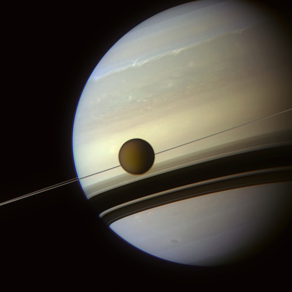
Saturn with Titan silhouetted against edge-on rings as if strung on wire.

Cassini captured this image of Saturn with its large moon, Titan, on August 29, 2012. Image via NASA/JPL-Caltech/SSI. Want to see more images? Try this collection of the most inspiring, beautiful and historic images from Cassini, from Vox.

Bottom line: A new study suggests the high rampart-like rims around some of the smaller lakes on Titan might have been caused by explosions of warming nitrogen.

Source: Possible explosion crater origin of small lake basins with raised rims on Titan

Via NASA/JPL-Caltech


from EarthSky https://ift.tt/2N9o1FS

Shedding light on black holes

Via NASA


from EarthSky https://ift.tt/34CMFEe

Via NASA


from EarthSky https://ift.tt/34CMFEe

Watch for the legendary green flash

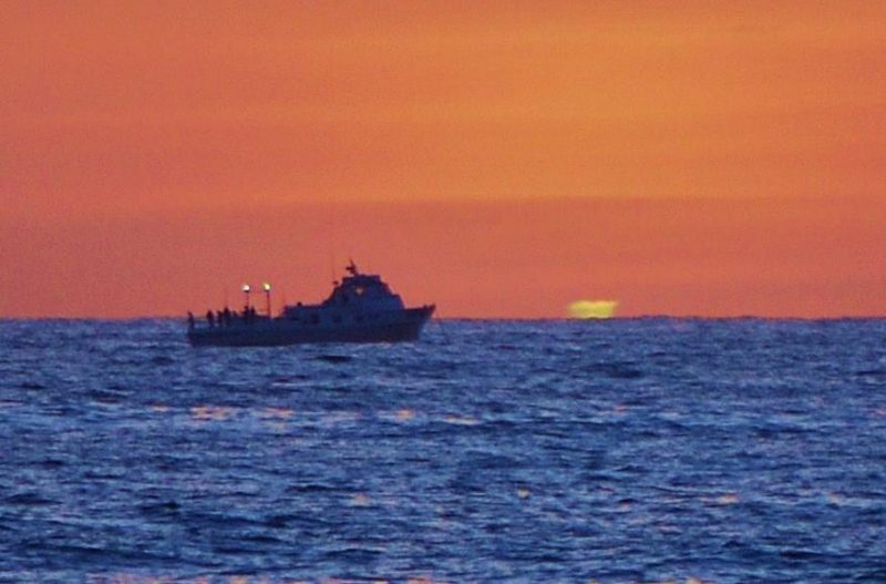
The green flash image at the top of this post was taken by Jim Grant, an EarthSky friend on Facebook. He captured it off the coast of Ocean Beach, California, and identified it a mock mirage green flash.

It’s not hard to see a green flash with the eye alone, when sky conditions are right, and when you’re looking toward a very clear and very distant horizon. That’s why those who live near an ocean tend to report green flashes most often. A sea horizon is the best place to see them.

The video below, posted to EarthSky by Vladek in 2016, is an excellent example of the experience of seeing a green flash:

Most people see green flashes just at sunset, at the last moment before the sun disappears below the horizon. Be careful and don’t look too soon. If you do look too soon, the light of the sunset will dazzle (or damage) your eyes, and you’ll miss your green flash chance that day.

But if you wait – looking away until just the thinnest rim of the sun appears above the horizon – that day’s green flash could be yours.

Of course, the green flash can be seen before sunrise, too, although it’s harder at that time of day to know precisely when to look.

Mock mirage and green flash seen from San Francisco in 2006. Image via Brocken Inaglory/Wikimedia Commons.

There are many different types of green flash. Some describe a streak or ray of the color green … like a green flame shooting up from the sunrise or sunset horizon.

The most common green flash, though – the one most people describe – is a flash of the color green seen when the sun is nearly entirely below the horizon.

Again … you need a distant horizon to see any of these phenomena, and you need a distinct edge to the horizon. That’s why these green flashes, streaks, and rays are most often seen over the ocean. But you can see them over land, too, if your horizon is far enough away.

Pollution or haze on the horizon will hide this instantaneous flash of the color green.

Jim Grant photographed this green flash on April 27, 2012, off the coast of San Diego.

If you’re interested in green flashes, Andrew Young’s green flash page is great. He also has a page of links to pictures of green flashes taken by people from around the globe.

And, of course, Les Cowley at the great website Atmospheric Optics devotes many pages to the green flash phenomenon. Notice the menu bar at the left side of the page; it’ll let you explore many different types of green flashes.

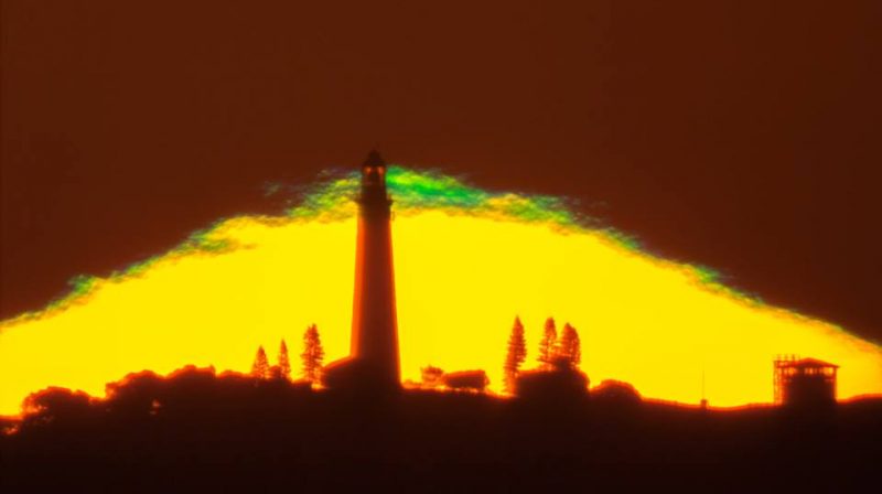
Green flash atop sun pyramid via astrophotographer Colin Legg in Australia.

Bottom line: The green flash is legendary, and some people have told us they thought it was a myth, like a unicorn or a pot of gold at the end of a rainbow. But green flashes are very real. You need a distant and exceedingly clear horizon to see them at the last moment before the sun disappears below the horizon at sunset.

Enjoying EarthSky so far? Sign up for our free daily newsletter today!

Can you see a green flash? More tips, plus more pictures


from EarthSky https://ift.tt/31enSo2

Skeptical Science New Research for Week #36, 2019

87 items this week, with 23 available as open access.

weekly-research

What are we doing on Mars?

We're from Earth, yet Included in this week's trawl of research articles are Streeter et al with Surface warming during the 2018/Mars Year 34 Global Dust Storm. Why are we visiting Mars today? Because the same storm that silenced the doughty Opportunity rover after over 14 years of operation yields an interesting research result on the dust-up's temporary effect on the Martian climate:

The impact of Mars’ 2018 Global Dust Storm (GDS) on surface and near‐surface air temperatures was investigated using an assimilation of Mars Climate Sounder (MCS) observations. Rather than simply resulting in cooling everywhere from solar absorption (average surface radiative flux fell 26 Wm‐2), the globally‐averaged result was a 0.9 K surface warming. These diurnally‐averaged surface temperature changes had a novel, highly non‐uniform spatial structure, with up to 16 K cooling/19 K warming. Net warming occurred in low thermal inertia (TI) regions, where rapid night‐time radiative cooling was compensated by increased longwave emission and scattering. This caused strong nightside warming, outweighing dayside cooling. The reduced surface‐air temperature gradient closely coupled surface and air temperatures, even causing local dayside air warming. 

Note the similar causal mechanism and ultimate effect of increased surface temperatures to what a little additional CO2 in Earth's atmosphere produces. Despite a drastic reduction of surface energy delivery to Mars, night time temperatures rose and this effect was even true to some extent in day time.

Leaving aside dust not being gaseous, the principle and concerning difference between the two is that dust rapidly drops out of the atmosphere whether on Mars or at home, while the additional CO2 we've liberated into our local thin skin of gas will require several hundred years to find a permanent new home away from where it causes deleterious effects on our climate.

Lost in thought

It's continually surprising to see the almost laconic back-and-forth exploration of abstract economic matters as they apply to climate change, which to some of us seems to lack a sense of urgency or connection to the real world. Not to pick on them but simply as they appeared in this week's haul, as an example Mallapragada & Mignone bring us A theoretical basis for the equivalence between physical and economic climate metrics and implications for the choice of Global Warming Potential time horizon

The global warming potential (GWP) is widely used in policy analysis, national greenhouse gas (GHG) accounting, and technology life cycle assessment (LCA) to compare the impact of non-CO2 GHG emissions to the impact of CO2 emissions. While the GWP is simple and versatile, different views about the appropriate choice of time horizon—and the factors that affect that choice—can impede decision-making. If the GWP is viewed as an approximation to a climate metric that more directly measures economic impact—the global damage potential (GDP)—then the time horizon may be viewed as a proxy for the discount rate. However, the validity of this equivalence rests on the theoretical basis used to equate the two metrics. In this paper, we develop a new theoretical basis for relating the GWP time horizon and the economic discount rate that avoids the most restrictive assumptions of prior studies, such as an assumed linear relationship between economic damages and temperature. We validate this approach with an extensive set of numerical experiments using an up-to-date climate emulator that represents state-dependent climate-carbon cycle feedbacks. The numerical results largely confirm the theoretical finding that, under certain reasonable assumptions, time horizons in the GWP of 100 years and 20 years are most consistent with discount rates of approximately 3% and 7% (or greater), respectively.

Introduction of the "discount rate" into thinking about climate change mitigation and adaptation costs and expenditures confuses simple and ignorant minds (such as the author of this blog entry). Application of a scrupulously calculated discount rate to the question of spending related to climate change is promised to yield a brighter future.To this layperson establishing this magic number appears to be a form of paralytic perfectionism and as well seems dependent on unreliable information about a future beyond our ken. 

As a person who spends time on boats and yet fully intends to never fall overboard, I can spend a lot or a little on a "PFD" (personal flotation device) despite knowing full well that any such expenditure large or small will be much more productively employed in a true investment even at a very poor interest rate, per the advice of economic experts. The wisdom and promised benefits of not buying a PFD hold  true until the exact moment when I pitch overboard into cold water and shortly am depending on the PFD for continued survival, at which point more riches in the future become crisply abstract. Surely if I'm dead I won't be able to grow my personal economy; staying alive appears to be a prime requirement for my successful economic outcome. Thus I choose to waste money now on a quality PFD despite it not being a rational choice in the formal economic sense.

Assuming we'll stay high and dry may drive the decision to not buy a PFD and instead invest elsewhere. Similarly, overweening fascination with and pursuit of establishing theoretically defensible discount rates in connection with climate change appears to hinge on a relatively static scenario of a functioning economy resembling to some degree what we've come to expect from the past: a machine producing more or less steady and uninterrupted growth. It seems arguable that assumptions required to model such an economy and produce an academically worthy and admirable result are not necessarily valid given the broadly agreed dire projections we face of global warming and its various knock-on disruptions; we're entering an era with challenges on a scale and breadth we've not yet encountered and so old rules may not apply.

 What am I missing?  

Ideally an actual economist would explain this in terms an ordinary layperson might understand. Coming up for air and offering some conclusions with clear directions based on the assumption we will be falling overboard and indeed have already lost our grip and footing— are clumsily plunging over the lifelines into a life-threatening circumstance— would be very helpful. Is there an argument for obtaining a PFD, the notionally irrational choice to spend money to buy some better luck, a wager to help assure a future?

Articles:

Observation of climate warming

Influence of instrumentation on long temperature time series

Key Uncertainties in the Recent Air‐Sea Flux of CO2

Linking Global Changes of Snowfall and Wet-bulb Temperature

Gap filling of monthly temperature data and its effect on climatic variability and trends

How accurate are modern climate reanalyses for the data-sparse Tibetan Plateau region?

Analysis of total column CO2 and CH4 measurements in Berlin with WRF-GHG (open access)

Impact of warming shelf waters on ice mélange and terminus retreat at a large SE Greenland glacier (open access)

Strong changes in englacial temperatures despite insignificantchanges in ice thickness at Dôme du Goûter glacier (Mont-Blanc area) (open access)

A long-term dataset of climatic mass balance, snow conditions, and runoff in Svalbard (1957–2018) (open access)

Is deoxygenation detectable before warming in the thermocline? (open access)

Half a century of satellite remote sensing of sea-surface temperature

Remote sensing of glacier and ice sheet grounding lines: A review

Analyses of observed features and future trend of extreme temperature events in Inner Mongolia of China

Chaotic signature of climate extremes

Characteristics of observed rainfall over Odisha: An extreme vulnerable zone in the east coast of India

HadUK‐Grid—A new UK dataset of gridded climate observations (open access)

Physical science of global warming

Revised estimates of paleoclimate sensitivity over the past 800,000 years

Indian Ocean Warming Trend Reduces Pacific Warming Response to Anthropogenic Greenhouse Gases: An Interbasin Thermostat Mechanism

Ocean heat transport into the Barents Sea: Distinct controls on the upward trend and interannual variability

Warm Events Induce Loss of Resilience in Organic Carbon Production in the Northeast Pacific Ocean

Surface warming during the 2018/Mars Year 34 Global Dust Storm

Dynamics and thermodynamics of the mean Transpolar Drift and ice thickness in the Arctic Ocean

Brief communication: A submarine wall protecting the Amundsen Sea intensifies melting of neighboring ice shelves (open access)

Changes in the sensitivity of tropical rainfall response to local sea surface temperature anomalies under global warming

A review of the major drivers of the terrestrial carbon uptake: model-based assessments, consensus, and uncertainties (open access)

A missing component of Arctic warming: black carbon from gas flaring (open access)

Proglacial freshwaters are significant and previously unrecognized sinks of atmospheric CO2 (open access)

Biology of the warming planet

Biogeochemical anomalies at two southern California Current System moorings during the 2014‐16 Warm Anomaly‐El Niño sequence

Influence of late Quaternary climate on the biogeography of Neotropical aquatic species as reflected by non-marine ostracodes (open access)

Projecting marine species range shifts from only temperature can mask climate vulnerability

Secondary forest fragments offer important carbon‐biodiversity co‐benefits

Climate warming alters subsoil but not topsoil carbon dynamics in alpine grassland

Multiple stressor effects on coral reef ecosystems

Role of suspension feeders in antarctic pelagic-benthic coupling: Trophic ecology and potential carbon sinks under climate change

Effects of long-term exposure to reduced pH conditions on the shell and survival of an intertidal gastropod

Microbial responses to warming enhance soil carbon loss following translocation across a tropical forest elevation gradient

Modeling the warming climate

Sahelian precipitation change induced by SST increase: the contrasting roles of regional and larger‐scale drivers

Probing the Sources of Uncertainty in Transient Warming on Different Time‐Scales

Nonlinear response of extreme precipitation to warming in CESM1

Projected changes in daily variability and seasonal cycle of near-surface air temperature over the globe during the 21st century

Reproducing Internal Variability with Few Ensemble Runs

A modeling and process-oriented study to investigate the projected change of ENSO-forced wintertime teleconnectivity in a warmer world

Re-examining the first climate models: Climate sensitivity of a modern radiative-convective equilibrium model

Enhanced climate change response of wintertime North Atlantic circulation, cyclonic activity and precipitation in a 25 km-resolution global atmospheric model

Intercomparison and improvement of two-stream shortwave radiative transfer schemes in Earth system models for a unified treatment of cryospheric surfaces (open access)

Modeling the response of Greenland outlet glaciers to global warming using a coupled flow line–plume model (open access)

Applicability and consequences of the integration of alternative models for CO2 transfer velocity into a process-based lake model (open access)

Remapping of Greenland ice sheet surface mass balance anomalies for large ensemble sea-level change projections (open access)

Projected changes in mid‐high latitude Eurasian climate during boreal spring in a 1.5oC and 2oC warmer world

Climate projections for glacier change modelling over the Himalayas

Statistical downscaling to project extreme hourly precipitation over the UK

Projected changes in rainfall and temperature over the Philippines from multiple dynamical downscaling models

Humans deal with our warming the climate

Evaluating climate change adaptation pathways through capital assessment: five case studies of forest social-ecological systems in France

The impact of climate change and variability on coffee production: a systematic review

The impact of temperature on mortality across different climate zones

A theoretical basis for the equivalence between physical and economic climate metrics and implications for the choice of Global Warming Potential time horizon (open access)

Social preferences for distributive outcomes of climate policy

Macro-economic analysis of green growth policies: the role of finance and technical progress in Italian green growth

Linking scales and disciplines: an interdisciplinary cross-scale approach to supporting climate-relevant ecosystem management (open access)

Does it matter if you “believe” in climate change? Not for coastal home vulnerability

Temperature and production efficiency growth: empirical evidence

Yield implications of date and cultivar adaptation to wheat phenological shifts: a survey of farmers in Turkey

Planned retreat in Global South megacities: disentangling policy, practice, and environmental justice

Climate change, natural hazards, and relocation: insights from Nabukadra and Navuniivi villages in Fiji

The accuracy of German citizens’ confidence in their climate change knowledge

Gendered perceptions of climate variability, food insecurity, and adaptation practices in Nepal (open access)

The future of agriculture and food: Evaluating the holistic costs and benefits

Evaluating China's water security for food production: The role of rainfall and irrigation

Characterization of Extreme Wet‐Bulb Temperature Events in Southern Pakistan

Neglecting the urban? Exploring rural-urban disparities in the climate change–conflict literature on Sub-Sahara Africa

Global adaptation governance: An emerging but contested domain

Indigenous perceptions of climate anomalies in Malaysian Borneo

Valuation of nature and nature’s contributions to people (open access)

Rules to goals: emergence of new governance strategies for sustainable development (open access)

Energy demand transitions and climate mitigation in low-income urban households in India (open access)

Harvesting big data from residential building energy performance certificates: retrofitting and climate change mitigation insights at a regional scale (open access)

Urbanization and CO 2 emissions in resource-exhausted cities: evidence from Xuzhou city, China

The global cropland footprint of Denmark's food supply 2000–2013

Potentials and opportunities for low carbon energy transition in Vietnam: A policy analysis

Analysis of carbon tax efficiency in energy industries of selected EU countries

Quantifying carbon for agricultural soil management: from the current status toward a global soil information system (open access)

Carbon capture induced changes in Deccan basalt: a mass‐balance approach

Suggestions

Please let us know if you're aware of an article you think may be of interest for Skeptical Science research news, or if we've missed something that may be important. Send your input to Skeptical Science via our contact form.

The previous edition of Skeptical Science new research may be found here. 


from Skeptical Science https://ift.tt/303wuwb

NHS diaries: ‘It’s the most stressful organisation I’ve worked in in my life’

NHS hospital bicycle

Diagnosing cancer at its earliest and most treatable stages is vital to help more people survive their cancer. But it requires the Government to ensure there are enough NHS staff in place.

Dawn Chaplin is a consultant radiographer.

Dawn Chaplin, a consultant radiographer, has seen her clinics get busier and busier over the years.

Dawn Chaplin, a consultant radiographer who diagnoses breast cancer, shares her experiences of working for a short-staffed and overstretched NHS.

“It’s very, very difficult – rewarding and unrewarding. I love my job and what I do, but the expectations are unrealistic,” she says.

Chaplin’s role involves taking breast scans and interpreting results, as well as taking biopsies of any lumps she sees. She worked full-time for the NHS for 10 years, before switching to work short-term contracts. She says the pressures have increased year on year.

“It’s completely changed over the last few years, the number of patients we’re expected to deal with has just increased beyond belief for the number of staff.”

Too many patients, not enough time

Chaplin typically runs two clinics a day, one in the morning and one in the afternoon.

“My clinics are enormous now, I’m expected see around 22 patients in my clinic, whereas I would be seeing 12-14 before.”

Despite the increase in numbers, Chaplin says she’s expected to complete each clinic in the same amount of time. This often means one clinic runs into another.

“Last Thursday, the clinic that was due to finish at 12.30pm actually finished at 2pm. But my afternoon clinic was supposed to start at 1.30pm, so already there were patients waiting for the next clinic while you’re still doing the first.”

This isn’t unusual. It means Chaplin rarely has time for a break, leaving her feeling that she’s “on a hamster wheel all the time”. This means more evening and weekend work to catch up.

But it’s not just her wellbeing that’s being affected, she thinks it’s having a big impact on patients too.

“They don’t get as much time with us as they used to be able to get. You try to give the patient as much time as you can but you’re always aware that there are 10 patients waiting outside to come in as well.”

And for Chaplin, the potential consequences are huge.

“Ultimately, I’m worried that people are going to die, because there’s just not enough people to diagnose the cancers in a timely manner.”

Chaplin fears a delay in cancer diagnosis could mean cancers present when they’re bigger, more advanced and more difficult to treat. “I worry it may lead to people dying earlier than they should,” she adds.

‘It’s the same across the country’

This isn’t an isolated problem, says Chaplin, having worked in many hospitals across the country and had the same conversations with colleagues. And it’s having a big impact on staff.

“People with fantastic skills, lovely, hardworking and dedicated people, are leaving to go and work elsewhere – outside the NHS and overseas – for more money and half the amount of stress,” she says.

According to analysis done on NHS staff survey results from 2018, almost 1 in 5 (18%) people are considering leaving the NHS to:

  • take up a position in healthcare outside the NHS;
  • retire or take an extended break; or
  • take up a role outside of healthcare.

That’s on top of the 1 in 10 NHS diagnostic staff jobs that are already unfilled in England. “It’s the most stressful organisation I’ve worked in in my life,” says Chaplin. And this includes time in the RAF.

Time to act

It’s in the hands of the Government to make sure there are enough staff to diagnose and treat cancer early. And with cancer rates increasing and the government target to diagnose 3 in 4 cancers early by 2028, the pressure faced by NHS staff is only going to grow.

“I think the NHS is definitely in crisis, despite what the Government is saying. We need more staff.”

>> Join us in telling the Government you want thousands more lives to be saved by diagnosing cancer early


from Cancer Research UK – Science blog https://ift.tt/2A4Z9qb

adds 2