A scientist would never tolerate statements about climate change that weren't based on scientific research and empirical evidence. However, the same evidentiary standards don't always seem to apply to statements about how to communicate about climate change. For example, on the topic of communicating the scientific consensus on human-caused global warming, there are lots of opinions on whether communicating the scientific consensus is effective or not. Many of these opinions are not based on the body of empirical research into consensus messaging.
So this post is a summary of the empirical research into consensus messaging and how people think about consensus. In psychological research, public perception of scientific consensus has been found to be so important that researchers now describe this dynamic as the Gateway Belief Model. This model finds that communicating the scientific consensus on climate change increased beliefs about climate change, which subsequently increases public support for climate policy. The vast majority of research in this field either confirms the Gateway Belief Model or confirms the efficacy of consensus messaging.
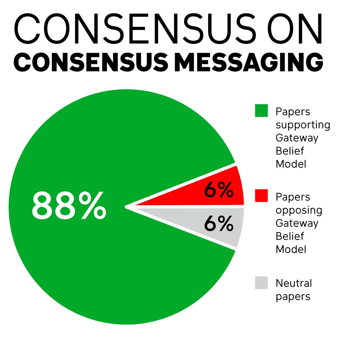
The following table lists any papers that test either consensus messaging or the Gateway Belief Model. Studies are either correlational (surveys that explore whether there's an association between perceived consensus and other climate beliefs) or experimental (randomized tests that measure the impact of consensus messaging). The Country column lists which countries the participants come from. The Support column indicates whether the study supports the Gateway Belief Model or the positive effect of consensus messaging.
Table: Studies into the Gateway Belief Model or Consensus Messaging
| Author (year) | Study type | Country | Finding | Support | |
| 1 | Malka et al. (2009) | Correlational | USA | Perceived consensus mediates association of knowledge with climate concern among Democrats and Independents who trust scientists. | Y |
| 2 | Ding et al. (2011) | Correlational | USA | Low perceived consensus is associated with lower climate beliefs and lower policy support. | Y |
| 3 | Lewandowsky et al. (2013) | Experimental | Australia | Consensus messaging increases acceptance of AGW. | Y |
| 4 | Rolfe-Redding et al. (2011) | Correlational | USA | Perceived consensus predicts climate beliefs and attitudes among Republicans. | Y |
| 5 | McCright et al. (2013) | Correlational | USA | Perceived consensus affects policy support, mediated by global warming beliefs. | Y |
| 6 | Aklin & Urpelainen (2014) | Experimental | USA | Modest amounts of scientific dissent undermine public support for environmental policy. | Y |
| 7 | Bolsen et al. (2014) | Experimental | USA | Consensus messaging reduces partisan differences on behavioral intent and belief in AGW. | Y |
| 8 | van der Linden et al. (2014) | Experimental | USA | Consensus messaging (in pie-chart form) reduces partisan difference in perceived consensus. | Y |
| 9 | Myers et al. (2015) | Experimental | USA | Consensus messaging is equally effective among liberals and conservatives. | Y |
| 10 | van der Linden et al. (2015) | Experimental | USA | Increasing perceived consensus is significantly and causally associated with climate beliefs, which predicts increased policy support. | Y |
| 11 | Cook & Lewandowsky (2016) | Experimental | Australia, USA | Consensus messaging reduces partisan differences on belief in AGW for Australians. It increases partisan differences for Americans but still have an overall positive effect on belief in AGW. | Y |
| 12 | Deryugina & Shurchkov (2016) | Experimental | USA | Consensus messaging increases acceptance of climate change and human causation. | Y |
| 13 | Hamilton (2016) | Correlational | USA | Acceptance of AGW correlates with perceived consensus. | Y |
| 14 | Hornsey et al. (2016) | Correlational | USA, UK, Australia, 30 European countries | Perceived consensus is a strong predictor of belief in climate change (stronger than cultural cognition). | Y |
| 15 | Schuldt & Pearson (2016) | Correlational | USA | Perceived consensus is associated with mitigation support for both whites and non-whites. | Y |
| 16 | Brewer & McKnight (2017) | Experimental | USA | Comedy segment about consensus has strongest effect on belief in climate change among participants with low interest in the environment. | Y |
| 17 | Cook et al. (2017) | Experimental | USA | Consensus messaging neutralizes polarizing influence of misinformation. | Y |
| 18 | Dixon et al. (2017) | Experimental | USA | Consensus messaging does not produce significant effects (including no backfire effect among conservatives). | Neutral |
| 19 | van der Linden et al. (2017a) | Experimental | USA | Consensus messaging reduces partisan differences on perceived consensus. | Y |
| 20 | Bolsen & Druckman (2018a) | Experimental | USA | Consensus messaging backfires with conspiracy theorists, but consensus messaging coupled with belief validation increases acceptance of AGW among conspiracy theorists. | Neutral |
| 21 | Bolsen & Druckman (2018b) | Experimental | USA | Consensus message increases perceived consensus with indirect effect on belief in AGW and policy support. | Y |
| 22 | Harris et al. (2018) | Experimental | UK | Consensus messaging increases perceived consensus and climate beliefs. | Y |
| 23 | Kerr & Wilson (2018a) | Correlational | New Zealand | Perceived consensus does not predict later personal climate beliefs. | N |
| 24 | Kerr & Wilson (2018b) | Experimental | New Zealand | Consensus messaging increases perceived consensus with indirect effect on belief in AGW. | Y |
| 25 | Kobayashi (2018b) |
Correlational, Experimental |
Japan | Perceived consensus predicts climate beliefs. Consensus messaging increases climate beliefs through perceived consensus. | Y |
| 26 | Tom (2018) | Correlational | USA | Misconception about consensus is one of the most important factors in predicting scientifically deviant beliefs. | Y |
| 27 | van der Linden et al. (2018b) | Correlational | USA | Perceived consensus did predict later personal climate beliefs. | Y |
| 28 | Zhang et al. (2018) | Experimental | USA | Consensus messaging is most effective in conservative parts of the USA. | Y |
| 29 | Bertoldo et al. (2019) | Correlational | UK, France, Germany, & Norway | Perceived consensus predicts belief in anthropogenic climate change with the relationship moderated by whether people’s model of science is “truth” vs “debate.” | Y |
| 30 | Goldberg et al. (2019) | Experimental | USA | Consensus messaging reduces partisan differences on perceived consensus. | Y |
| 31 | Ma et al. (2019) | Experimental | Consensus messaging produces reactance among conservative dismissives. | N | |
| 32 | van der Linden et al. (2019a) | Experimental | USA | Consensus messaging increased climate beliefs and attitudes, which were associated with increases in support for action. Conservatives showed greater belief updates. | Y |
| 33 | van der Linden et al. (2019b) | Experimental | USA | No evidence of psychological reactance in response to consensus messaging among Republicans, conservatives, or those with dismissive prior views. | Y |
This is a quickly growing body of literature and I will continue to add to this list as more studies are published (so please don't hesitate to let me know if there are new studies or if I missed any).
References
Aklin, M., & Urpelainen, J. (2014). Perceptions of scientific dissent undermine public support for environmental policy. Environmental Science & Policy, 38, 173-177.
Bertoldo, R., Mays, C., Böhm, G., Poortinga, W., Poumadere, M., Tvinnereim, E., Arnold, A.,Steentjes, K., & Pidgeon, N. (2019). Scientific truth or debate: On the link between perceived scientific consensus and belief in anthropogenic climate change. Public Understanding of Science, https://doi.org/10.1177/0963662519865448
Bolsen, T., Leeper, T. J., & Shapiro, M. A. (2014). Doing What Others Do Norms, Science, and Collective Action on Global Warming. American Politics Research, 42(1), 65-89.
Bolsen, T. and Druckman, J.N., (2018a). Validating Conspiracy Beliefs and Effectively Communicating Scientific Consensus. Weather, Climate, and Society, 10(3), pp.453-458.
Bolsen, T., & Druckman, J. N. (2018b). Do partisanship and politicization undermine the impact of a scientific consensus message about climate change? Group Processes & Intergroup Relations, 21(3), 389-402.
Brewer, P. R., & McKnight, J. (2017). “A Statistically Representative Climate Change Debate”: Satirical Television News, Scientific Consensus, and Public Perceptions of Global Warming. Atlantic Journal of Communication, 25(3), 166-180.
Cook, J. & Lewandowsky, S. (2016). Rational Irrationality: Modeling Climate Change Belief Polarization Using Bayesian Networks. Topics in Cognitive Science, 8(1), 160-179.
Cook, J., Lewandowsky, S., & Ecker, U. K. (2017). Neutralizing misinformation through inoculation: Exposing misleading argumentation techniques reduces their influence. PLoS One, 12(5), e0175799.
Deryugina, T., & Shurchkov, O. (2016). The Effect of Information Provision on Public Consensus about Climate Change. PLoS One, 11(4), e0151469.
Ding, D., Maibach, E. W., Zhao, X., Roser-Renouf, C., & Leiserowitz, A. (2011). Support for climate policy and societal action are linked to perceptions about scientific agreement. Nature Climate Change, 1(9), 462-466.
Dixon, G., Hmielowski, J., & Ma, Y. (2017). Improving Climate Change Acceptance Among US Conservatives Through Value-Based Message Targeting. Science Communication, 1075547017715473.
Goldberg, M. H., van der Linden, S., Ballew, M. T., Rosenthal, S. A., & Leiserowitz, A. (2019). The role of anchoring in judgments about expert consensus. Journal of Applied Social Psychology, e0001.
Hamilton, L. C. (2016). Public Awareness of the Scientific Consensus on Climate. SAGE Open, 6(4), 2158244016676296.
Harris, A. J., Sildmäe, O., Speekenbrink, M., & Hahn, U. (2018). The potential power of experience in communications of expert consensus levels. Journal of Risk Research, 1-17.
Hornsey, M. J., Harris, E. A., Bain, P. G., Fielding, K. S. (2016). Meta-analyses of the determinants and outcomes of belief in climate change. Nature Climate Change, DOI: 10.1038/NCLIMATE2943.
Kerr, J. R., & Wilson, M. S. (2018a). Changes in perceived scientific consensus shift beliefs about climate change and GM food safety. PloS One, 13(7), e0200295.
Kerr, J. R., & Wilson, M. S. (2018b). Perceptions of scientific consensus do not predict later beliefs about the reality of climate change: A test of the gateway belief model using cross-lagged panel analysis. Journal of Environmental Psychology.
Kobayashi, K. (2018b). The Impact of Perceived Scientific and Social Consensus on Scientific Beliefs. Science Communication, 40(1), 63-88.
Lewandowsky, S., Gignac, G. E., & Vaughan, S. (2013). The pivotal role of perceived scientific consensus in acceptance of science. Nature Climate Change, 3(4), 399-404.
Ma, Y., Dixon, G., & Hmielowski, J. D. (2019). Psychological Reactance From Reading Basic Facts on Climate Change: The Role of Prior Views and Political Identification. Environmental Communication: A Journal of Nature and Culture, 13(1), 71-86.
Malka, A., Krosnick, J. A., & Langer, G. (2009). The association of knowledge with concern about global warming: Trusted information sources shape public thinking. Risk Analysis, 29(5), 633-647.
McCright, A. M., Dunlap, R. E., & Xiao, C. (2013). Perceived scientific agreement and support for government action on climate change in the USA. Climatic Change, 119(2), 511-518.
Myers, T. A., Maibach, E., Peters, E., & Leiserowitz, A. (2015). Simple Messages Help Set the Record Straight about Scientific Agreement on Human-Caused Climate Change: The Results of Two Experiments. PloS One, 10(3), e0120985-e0120985.
Rolfe-Redding, J., Maibach, E. W., Feldman, L., & Leiserowitz, A. (2011). Republicans and climate change: An audience analysis of predictors for belief and policy preferences. Available at SSRN 2026002. [accessed 6 Feb 2019]. http://papers.ssrn.com/abstract=2026002
Schuldt, J. P., & Pearson, A. R. (2016). The role of race and ethnicity in climate change polarization: evidence from a US national survey experiment. Climatic Change, 136(3-4), 495-505.
Tom, J. C. (2018). Social Origins of Scientific Deviance: Examining Creationism and Global Warming Skepticism. Sociological Perspectives, 0731121417710459.
van der Linden, S. L., Leiserowitz, A. A., Feinberg, G. D., & Maibach, E. W. (2014). How to communicate the scientific consensus on climate change: plain facts, pie charts or metaphors? Climatic Change, 126(1-2), 255-262.
van der Linden, S., Leiserowitz, A. A., Feinberg, G. D., & Maibach, E. W. (2015). The scientific consensus on climate change as a gateway belief: Experimental evidence. PLoS One, 10(2), e0118489.
van der Linden, S., Leiserowitz, A., Rosenthal, S., & Maibach, E. (2017a). Inoculating the public against misinformation about climate change. Global Challenges, 1(2), 1600008.
van der Linden, S., Leiserowitz, A., & Maibach, E. (2018b). Perceptions of scientific consensus predict later beliefs about the reality of climate change using cross-lagged panel analysis: A response to Kerr and Wilson (2018). Journal of Environmental Psychology, 60, 110-111.
van der Linden, S., Leiserowitz, A., & Maibach, E. (2019a). The gateway belief model: A large-scale replication. Journal of Environmental Psychology, 62, 49-58.
van der Linden, S., Maibach, E., & Leiserowitz, A. (2019b). Exposure to Scientific Consensus Does Not Cause Psychological Reactance. Environmental Communication, 1-8.
Zhang, B., van der Linden, S., Mildenberger, M., Marlon, J. R., Howe, P. D., & Leiserowitz, A. (2018). Experimental effects of climate messages vary geographically. Nature Climate Change, 8(5), 370.
from Skeptical Science https://ift.tt/2OSGBUC
A scientist would never tolerate statements about climate change that weren't based on scientific research and empirical evidence. However, the same evidentiary standards don't always seem to apply to statements about how to communicate about climate change. For example, on the topic of communicating the scientific consensus on human-caused global warming, there are lots of opinions on whether communicating the scientific consensus is effective or not. Many of these opinions are not based on the body of empirical research into consensus messaging.
So this post is a summary of the empirical research into consensus messaging and how people think about consensus. In psychological research, public perception of scientific consensus has been found to be so important that researchers now describe this dynamic as the Gateway Belief Model. This model finds that communicating the scientific consensus on climate change increased beliefs about climate change, which subsequently increases public support for climate policy. The vast majority of research in this field either confirms the Gateway Belief Model or confirms the efficacy of consensus messaging.
The following table lists any papers that test either consensus messaging or the Gateway Belief Model. Studies are either correlational (surveys that explore whether there's an association between perceived consensus and other climate beliefs) or experimental (randomized tests that measure the impact of consensus messaging). The Country column lists which countries the participants come from. The Support column indicates whether the study supports the Gateway Belief Model or the positive effect of consensus messaging.
Table: Studies into the Gateway Belief Model or Consensus Messaging
| Author (year) | Study type | Country | Finding | Support | |
| 1 | Malka et al. (2009) | Correlational | USA | Perceived consensus mediates association of knowledge with climate concern among Democrats and Independents who trust scientists. | Y |
| 2 | Ding et al. (2011) | Correlational | USA | Low perceived consensus is associated with lower climate beliefs and lower policy support. | Y |
| 3 | Lewandowsky et al. (2013) | Experimental | Australia | Consensus messaging increases acceptance of AGW. | Y |
| 4 | Rolfe-Redding et al. (2011) | Correlational | USA | Perceived consensus predicts climate beliefs and attitudes among Republicans. | Y |
| 5 | McCright et al. (2013) | Correlational | USA | Perceived consensus affects policy support, mediated by global warming beliefs. | Y |
| 6 | Aklin & Urpelainen (2014) | Experimental | USA | Modest amounts of scientific dissent undermine public support for environmental policy. | Y |
| 7 | Bolsen et al. (2014) | Experimental | USA | Consensus messaging reduces partisan differences on behavioral intent and belief in AGW. | Y |
| 8 | van der Linden et al. (2014) | Experimental | USA | Consensus messaging (in pie-chart form) reduces partisan difference in perceived consensus. | Y |
| 9 | Myers et al. (2015) | Experimental | USA | Consensus messaging is equally effective among liberals and conservatives. | Y |
| 10 | van der Linden et al. (2015) | Experimental | USA | Increasing perceived consensus is significantly and causally associated with climate beliefs, which predicts increased policy support. | Y |
| 11 | Cook & Lewandowsky (2016) | Experimental | Australia, USA | Consensus messaging reduces partisan differences on belief in AGW for Australians. It increases partisan differences for Americans but still have an overall positive effect on belief in AGW. | Y |
| 12 | Deryugina & Shurchkov (2016) | Experimental | USA | Consensus messaging increases acceptance of climate change and human causation. | Y |
| 13 | Hamilton (2016) | Correlational | USA | Acceptance of AGW correlates with perceived consensus. | Y |
| 14 | Hornsey et al. (2016) | Correlational | USA, UK, Australia, 30 European countries | Perceived consensus is a strong predictor of belief in climate change (stronger than cultural cognition). | Y |
| 15 | Schuldt & Pearson (2016) | Correlational | USA | Perceived consensus is associated with mitigation support for both whites and non-whites. | Y |
| 16 | Brewer & McKnight (2017) | Experimental | USA | Comedy segment about consensus has strongest effect on belief in climate change among participants with low interest in the environment. | Y |
| 17 | Cook et al. (2017) | Experimental | USA | Consensus messaging neutralizes polarizing influence of misinformation. | Y |
| 18 | Dixon et al. (2017) | Experimental | USA | Consensus messaging does not produce significant effects (including no backfire effect among conservatives). | Neutral |
| 19 | van der Linden et al. (2017a) | Experimental | USA | Consensus messaging reduces partisan differences on perceived consensus. | Y |
| 20 | Bolsen & Druckman (2018a) | Experimental | USA | Consensus messaging backfires with conspiracy theorists, but consensus messaging coupled with belief validation increases acceptance of AGW among conspiracy theorists. | Neutral |
| 21 | Bolsen & Druckman (2018b) | Experimental | USA | Consensus message increases perceived consensus with indirect effect on belief in AGW and policy support. | Y |
| 22 | Harris et al. (2018) | Experimental | UK | Consensus messaging increases perceived consensus and climate beliefs. | Y |
| 23 | Kerr & Wilson (2018a) | Correlational | New Zealand | Perceived consensus does not predict later personal climate beliefs. | N |
| 24 | Kerr & Wilson (2018b) | Experimental | New Zealand | Consensus messaging increases perceived consensus with indirect effect on belief in AGW. | Y |
| 25 | Kobayashi (2018b) |
Correlational, Experimental |
Japan | Perceived consensus predicts climate beliefs. Consensus messaging increases climate beliefs through perceived consensus. | Y |
| 26 | Tom (2018) | Correlational | USA | Misconception about consensus is one of the most important factors in predicting scientifically deviant beliefs. | Y |
| 27 | van der Linden et al. (2018b) | Correlational | USA | Perceived consensus did predict later personal climate beliefs. | Y |
| 28 | Zhang et al. (2018) | Experimental | USA | Consensus messaging is most effective in conservative parts of the USA. | Y |
| 29 | Bertoldo et al. (2019) | Correlational | UK, France, Germany, & Norway | Perceived consensus predicts belief in anthropogenic climate change with the relationship moderated by whether people’s model of science is “truth” vs “debate.” | Y |
| 30 | Goldberg et al. (2019) | Experimental | USA | Consensus messaging reduces partisan differences on perceived consensus. | Y |
| 31 | Ma et al. (2019) | Experimental | Consensus messaging produces reactance among conservative dismissives. | N | |
| 32 | van der Linden et al. (2019a) | Experimental | USA | Consensus messaging increased climate beliefs and attitudes, which were associated with increases in support for action. Conservatives showed greater belief updates. | Y |
| 33 | van der Linden et al. (2019b) | Experimental | USA | No evidence of psychological reactance in response to consensus messaging among Republicans, conservatives, or those with dismissive prior views. | Y |
This is a quickly growing body of literature and I will continue to add to this list as more studies are published (so please don't hesitate to let me know if there are new studies or if I missed any).
References
Aklin, M., & Urpelainen, J. (2014). Perceptions of scientific dissent undermine public support for environmental policy. Environmental Science & Policy, 38, 173-177.
Bertoldo, R., Mays, C., Böhm, G., Poortinga, W., Poumadere, M., Tvinnereim, E., Arnold, A.,Steentjes, K., & Pidgeon, N. (2019). Scientific truth or debate: On the link between perceived scientific consensus and belief in anthropogenic climate change. Public Understanding of Science, https://doi.org/10.1177/0963662519865448
Bolsen, T., Leeper, T. J., & Shapiro, M. A. (2014). Doing What Others Do Norms, Science, and Collective Action on Global Warming. American Politics Research, 42(1), 65-89.
Bolsen, T. and Druckman, J.N., (2018a). Validating Conspiracy Beliefs and Effectively Communicating Scientific Consensus. Weather, Climate, and Society, 10(3), pp.453-458.
Bolsen, T., & Druckman, J. N. (2018b). Do partisanship and politicization undermine the impact of a scientific consensus message about climate change? Group Processes & Intergroup Relations, 21(3), 389-402.
Brewer, P. R., & McKnight, J. (2017). “A Statistically Representative Climate Change Debate”: Satirical Television News, Scientific Consensus, and Public Perceptions of Global Warming. Atlantic Journal of Communication, 25(3), 166-180.
Cook, J. & Lewandowsky, S. (2016). Rational Irrationality: Modeling Climate Change Belief Polarization Using Bayesian Networks. Topics in Cognitive Science, 8(1), 160-179.
Cook, J., Lewandowsky, S., & Ecker, U. K. (2017). Neutralizing misinformation through inoculation: Exposing misleading argumentation techniques reduces their influence. PLoS One, 12(5), e0175799.
Deryugina, T., & Shurchkov, O. (2016). The Effect of Information Provision on Public Consensus about Climate Change. PLoS One, 11(4), e0151469.
Ding, D., Maibach, E. W., Zhao, X., Roser-Renouf, C., & Leiserowitz, A. (2011). Support for climate policy and societal action are linked to perceptions about scientific agreement. Nature Climate Change, 1(9), 462-466.
Dixon, G., Hmielowski, J., & Ma, Y. (2017). Improving Climate Change Acceptance Among US Conservatives Through Value-Based Message Targeting. Science Communication, 1075547017715473.
Goldberg, M. H., van der Linden, S., Ballew, M. T., Rosenthal, S. A., & Leiserowitz, A. (2019). The role of anchoring in judgments about expert consensus. Journal of Applied Social Psychology, e0001.
Hamilton, L. C. (2016). Public Awareness of the Scientific Consensus on Climate. SAGE Open, 6(4), 2158244016676296.
Harris, A. J., Sildmäe, O., Speekenbrink, M., & Hahn, U. (2018). The potential power of experience in communications of expert consensus levels. Journal of Risk Research, 1-17.
Hornsey, M. J., Harris, E. A., Bain, P. G., Fielding, K. S. (2016). Meta-analyses of the determinants and outcomes of belief in climate change. Nature Climate Change, DOI: 10.1038/NCLIMATE2943.
Kerr, J. R., & Wilson, M. S. (2018a). Changes in perceived scientific consensus shift beliefs about climate change and GM food safety. PloS One, 13(7), e0200295.
Kerr, J. R., & Wilson, M. S. (2018b). Perceptions of scientific consensus do not predict later beliefs about the reality of climate change: A test of the gateway belief model using cross-lagged panel analysis. Journal of Environmental Psychology.
Kobayashi, K. (2018b). The Impact of Perceived Scientific and Social Consensus on Scientific Beliefs. Science Communication, 40(1), 63-88.
Lewandowsky, S., Gignac, G. E., & Vaughan, S. (2013). The pivotal role of perceived scientific consensus in acceptance of science. Nature Climate Change, 3(4), 399-404.
Ma, Y., Dixon, G., & Hmielowski, J. D. (2019). Psychological Reactance From Reading Basic Facts on Climate Change: The Role of Prior Views and Political Identification. Environmental Communication: A Journal of Nature and Culture, 13(1), 71-86.
Malka, A., Krosnick, J. A., & Langer, G. (2009). The association of knowledge with concern about global warming: Trusted information sources shape public thinking. Risk Analysis, 29(5), 633-647.
McCright, A. M., Dunlap, R. E., & Xiao, C. (2013). Perceived scientific agreement and support for government action on climate change in the USA. Climatic Change, 119(2), 511-518.
Myers, T. A., Maibach, E., Peters, E., & Leiserowitz, A. (2015). Simple Messages Help Set the Record Straight about Scientific Agreement on Human-Caused Climate Change: The Results of Two Experiments. PloS One, 10(3), e0120985-e0120985.
Rolfe-Redding, J., Maibach, E. W., Feldman, L., & Leiserowitz, A. (2011). Republicans and climate change: An audience analysis of predictors for belief and policy preferences. Available at SSRN 2026002. [accessed 6 Feb 2019]. http://papers.ssrn.com/abstract=2026002
Schuldt, J. P., & Pearson, A. R. (2016). The role of race and ethnicity in climate change polarization: evidence from a US national survey experiment. Climatic Change, 136(3-4), 495-505.
Tom, J. C. (2018). Social Origins of Scientific Deviance: Examining Creationism and Global Warming Skepticism. Sociological Perspectives, 0731121417710459.
van der Linden, S. L., Leiserowitz, A. A., Feinberg, G. D., & Maibach, E. W. (2014). How to communicate the scientific consensus on climate change: plain facts, pie charts or metaphors? Climatic Change, 126(1-2), 255-262.
van der Linden, S., Leiserowitz, A. A., Feinberg, G. D., & Maibach, E. W. (2015). The scientific consensus on climate change as a gateway belief: Experimental evidence. PLoS One, 10(2), e0118489.
van der Linden, S., Leiserowitz, A., Rosenthal, S., & Maibach, E. (2017a). Inoculating the public against misinformation about climate change. Global Challenges, 1(2), 1600008.
van der Linden, S., Leiserowitz, A., & Maibach, E. (2018b). Perceptions of scientific consensus predict later beliefs about the reality of climate change using cross-lagged panel analysis: A response to Kerr and Wilson (2018). Journal of Environmental Psychology, 60, 110-111.
van der Linden, S., Leiserowitz, A., & Maibach, E. (2019a). The gateway belief model: A large-scale replication. Journal of Environmental Psychology, 62, 49-58.
van der Linden, S., Maibach, E., & Leiserowitz, A. (2019b). Exposure to Scientific Consensus Does Not Cause Psychological Reactance. Environmental Communication, 1-8.
Zhang, B., van der Linden, S., Mildenberger, M., Marlon, J. R., Howe, P. D., & Leiserowitz, A. (2018). Experimental effects of climate messages vary geographically. Nature Climate Change, 8(5), 370.
from Skeptical Science https://ift.tt/2OSGBUC