Editor's Pick
German environment minister proposes carbon tax
Svenja Schulze has said such a plan is important for sinking carbon emissions, yet other measures are needed. She claims the plan would not unduly burden the poor, but reward those who use less fuel.

Germany's Social Democrat (SPD) Environment Minister Svenja Schulze presented three independent studies on possible carbon tax schemes in Berlin on Friday. Insisting such a tax would not unduly burden the poor, she said, "those who decide to live a more climate-friendly life could actually get money back."
Schulze told reporters that those who consume less, including children, will be given a so-called climate bonus of up to €100 per person, per year, which she claims would offset a person's outlay for the tax, "The less you drive, the less oil you burn, the more you will get back."
The minister underscored the importance of not burdening low and middle-class families: "It's really important to me to avoid unfairly burdening those with low and medium incomes, and especially affected groups like commuters and tenants."
German environment minister proposes carbon tax, Deutsche Welle (DW), July 5, 2019
Links posted on Facebook
Sun June 30, 2019
- How Republican senators killed Oregon’s climate crisis bill by Jason Wilson, US News, Guardian, June 29, 2019
- Protective Wind Shear Barrier Against Hurricanes on Southeast U.S. Coast Likely to Weaken in Coming Decades by Jeff Masters, Category 6, Weather Underground, June 24, 2019
- "I'm Not Willing to Do That": Trump Says He Won't Take Climate Action Because It Would Threaten Corporate Profits by Jake Johnson, Common Dreams, June 29, 2019
- United States remains outlier as G20 split over tackling climate change by Malcolm Foster & Chang-Ran Kim, Reuters, June 29, 2019
- Is climate change an “existential threat” — or just a catastrophic one? by Kelsey Piper, Future Perfect, Vox, June 28, 2019
- Religion must rise to the challenge of climate change too, Opinion by Graham Lawton, Environment, New Scientists, June 19, 2019
- If Climate Change Doesn't Kill Me, My Anxiety About It Will by Véronique Hyland Elle Magazine, June 9, 2019
- 4 Reasons Climate Change Impacts On Agriculture Matter To You by Marshall Shepherd, Science, Forbes, June 26, 2019
Mon July 1, 2019
- Heatwave cooks mussels in their shells on California shore by Susie Cagle, Environment, Guardian, June 29, 2019
- GE’s Multi-Billion Dollar Mistake by Molly Taft, Nexus Media News, June 26, 2019
- Flood apocalypse in Eastern Siberia kills five and maroons 9,919 whose homes destroyed or damaged, The Siberian Times, June 30, 3019
- Europe’s record heat wave is changing stubborn minds about the value of air conditioning by Rick Noack, World, Washington Post, June 28, 2019
- No End in Sight for Record Midwest Flood Crisis by Daniel Cusick, E&E News/Scientific American, June 26, 2019
- We have too many fossil-fuel power plants to meet climate goals by Stephen Leahy, Environment, National Geographic, July 1, 2019
- Precipitous' fall in Antarctic sea ice since 2014 revealed by Damian Carrington, Environment, Guardian, July 1, 2019
- The problem with predicting the end the world by Matthew Rozsa, Salon, June 30, 2019
Tue July 2, 2019
- Europe dodged a Bullet during Record June Heatwave, Climate State, July 1, 2019
- Chubb cuts coal insurance exposure because of climate change, Business, BBC News, July 1, 2019
- Nuclear Power, Once Seen as Impervious to Climate Change, Threatened by Heat Waves by Alan Neuhauser, National, US News & World Report, July 1, 2019
- France’s record-breaking heatwave made ‘at least five times’ more likely by climate change by Daisy Dunne, Carbon Brief, July 2, 2019
- Revealed: rampant deforestation of Amazon driven by global greed for meat by Dom Phillips, Daniel Camargos, Andre Campos, Andrew Wasley & Alexandra Heal, Environment, Guardian, July 2, 2019
- Planned growth of UK airports not consistent with net-zero climate goal, Guest Post by Declan Finney & Giulio Mattioli, Carbon Brief, June 24, 2019
- Donald Trump USDA Climate Science Quash Squanders US Science Leadership, YouTube Video by Rachel Maddow Show, MSNBC, June 1, 2019
- U.S. Mayors Pressure Congress on Carbon Pricing, Climate Lawsuits and a Green New Deal by Marianne Lavelle, InsideClimate News, July 1, 2019
Wed July 3, 2019
- Cities are beginning to own up to the climate impacts of what they consume by David Roberts, Energy & Environment, Vox, July 1, 2019
- Baked Alaska: record heat fuels wildfires and sends tourists to the beach by Susie Cagle, Environment, Guardian, July 3, 2019
- Bonn climate talks: Key outcomes from the June 2019 UN climate conference by Josh Gabbatiss, Carbon Brief, July 1, 2019
- It takes years to fully recover from big storms like Sandy by Jack L Harris, The Conversation US, July 2, 2019
- Meet generation Greta: young climate activists around the world by Anna Turns, Environment, Guardian, June 28, 2019
- Exclusive: Investors with $34 trillion demand urgent climate change action by Simon Jessop & Nina Chestney, Sustainable Business, Reuters, June 25, 2019
- Europe's Extreme Heat Wave Had Climate Change Fingerprints, Study Says by Bob Berwyn, InsideClimate News, July 3, 2019
- Welcome to the fastest-heating place on Earth place on Earth by Jonathan Watts, Environment (Interactive), Guardian, July 1, 2019
Thur July 4, 2019
- An Ancient City’s Demise Hints at a Hidden Risk of Sea-Level Rise by Parker Richards, Science, The Atlantic Magazine, June 28, 2019
- We must not barter the Amazon rainforest for burgers and steaks, Opinion by Jonathan Watts, Comment is Free, Guardian, July 2, 2019
- A giant heat dome over Alaska is set to threaten all-time temperature records by Ian Livingston, Capital Weather Gang, Washington Post, July 3, 2019
- Are parts of India becoming too hot for humans? by Shekhar Chandra, CNN, July 3, 2019
- 8 Essential Steps to Radically Transform Our Economy, Opinion by David Korten, New Economy, YES! Magazine, July 2, 2019
- Keep climate teaching real and honest by Anne Kagoya, Climate News Network, July 4, 2019
- Governments and firms in 28 countries sued over climate crisis – report by Sandra Laville, Environment, Guardian, July 4, 2019
- Do Americans Need Air-Conditioning? by Penelope Green, Style, New York Times, July 3, 2019
Fri July 5, 2019
- We must face climate emergency head-on by Quentin Atkinson, ideasroom, newsroom.co.nz, July 4, 2018
- Climate campaigners 'greatest threat' to oil sector: OPEC, AFP, July 2, 2019
- India staring at a water apocalypse by Saikat Datta, India, Asia Times, July 2, 2019
- 10 things a committed U.S. President and Congress could do about climate change, Commentary by Craig K. Chandler, Yale Climate Connections, June 25, 2019
- Redefining hope in a world threatened by climate change by SueEllen Campbell, Yale Climate Connections, July 5, 2019
- Climate change: Trees 'most effective solution' for warming by Matt McGrath, Science & Environment, BBC News, July 4, 2019
- 'Revolutionise the world’: UN chief calls for youth to lead on Jclimate by Chloé Farand, Climate Home News, June 30, 2019
- ‘Our biggest compliment yet’: Greta Thunberg thanks OPEC for criticism by Sam Meredith, CNBC News, Jul 5, 2019
Sat July 6, 2019
- UK Government Agency's Annual Support for Overseas Fossil Fuel Projects Rises to £2bn by Simon Roach & Richard Collett-White, DeSmog UK, June 27, 2019
- Booming LNG industry could be as bad for climate as coal, experts warn by Adam Morton, Environment, Guardian, July 2, 2019
- The Powerpoint That Got a Climate Scientist Disinvited from a Shell Conference by Kate Aronoff, The Intercept, July 5, 2019
- Electric cars 'will not solve transport problem,' report warns by Roger Harrabin, BBC News, July 5, 2019
- A ‘Climate Emergency’ Was Declared in New York City. Will That Change Anything? by Anne Barnard, New York Times, July 5, 2019
- German environment minister proposes carbon tax, Deutsche Welle (DW), July 5, 2019
from Skeptical Science https://ift.tt/2FX9I21
Editor's Pick
German environment minister proposes carbon tax
Svenja Schulze has said such a plan is important for sinking carbon emissions, yet other measures are needed. She claims the plan would not unduly burden the poor, but reward those who use less fuel.
Germany's Social Democrat (SPD) Environment Minister Svenja Schulze presented three independent studies on possible carbon tax schemes in Berlin on Friday. Insisting such a tax would not unduly burden the poor, she said, "those who decide to live a more climate-friendly life could actually get money back."
Schulze told reporters that those who consume less, including children, will be given a so-called climate bonus of up to €100 per person, per year, which she claims would offset a person's outlay for the tax, "The less you drive, the less oil you burn, the more you will get back."
The minister underscored the importance of not burdening low and middle-class families: "It's really important to me to avoid unfairly burdening those with low and medium incomes, and especially affected groups like commuters and tenants."
German environment minister proposes carbon tax, Deutsche Welle (DW), July 5, 2019
Links posted on Facebook
Sun June 30, 2019
- How Republican senators killed Oregon’s climate crisis bill by Jason Wilson, US News, Guardian, June 29, 2019
- Protective Wind Shear Barrier Against Hurricanes on Southeast U.S. Coast Likely to Weaken in Coming Decades by Jeff Masters, Category 6, Weather Underground, June 24, 2019
- "I'm Not Willing to Do That": Trump Says He Won't Take Climate Action Because It Would Threaten Corporate Profits by Jake Johnson, Common Dreams, June 29, 2019
- United States remains outlier as G20 split over tackling climate change by Malcolm Foster & Chang-Ran Kim, Reuters, June 29, 2019
- Is climate change an “existential threat” — or just a catastrophic one? by Kelsey Piper, Future Perfect, Vox, June 28, 2019
- Religion must rise to the challenge of climate change too, Opinion by Graham Lawton, Environment, New Scientists, June 19, 2019
- If Climate Change Doesn't Kill Me, My Anxiety About It Will by Véronique Hyland Elle Magazine, June 9, 2019
- 4 Reasons Climate Change Impacts On Agriculture Matter To You by Marshall Shepherd, Science, Forbes, June 26, 2019
Mon July 1, 2019
- Heatwave cooks mussels in their shells on California shore by Susie Cagle, Environment, Guardian, June 29, 2019
- GE’s Multi-Billion Dollar Mistake by Molly Taft, Nexus Media News, June 26, 2019
- Flood apocalypse in Eastern Siberia kills five and maroons 9,919 whose homes destroyed or damaged, The Siberian Times, June 30, 3019
- Europe’s record heat wave is changing stubborn minds about the value of air conditioning by Rick Noack, World, Washington Post, June 28, 2019
- No End in Sight for Record Midwest Flood Crisis by Daniel Cusick, E&E News/Scientific American, June 26, 2019
- We have too many fossil-fuel power plants to meet climate goals by Stephen Leahy, Environment, National Geographic, July 1, 2019
- Precipitous' fall in Antarctic sea ice since 2014 revealed by Damian Carrington, Environment, Guardian, July 1, 2019
- The problem with predicting the end the world by Matthew Rozsa, Salon, June 30, 2019
Tue July 2, 2019
- Europe dodged a Bullet during Record June Heatwave, Climate State, July 1, 2019
- Chubb cuts coal insurance exposure because of climate change, Business, BBC News, July 1, 2019
- Nuclear Power, Once Seen as Impervious to Climate Change, Threatened by Heat Waves by Alan Neuhauser, National, US News & World Report, July 1, 2019
- France’s record-breaking heatwave made ‘at least five times’ more likely by climate change by Daisy Dunne, Carbon Brief, July 2, 2019
- Revealed: rampant deforestation of Amazon driven by global greed for meat by Dom Phillips, Daniel Camargos, Andre Campos, Andrew Wasley & Alexandra Heal, Environment, Guardian, July 2, 2019
- Planned growth of UK airports not consistent with net-zero climate goal, Guest Post by Declan Finney & Giulio Mattioli, Carbon Brief, June 24, 2019
- Donald Trump USDA Climate Science Quash Squanders US Science Leadership, YouTube Video by Rachel Maddow Show, MSNBC, June 1, 2019
- U.S. Mayors Pressure Congress on Carbon Pricing, Climate Lawsuits and a Green New Deal by Marianne Lavelle, InsideClimate News, July 1, 2019
Wed July 3, 2019
- Cities are beginning to own up to the climate impacts of what they consume by David Roberts, Energy & Environment, Vox, July 1, 2019
- Baked Alaska: record heat fuels wildfires and sends tourists to the beach by Susie Cagle, Environment, Guardian, July 3, 2019
- Bonn climate talks: Key outcomes from the June 2019 UN climate conference by Josh Gabbatiss, Carbon Brief, July 1, 2019
- It takes years to fully recover from big storms like Sandy by Jack L Harris, The Conversation US, July 2, 2019
- Meet generation Greta: young climate activists around the world by Anna Turns, Environment, Guardian, June 28, 2019
- Exclusive: Investors with $34 trillion demand urgent climate change action by Simon Jessop & Nina Chestney, Sustainable Business, Reuters, June 25, 2019
- Europe's Extreme Heat Wave Had Climate Change Fingerprints, Study Says by Bob Berwyn, InsideClimate News, July 3, 2019
- Welcome to the fastest-heating place on Earth place on Earth by Jonathan Watts, Environment (Interactive), Guardian, July 1, 2019
Thur July 4, 2019
- An Ancient City’s Demise Hints at a Hidden Risk of Sea-Level Rise by Parker Richards, Science, The Atlantic Magazine, June 28, 2019
- We must not barter the Amazon rainforest for burgers and steaks, Opinion by Jonathan Watts, Comment is Free, Guardian, July 2, 2019
- A giant heat dome over Alaska is set to threaten all-time temperature records by Ian Livingston, Capital Weather Gang, Washington Post, July 3, 2019
- Are parts of India becoming too hot for humans? by Shekhar Chandra, CNN, July 3, 2019
- 8 Essential Steps to Radically Transform Our Economy, Opinion by David Korten, New Economy, YES! Magazine, July 2, 2019
- Keep climate teaching real and honest by Anne Kagoya, Climate News Network, July 4, 2019
- Governments and firms in 28 countries sued over climate crisis – report by Sandra Laville, Environment, Guardian, July 4, 2019
- Do Americans Need Air-Conditioning? by Penelope Green, Style, New York Times, July 3, 2019
Fri July 5, 2019
- We must face climate emergency head-on by Quentin Atkinson, ideasroom, newsroom.co.nz, July 4, 2018
- Climate campaigners 'greatest threat' to oil sector: OPEC, AFP, July 2, 2019
- India staring at a water apocalypse by Saikat Datta, India, Asia Times, July 2, 2019
- 10 things a committed U.S. President and Congress could do about climate change, Commentary by Craig K. Chandler, Yale Climate Connections, June 25, 2019
- Redefining hope in a world threatened by climate change by SueEllen Campbell, Yale Climate Connections, July 5, 2019
- Climate change: Trees 'most effective solution' for warming by Matt McGrath, Science & Environment, BBC News, July 4, 2019
- 'Revolutionise the world’: UN chief calls for youth to lead on Jclimate by Chloé Farand, Climate Home News, June 30, 2019
- ‘Our biggest compliment yet’: Greta Thunberg thanks OPEC for criticism by Sam Meredith, CNBC News, Jul 5, 2019
Sat July 6, 2019
- UK Government Agency's Annual Support for Overseas Fossil Fuel Projects Rises to £2bn by Simon Roach & Richard Collett-White, DeSmog UK, June 27, 2019
- Booming LNG industry could be as bad for climate as coal, experts warn by Adam Morton, Environment, Guardian, July 2, 2019
- The Powerpoint That Got a Climate Scientist Disinvited from a Shell Conference by Kate Aronoff, The Intercept, July 5, 2019
- Electric cars 'will not solve transport problem,' report warns by Roger Harrabin, BBC News, July 5, 2019
- A ‘Climate Emergency’ Was Declared in New York City. Will That Change Anything? by Anne Barnard, New York Times, July 5, 2019
- German environment minister proposes carbon tax, Deutsche Welle (DW), July 5, 2019
from Skeptical Science https://ift.tt/2FX9I21


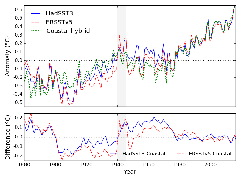 Comparison of HadSST3 (the current version of the UK Met Office dataset), ERSST5 (the current NOAA sea surface temperature dataset), and the coastal hybrid sea surface temperature dataset (from Cowtan et al, 2017). Temperature averages are calculated using common coverage.
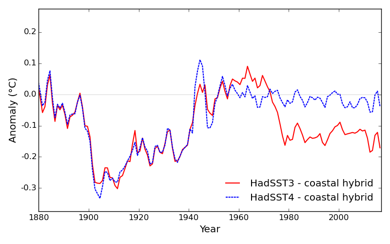 Comparison of the current and new versions of the UKMO sea surface temperature data (HadSST3 and HadSST4) to the coastal hybrid temperature record of Cowtan and colleagues (2017).
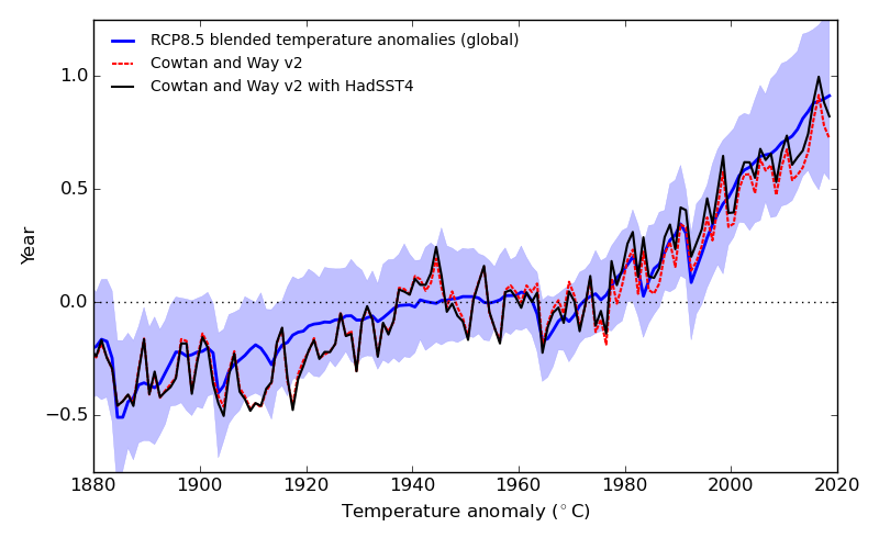 Comparison of infilled global temperature observations calculated according to Cowtan and Way (2014) using either HadSST3 or HadSST4 against blended land-ocean temperatures from the CMIP5 RCP85 climate model simulations. (1951-1980 baseline)


